The Well - Archived Work from 2016
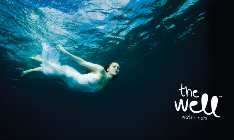
The new identity combines fluid typography that mimics the movement of water with a circle that invokes the act of looking into a well, into a fresh, contemporary brandmark.
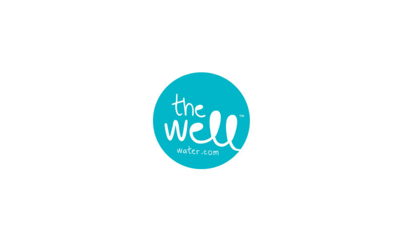
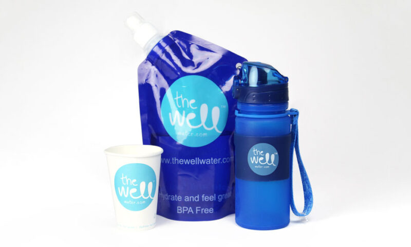
The Well
This refreshing brand is really making waves! Its unique technology improves on the familiar water bottles you’ll find in any office, instead using a much more space efficient, hygienic and environmentally-friendly system with a sealed bag and a collapsible box.
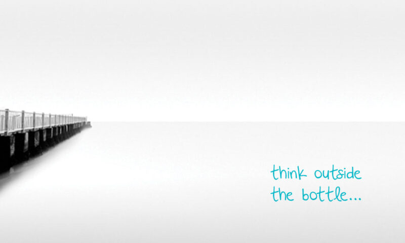
No wonder The Well asks people to ‘think outside the bottle’! So a new brand was needed to match the new technology. The new identity combines fluid typography that mimics the movement of water with a circle that invokes the act of looking into a well, into a fresh, contemporary brandmark.
Other Work
Golden Bake

Hamilton Princess
Montenotte
Warbler & Wren
Active Iron

NUI Galway
Adare Manor
The Shelbourne
Kish Fish
Flahavan’s
Nuvion Nutrition
O’Neills
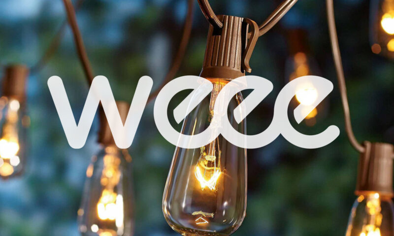
WEEE
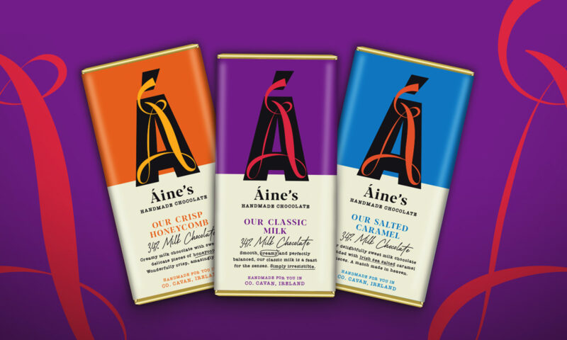
Áine’s Handmade Chocolate

Forestry Partners
8 Degrees
Glenisk
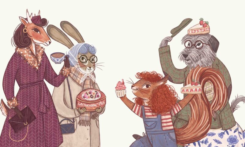
Vintage Tea Trips

The Hendrick
Bord Bia Food Works

Mercury
IrelandsEye
Terrace Club