Port of Waterford - Archived Work from 2016
Reinvigorating a challenger brand in a competitive B2B industry

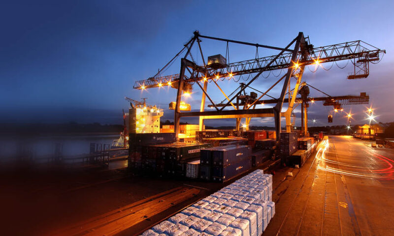
Port of Waterford
As a key element of an overall strategic review, Port of Waterford came to us to re-establish its rightful place in the market. It needed to strengthen its position as a serious contender in an industry dominated by a very small number of key players. To compete on both a national and international playing field it needed to raise its profile and clearly define its proposition.
Our solution
With a heavy industry focus on functionality we had to balance purpose with a powerful positioning that would connect with staff, customers and also the surrounding Waterford region. The result unites both the tangible physical assets and location with a much deeper, emotive component – “Brings You Closer”.
We captured this in a robust brandmark that is layered with heritage. Three coils of a rope play tribute to the three rivers that meet in Waterford – together composing a memorable “W”.
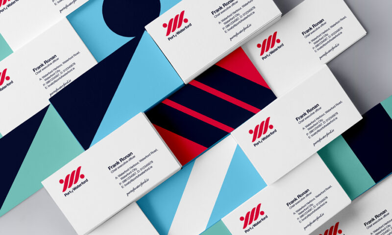
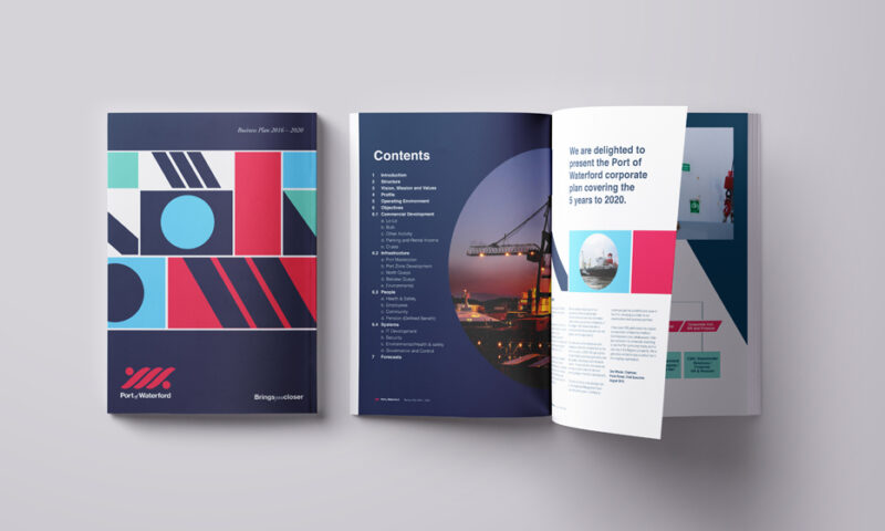
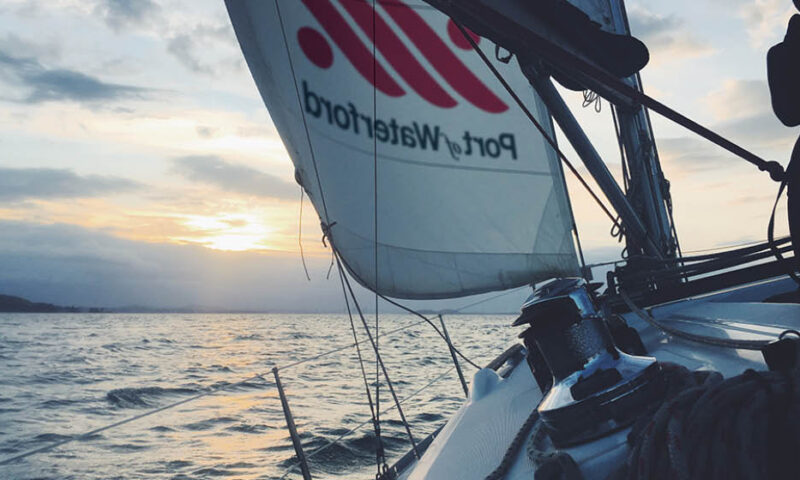
Most importantly, the rope ties the local community to the Port – a visual representation of our new positioning. In contrast to the clichéd use of blue in maritime brands we chose a bold red with strong, dynamic secondary graphics that take inspiration from nautical flags. Balancing this is the local, human element of the brand – an emphasis on a warm photography style and an open, approachable tone of voice.
Other Work
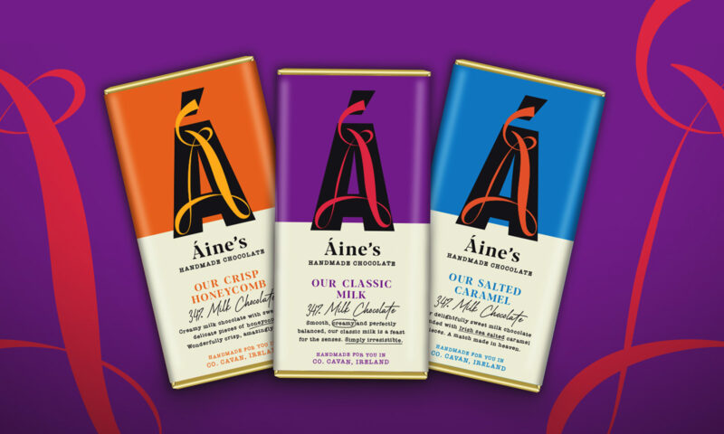
Áine’s Handmade Chocolate
O’Neills
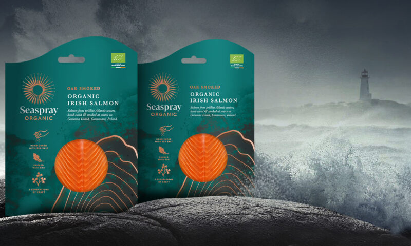
Irish Seaspray

Golden Irish

NCCR AntiResist
Glenisk
8 Degrees

Hamilton Princess
The Grand Hotel

The Shelbourne
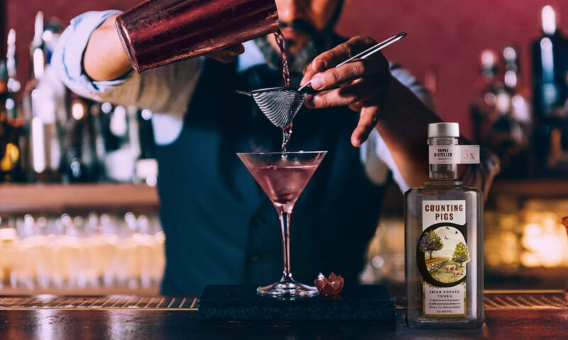
Counting Pigs
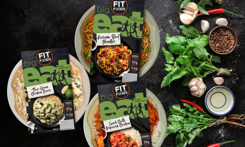
Fit Foods
Warbler & Wren
eDesk

The Hendrick

Forestry Partners
Nolan Kitchens
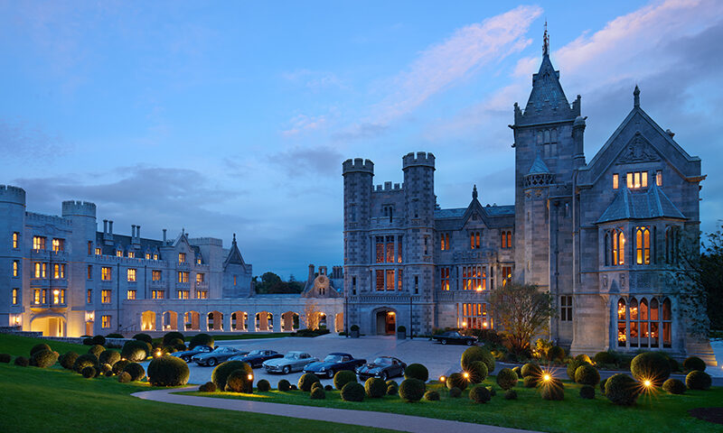
Adare Manor
Montenotte
Findlater & Co
Active Iron

Mimi Care

NUI Galway
Monaghan
Shaws
Kish Fish
The Killarney Park

WEEE

Golden Bake
Nuvion Nutrition

IrelandsEye
Spry Finance

Mercury
Flahavan’s

Bord Bia Food Works
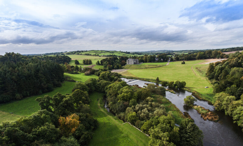
Slane Castle
DLR Mill Theatre
NitroFert
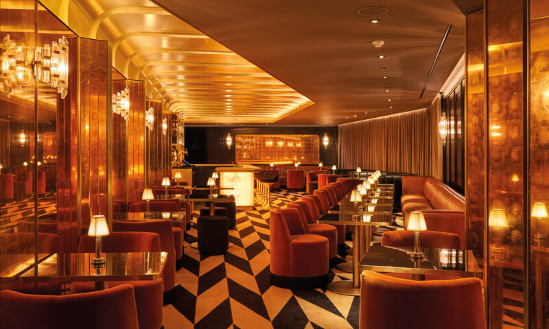
Terrace Club
Donnelly Fresh