Make the logo bigger
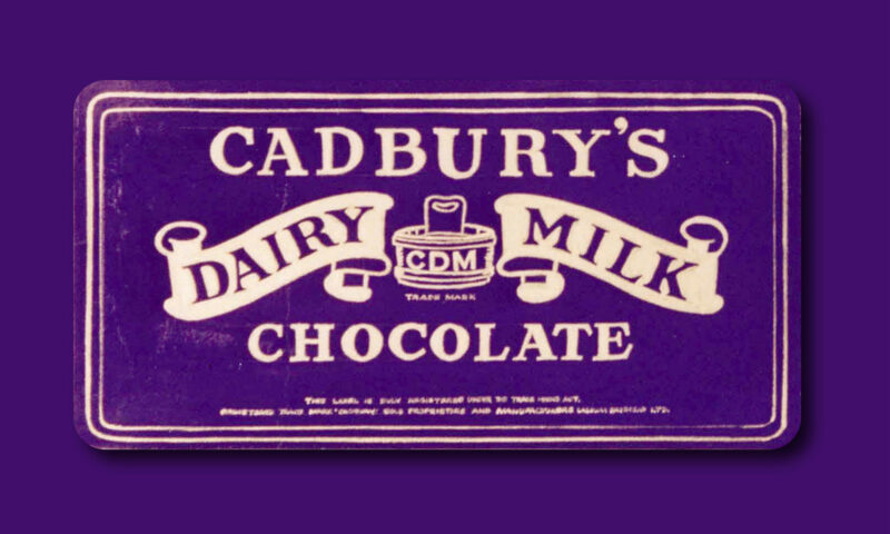
Kellogg recently underwent a rebrand. Perhaps the largest in its 113 year history. Tom Seymour wrote a nice piece in Creative Review describing the new packs:
“The revamped packs – which include brands such as Kellogg’s Corn Flakes, Kellogg’s Crunchy Nut and Kellogg’s Coco Pops – feature ‘bold and striking colours’ to make the product stand out on supermarket shelves.
‘A new visual language has been created so consumers can understand more about the food, and also about the Kellogg’s brand,’ Kellogg said. ‘The design cues on pack depict the simplification of the food inside the box.’
The new package design takes some of the emphasis of the boxes away from the famous characters that Kellogg’s has used over the years to advertise its cereals, which include Coco the Monkey and Tony the Tiger.”
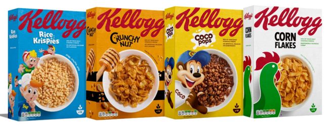
The packs have been stripped back, yes. But one thing I couldn’t help but notice was the logo – it had been enlarged so much so that it now wrapped around the top of the box.
This really resonated with me. From a branding point of view, I can’t deny the value of getting your name out there and reaffirming it time and time again. It can be argued that it’s even more important after 113 years of business.
But the designer in me couldn’t help but laugh. Because hearing the words ‘make the logo bigger’ is literally every designer’s worst nightmare. Hats off to the team at Landor for making it happen beautifully for Kellogg.
On a final note, I thought I’d share this piece we commissioned for the studio in honour of all of the times that we’ve been met with the request. 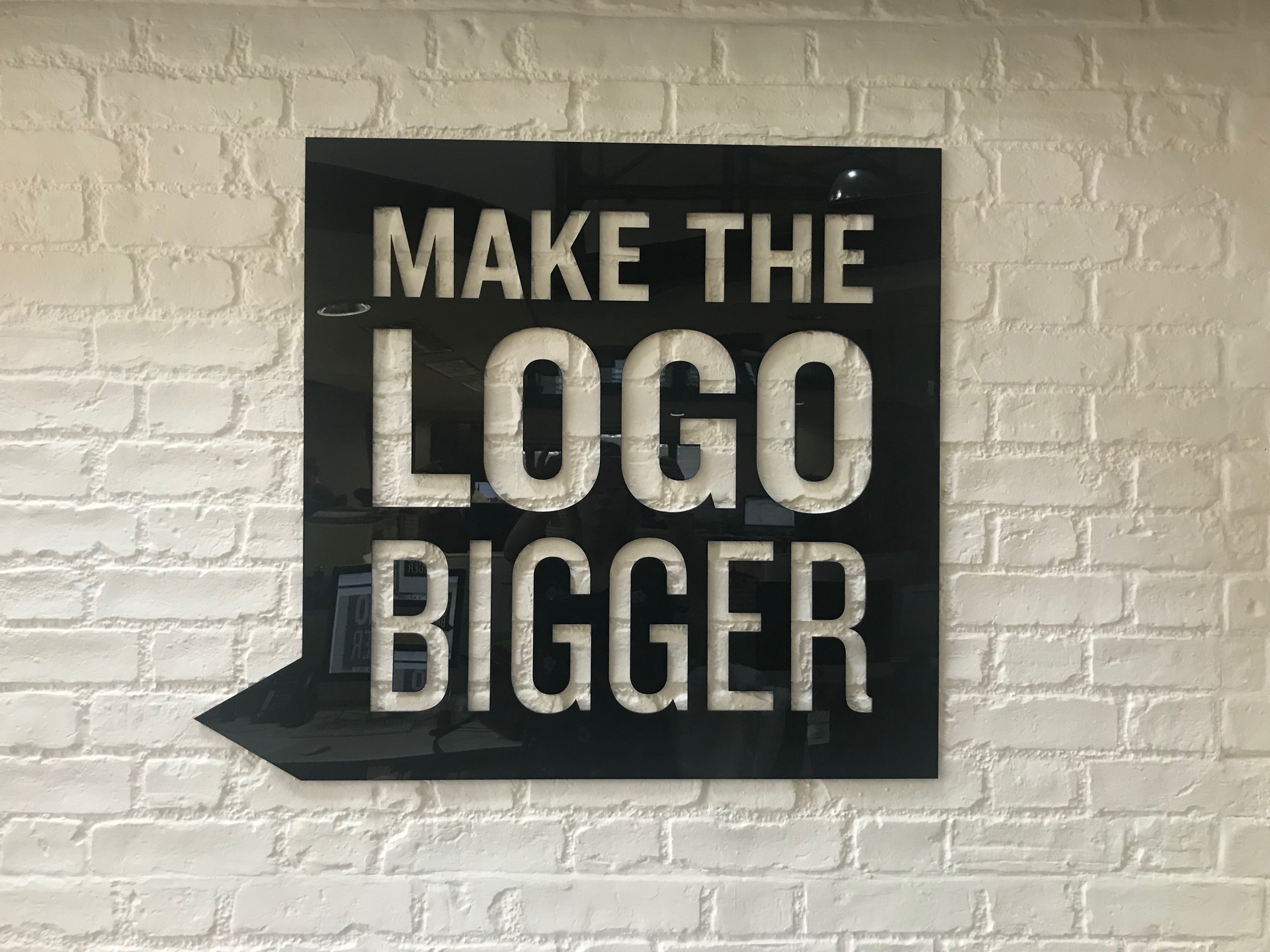
PAT KINSLEY, FOUNDER AND MANAGING DIRECTOR
One of the original Brand Thinkers on this Island, Pat has spent the last 33 years extolling the virtues of branding as an essential commercial device that improves every company’s bottom-line. A native of New York City, he brought this passion to Dublin City and now it travels with him wherever he goes!
Keep Reading
Less grey, more play… Dublin Canvas
Brands that compliment and brands that complement

5 Questions to ask a prospective web agency
When is the time right to update your packaging?

What’s in a name? Taxi!

Eclectic Style of Art and Architecture at Its Best
Edible-insect packaging: It’s worm in here!
Brand Stretch – The Odd Couple
Branding from the heart

Lost In Space
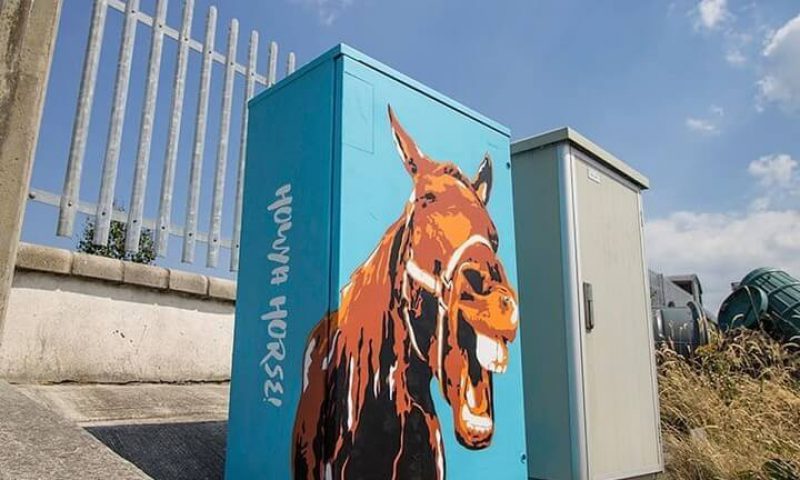
Street Cred
Bringing Digital Art to Life

Instagram your brand

Three, Two, One, Lift off
My Type of Exhibition
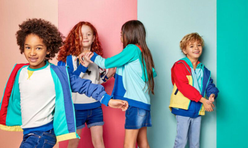
Unisex clothes for kids
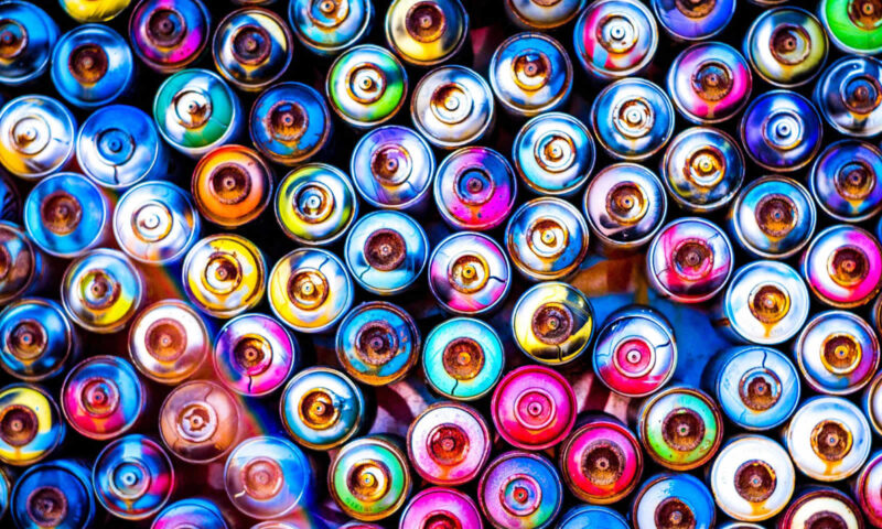
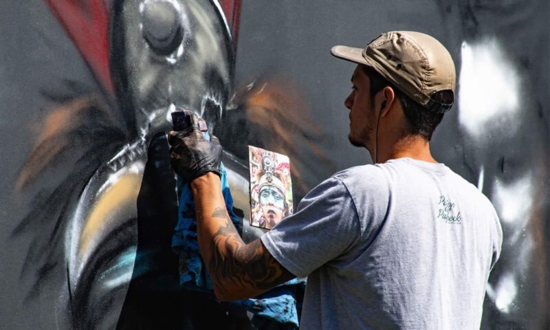
Every wall is an opportunity!
Her apron strings and her purse…

Your brain on criticism