The Power of a Symbol
Last August, a mysterious symbol began to appear in a variety of locations throughout the world. These included London, New York, Turin and Tokyo amongst others. The unique implementation of this symbol made it all the more intriguing – applied in an almost otherworldly, celestial fashion akin to crop circles. It was also unsupported by any text or social media link, restricting further explanation. In other words, it was perfect in its execution.

Richard D. James aka Aphex Twin
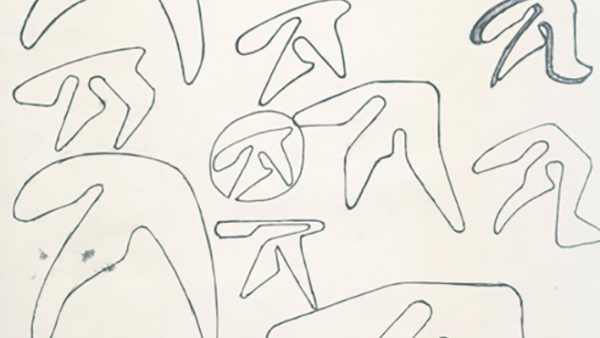
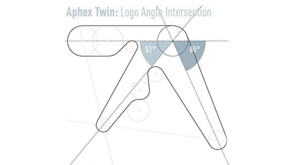
The mark itself was of course seen before and is the brandmark of the electronic musician Richard D. James aka Aphex Twin. Originally designed by Paul Nicholson using circle templates and rulers, the amorphic monogram was created based loosely on the letter ‘A’.

Aphex Twin brand mark designed by Paul Nicholson
Its concept was firstly pitched as a design for use by a skate-wear company called Anarchic Adjustment but then rejected. James requested Nicholson for some tweaks to make it his own and an icon was born. Unbalanced and not perfectly legible, in theory it shouldn’t work but it just does. Experimental in its structure and construction, the monogram encapsulates a visual representation of the artists sound, an achievement in itself. Last year was the 25th Anniversary of the first use of the mark, whereupon Nicholson released its graphic construction and original sketches of the design, including a related font style.
The Power of a Symbol
To promote the launch of a new Aphex Twin release called Collapse this year, the mark was put to some innovative use by his label Warp Records. In August, the logo was seen illustrated, visually sinking into the wall of the Elephant & Castle Tube station, London. It was then seen illustrated as part of metal shutters in Turin. It even appeared as sinking ivy in Los Angeles, all treatments in a state of collapse as a theme.
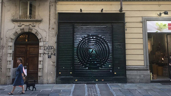
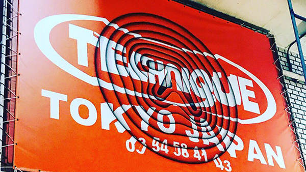
Innovative uses of the mark in Turin, Tokyo, London and Los Angeles
No hyperbole about release dates this or critical acclaim that, just a symbol used to huge effect.
As the late Jim Bowen might say, ‘Super, smashing, great!’
Sean Deignan, Senior Production Artist
Sean is a Senior Production Artist at Neworld. He is responsible for the handling of major brand name projects from brief to final production, and for taking design concepts and working them to fully finished packaging and literature ready for print. He has worked with a variety of brands including Barry’s Tea, Glenisk, Arrabawn, The Jelly Bean Factory and Irish Pride
Keep Reading
When a Slogan Fits, It Sits
Optical Illusions

The countdown’s begun! 5 of my favourite John Lewis...

Brands for Life

Perfect Packaging for Pets

3 Key Rules of Web Design

Millennials v Generation Z

Drinking with celebrities

What Is Company Culture?
Unlock Your Creative Side

5 Ways To Improve The Marketing And Finance Alliance

5 new tech terms you need to know

Simple Design That Can Change a City
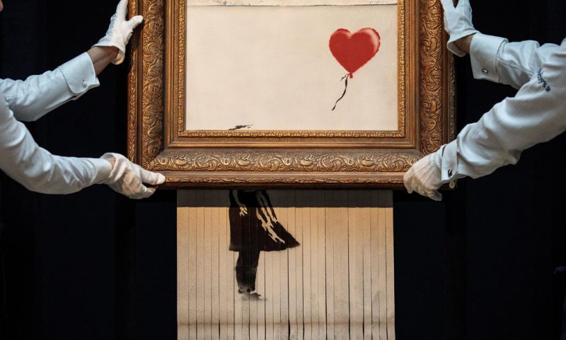
We just got Banksy-ed
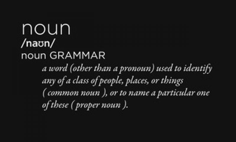
When Brands Become a Noun
Lost
I vote for better election posters!

Spooky Craft Beers

Halloween Fever!