I vote for better election posters!
While doing my civic duty and heading to the polls Friday morning I couldn’t help but question ‘those posters’, whose sole purpose is to entice, sway or confirm my opinion.
Why do they all look the same? Why are they so outdated? Why don’t they actually consider the power of design?
Perhaps I’m slightly jaded as my life is inextricably linked with branding and I scrutinise everything. Nevertheless, I believe I’m not the only one.
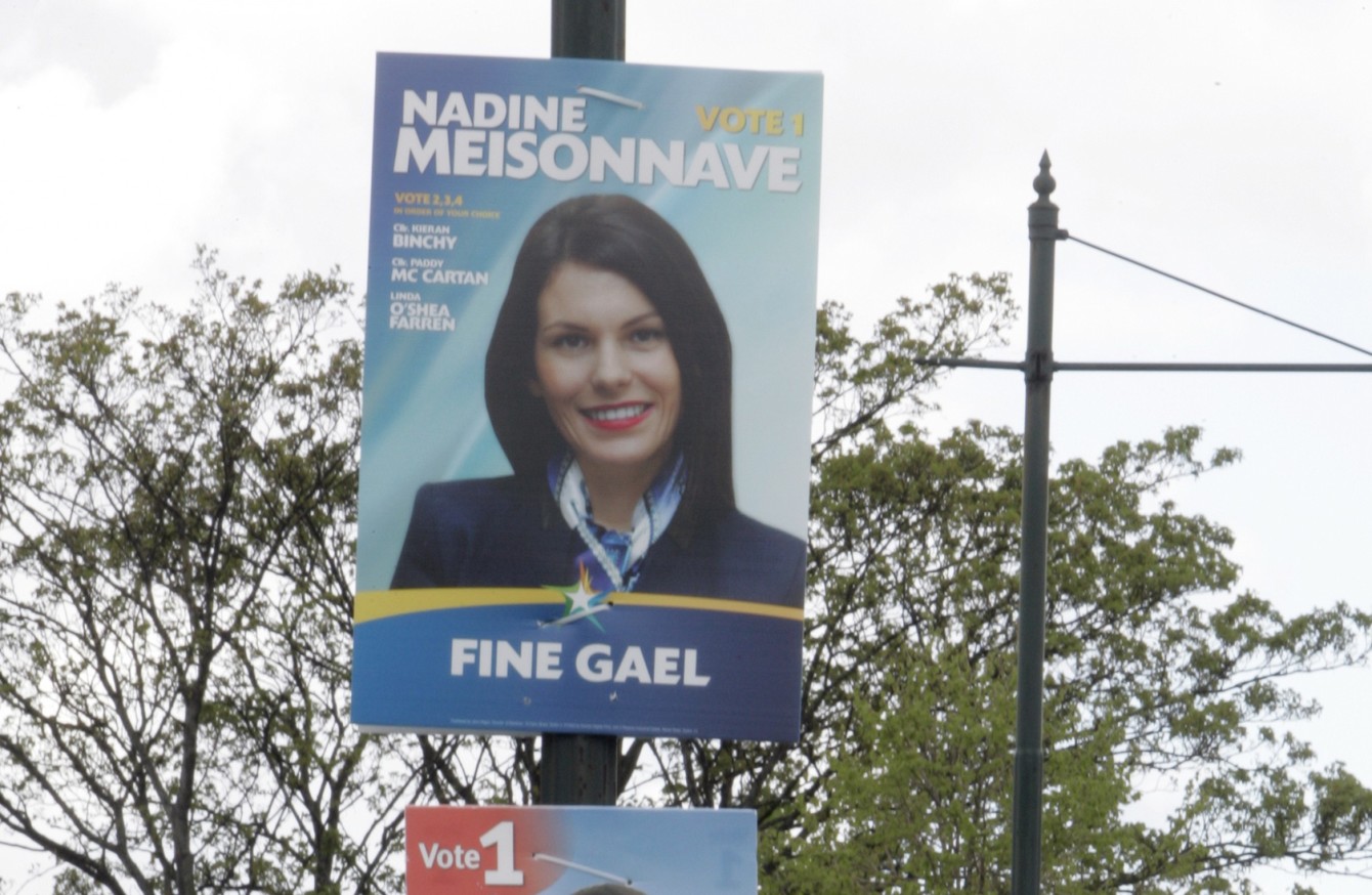
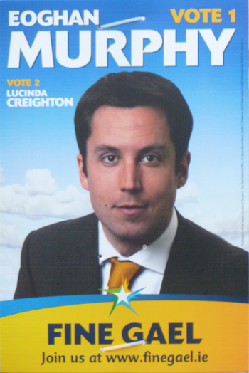
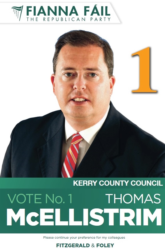
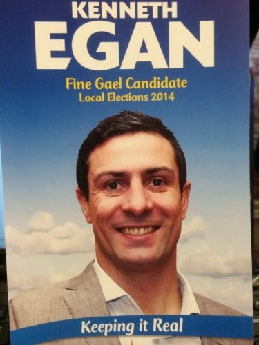
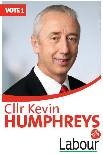
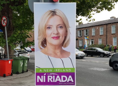
Even a little consideration goes a long way – looking at photography quality, backgrounds, language, structure, fonts. They can turn average (or worse) communications into something really powerful, evoke a feeling and make a connection. Isn’t that the point?
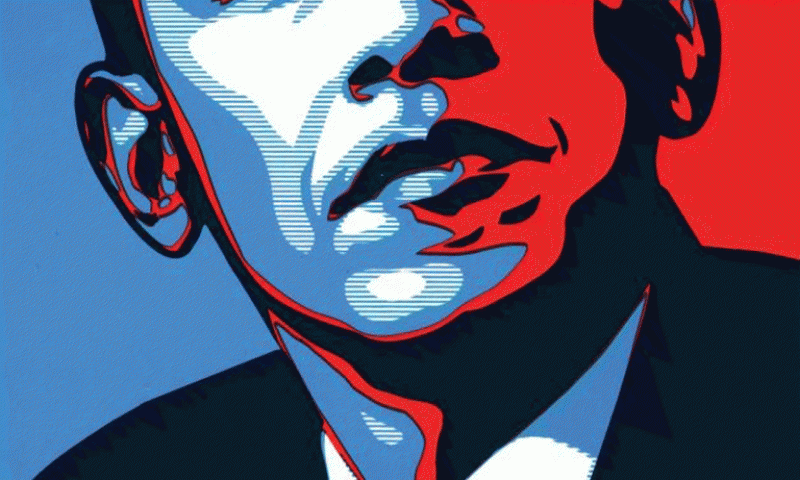
Our international counterparts are giving a lot more attention to this medium, understanding its value.
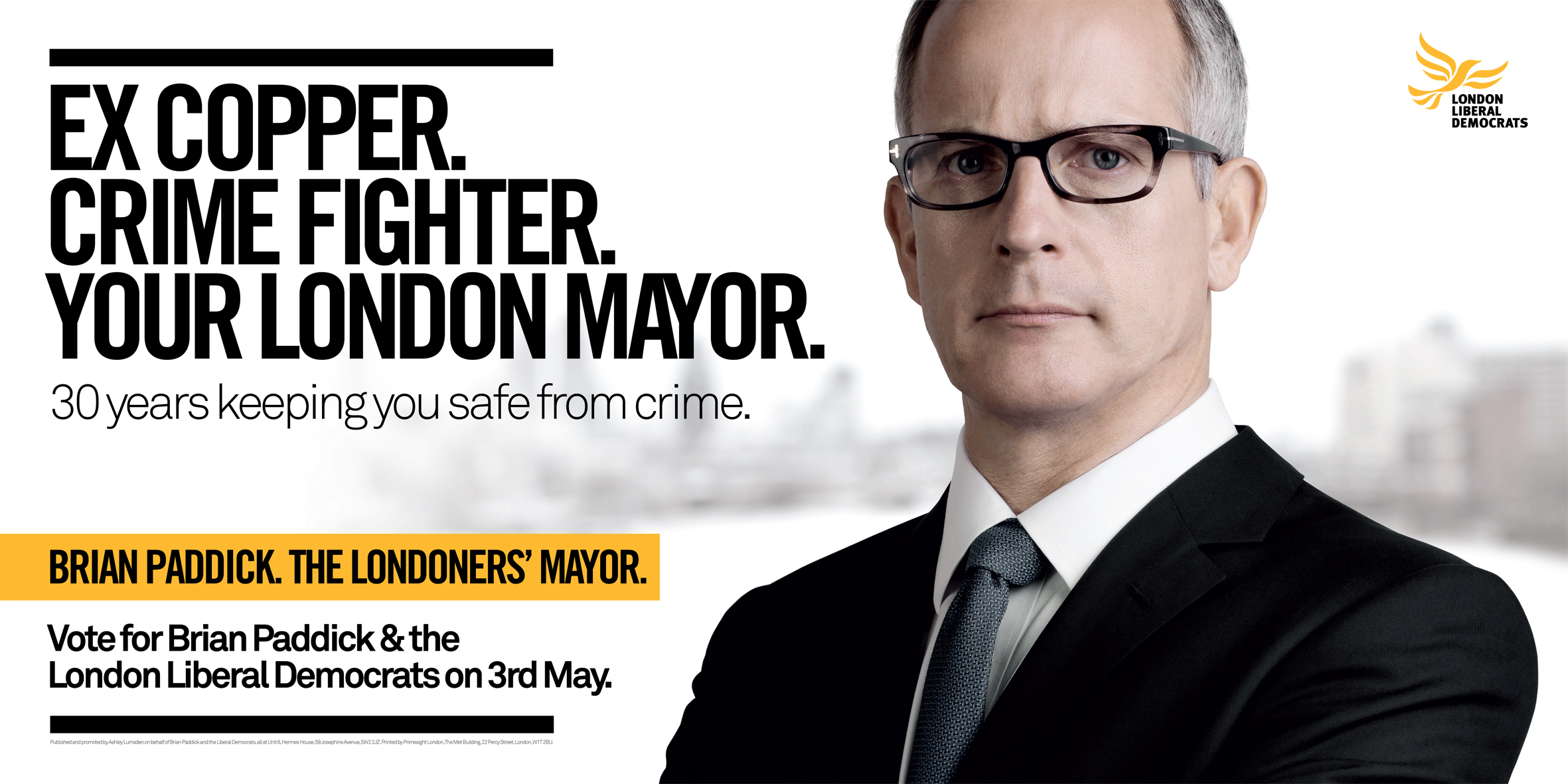
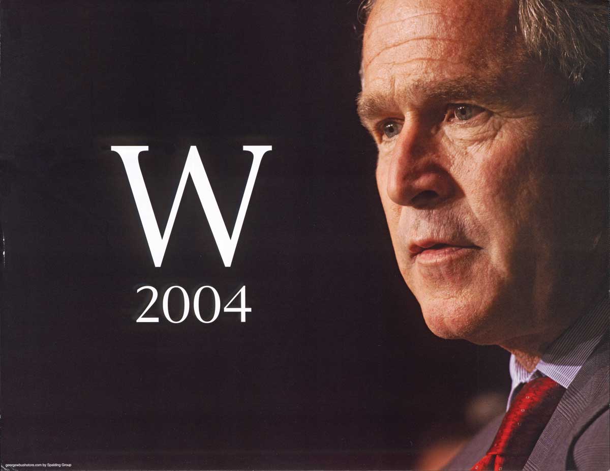
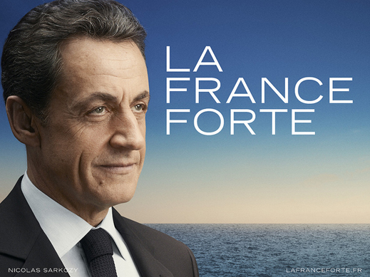
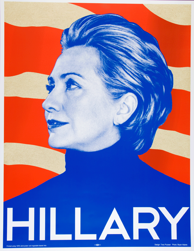
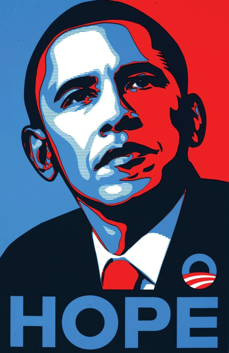
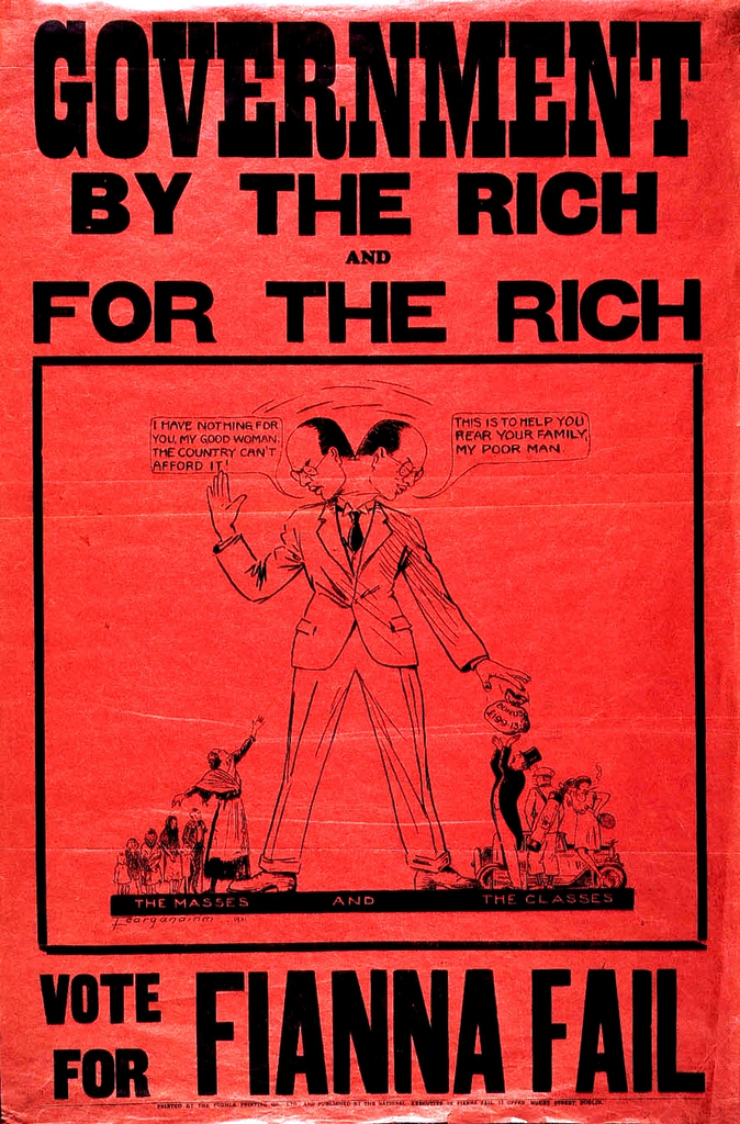
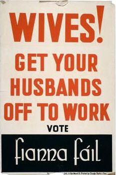
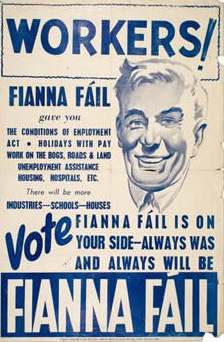
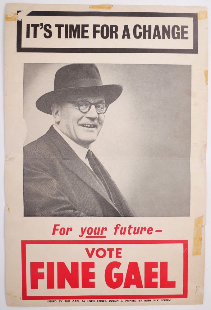
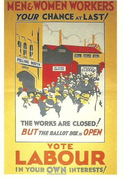
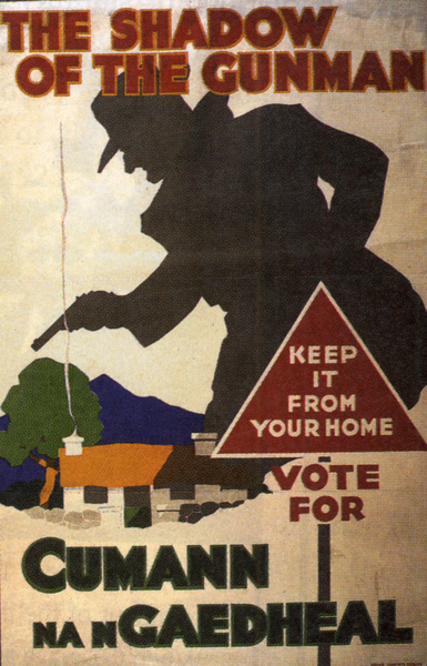
It’s interesting to see how things have changed over time:
Dear Ireland,
Please call me. I’d like to help.
Thanks, Mary
Mary Helow, Senior Account Director
Mary called San Francisco home until 2005 but prefers the cobblestone streets of Dublin. Her loves are understanding what makes a brand tick, Star Trek (Captain Kirk is king, she says) and any type of Mexican food she can get her hands on.
Keep Reading
Drinking with celebrities

What Is Company Culture?
Unlock Your Creative Side
The Power of a Symbol

5 Ways To Improve The Marketing And Finance Alliance

5 new tech terms you need to know
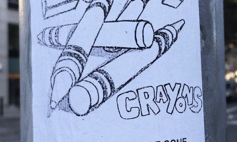
Simple Design That Can Change a City
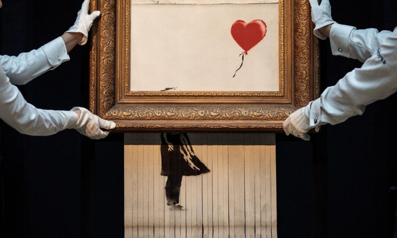
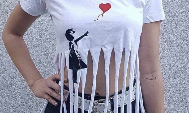
We just got Banksy-ed
When Brands Become a Noun
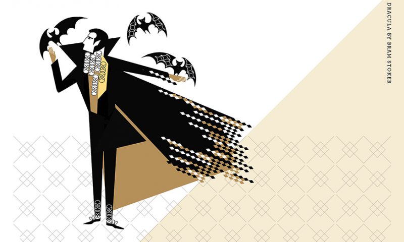
Lost
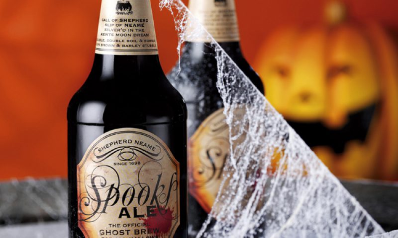
Spooky Craft Beers
Halloween Fever!
If the walls could talk

Signs of the times
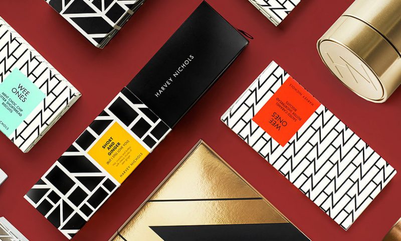
Harvey Nichols Food Collection – Style With Substance

The unbearable nostalgia of books
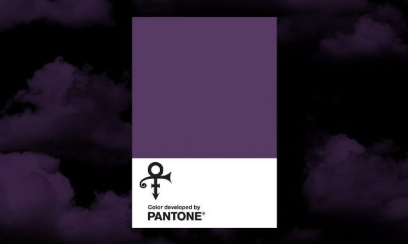
Trademarking Brand Colours
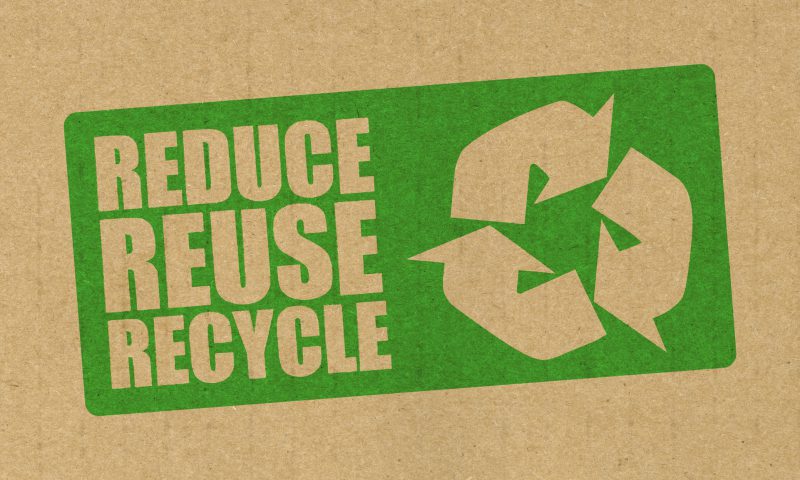
Attract Millennials to your Brand: Reduce Packaging Waste,...
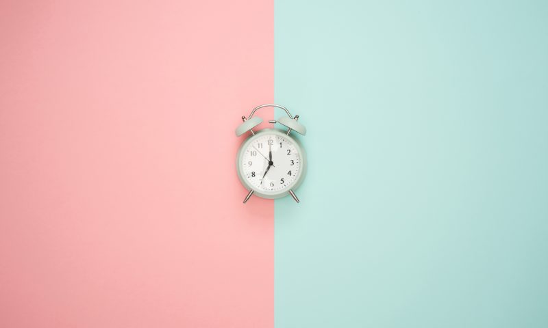
Time Management for Designers