Signs of the times
What differentiates design from art is the functional aspect – design is about problem solving – communicating a message, an idea or an action. This is no more so than in signage and particularly transport signage.
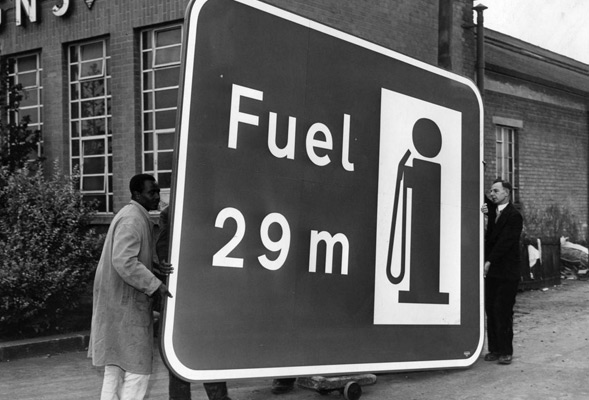
Road signs need to warn and guide drivers, helping to regulate the flow of traffic for vehicles of different types, and for pedestrians, motorcycles, bicycles and other road users. They have to be eye-catching and clear but not too distracting to become a danger themselves. Design is key to translating a message into a simple visual solution using iconography and typography. Successful signs are designed to be simple clear and understandable at a glance and in different road conditions.
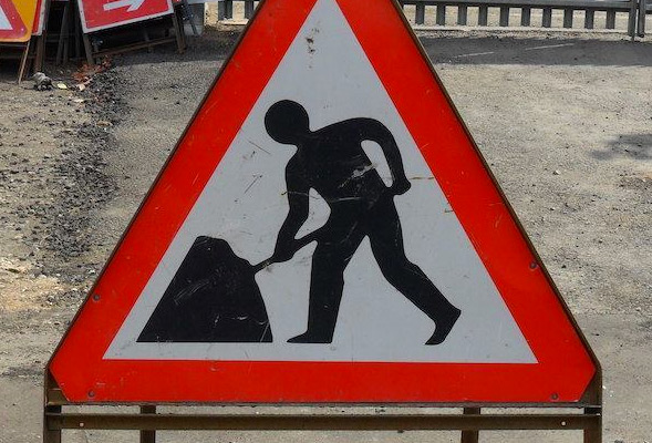
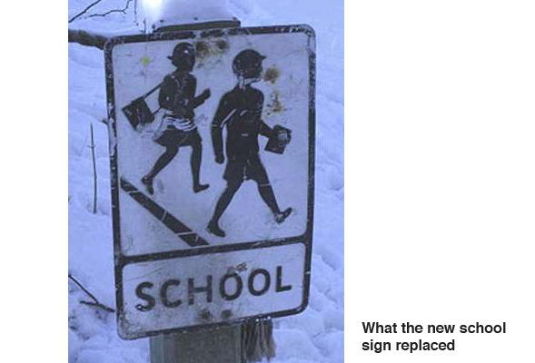
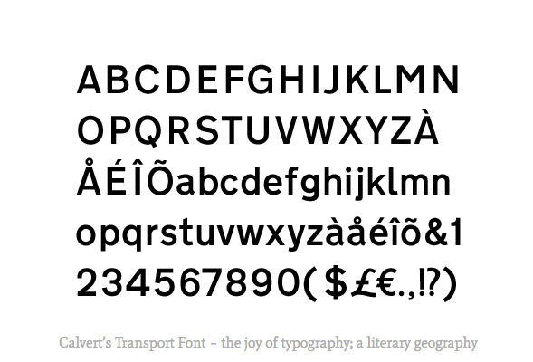
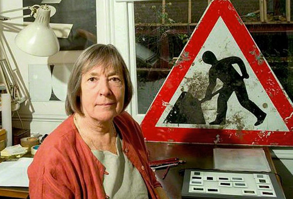
Modern UK signage owes a huge debt to Margaret Calvert, a South African born woman who worked as an assistent to Jock Kinneir, designing the UK road sign system. She came up with simple, easy-to-understand pictograms, including the signs for “men at work”, “farm animals”, and “schoolchildren nearby”, based on pre-existing European road signs. (It’s interesting to note that until the 1950s the sign for a school was an olympic flame.) She also designed the Transport font used on road signs and the Rail Alphabet font used on the British railway system.

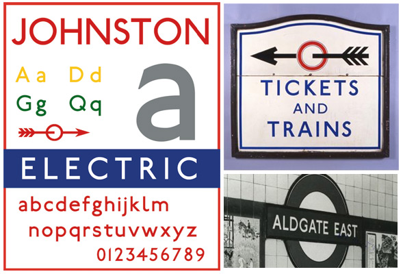
Another font closely associated with transport signage is the Johnston font used on the London Underground. It has been the corporate font of public transport in London since the foundation of the London Passenger Transport Board in 1933, and of previous companies since its introduction in 1916, making its use one of the world’s most enduring examples of corporate branding. It inspired the Gill Sans font designed by Eric Gill, a student of Johnston. Johnston also refined the ‘bar and circle’ roundel that the Underground still uses to this day.
Introducing Johnston100: A 2016 update to Transport for London’s Johnston typeface, to mark the centennial of its use across the bus, rail and Underground systems.
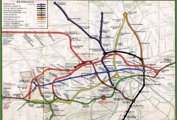
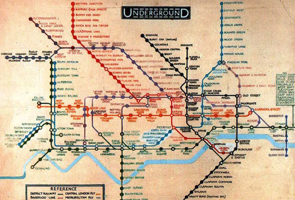
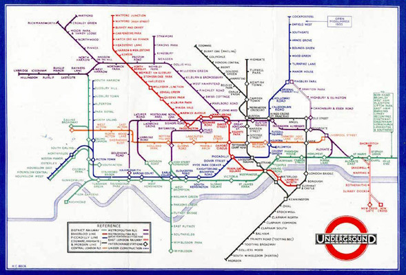
Of course any discussion about design and the London Underground can’t ignore the London Underground map. The first schematic Tube map was designed by Harry Beck in 1931. He drew up the diagram in his spare time while working as an engineering draftsman at the London Underground Signals Office. Although it has been updated many times to cater for expansion of the tube network, it is still very much based on the original schematic concept.
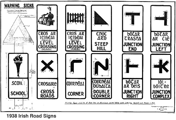
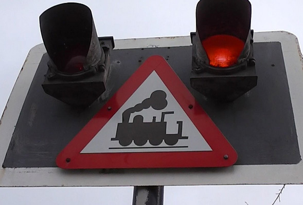
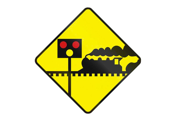
The most successful designs stand the test of time but that does not mean they are always appropriate for the modern age. It often surprises me to see level crossing signs that feature a pictogram of a steam train, when diesel and electric replaced them many years ago. I guess it’s still understandable to all age groups and all around the world where steam train pictograms are still in use.
Which prompts a thought on what signs are we missing for the modern world?
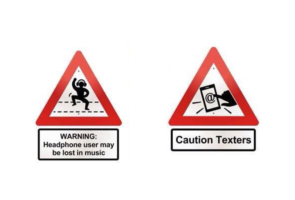
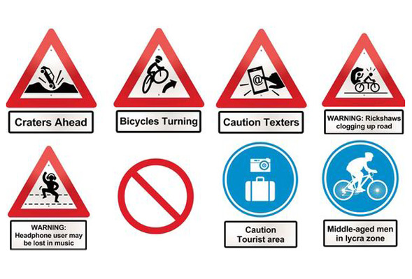
Not too many years ago a PR company working on behalf of London cab drivers drew up a partially tongue in cheek wish-list of some new signs they would like to see. It included ‘Caution Texters’, ‘Warning Rickshaws’ and ‘Warning Headphone user may be lost in music’.
David Jordan – Digital Director
David set up the dedicated digital division of Neworld in 1999 and oversees the strategic approach, creative design and technical development of digital projects from websites to moving graphics and on-screen presentations. When not tinkering with computers, he is likely trying not to be distracted by transport signage.
Keep Reading

5 Ways To Improve The Marketing And Finance Alliance

5 new tech terms you need to know

Simple Design That Can Change a City
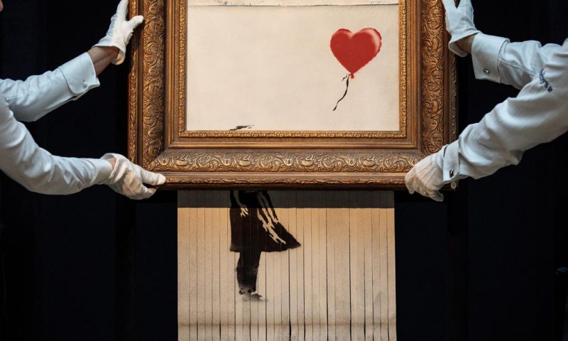
We just got Banksy-ed
When Brands Become a Noun
Lost
I vote for better election posters!

Spooky Craft Beers

Halloween Fever!

If the walls could talk

Harvey Nichols Food Collection – Style With Substance

The unbearable nostalgia of books

Trademarking Brand Colours

Attract Millennials to your Brand: Reduce Packaging Waste,...

Time Management for Designers

Illustrator Jean Jullien: A Lesson in Simplicity

A Christmas Experience

The Perks of Coffee Packaging

For the love of twitter