Five bespoke typefaces we want to get our hands on!
I recently read an article in It’s Nice That, an online design magazine, by Nayoung Kim talking about custom typefaces and if they are worth the hype:
Custom is a magic word. Everyone wants to be unique, different, special. In an increasingly homogeneous globalised world, we crave exclusivity and individuality. Customisation allows for self-expression – whether it’s the clothing we drape our bodies in or the sofas we furnish our living rooms with – we want to surround ourselves with belongings which are unique and representational at the same time.
The concept of using custom brand typefaces isn’t new: they were first introduced in the tech industry about a decade ago as a way to save on the cost of licensing existing typefaces. Today though, as brands seek ever more ways to stand out among the crowd, a custom typeface has become an identity power-up in the game of “This-Is-Me-I-Am-Special.
Even so, 2018 has been a standout year for custom brand typefaces. A raft of major brands have released their own; from Chobani’s chunky serif to Netflix’s compact sans. YouTube, Lyft and Airbnb have each launched their own custom typeface to much discussion from the global graphic design community. (Nayoung Kim for It’s Nice That)
With this in mind, here are five recently designed bespoke typefaces I’d love to get my hands on:
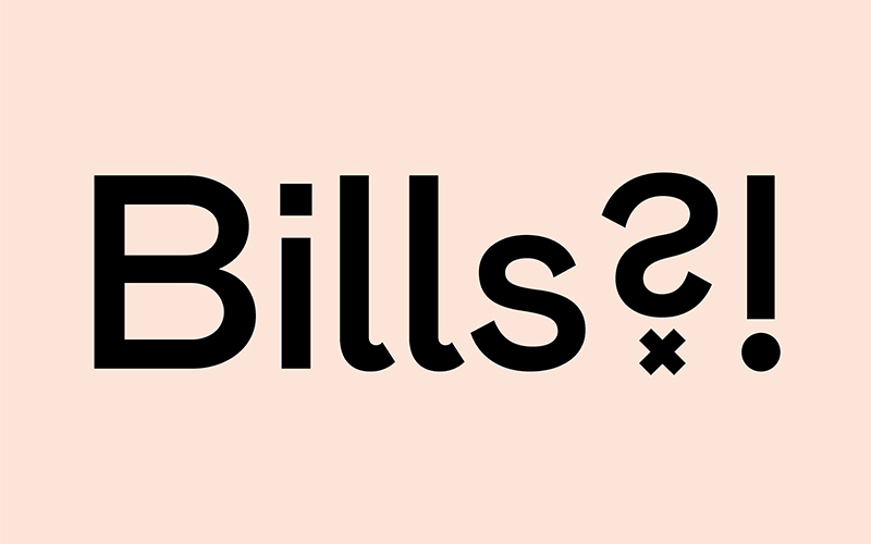
1. eir
Well known in Ireland since its launch in 2015, eir has a contemporary fresh look. Its bespoke typeface compliments and echoes the curves in the new brandmark. Legible and contemporary yet just enough character to keep things interesting.
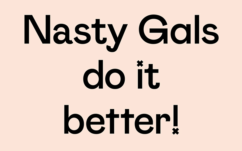
2. Nasty Gal
Now I don’t shop there every day but Nasty Gal’s new typeface is fantastic. It screams character, attitude and has alternating characters to keep things interesting. At the same time, the typeface is crafted to behave in large bodies of text.
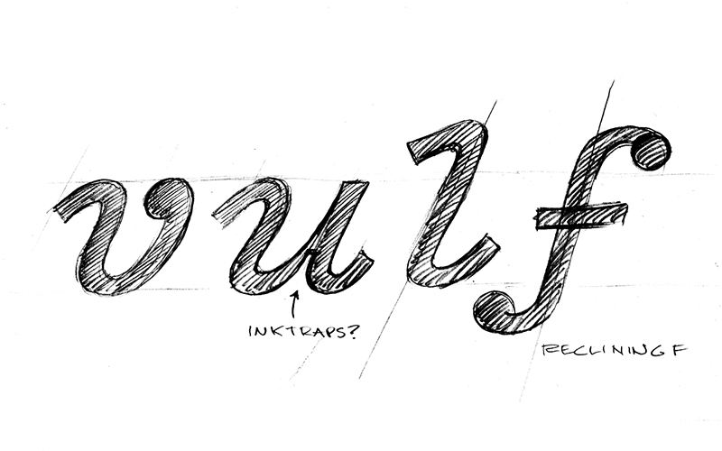
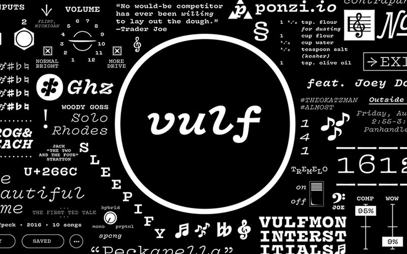
3. Vulf Mono
If you’re into your nerdy dad funk, you’ll know of a band called Vulfpeck. Their ‘sweet licks’ and VHS-like music videos have gathered a huge cult following. And of course, a few members of said cult designed a full typeface for the band, stemming from the bands original grainy 80’s sting intros to their videos. It’s not often a band has their own typeface.
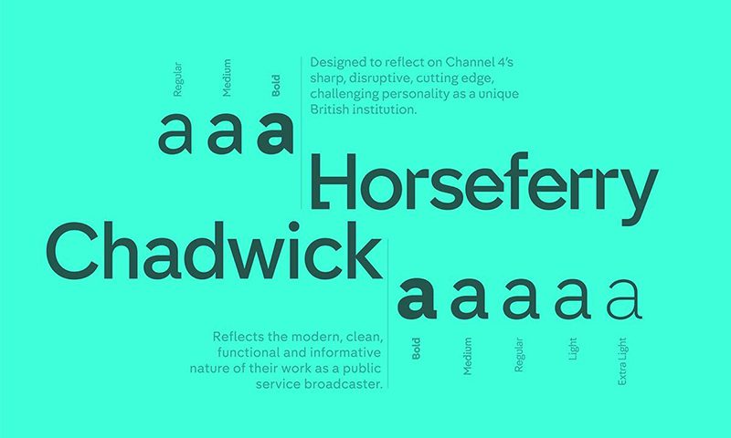
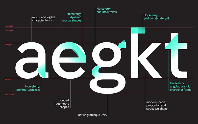
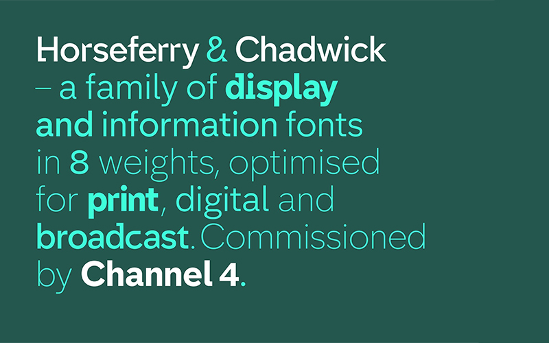
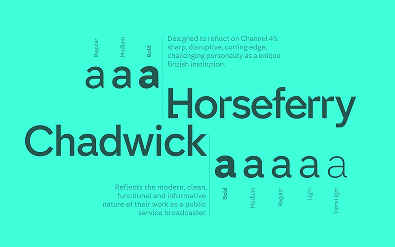
4. Channel 4
Designed by Neville Brody, Channel Four actually has two typefaces I’d want to get my hands on – Horseferry and Chadwick. “Based on the idea of a new British Gothic, to which [ They ] then added imbalanced flourishes and imperfections, celebrating the idea of our nation as one of inventors, eccentrics and individuals.” Echoing elements of the blocks that form the Channel 4 brandmark itself.
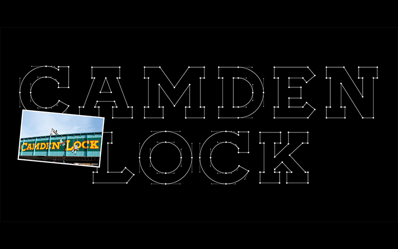
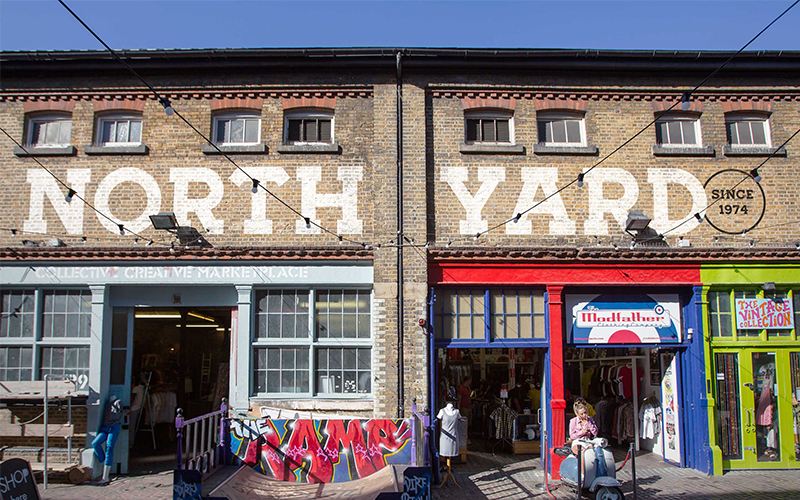
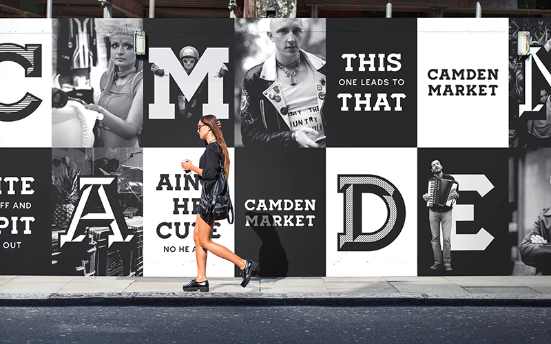
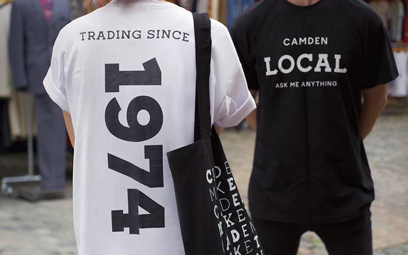
5. Camden Market
A Studio in London called Ragged Edge was tasked to define and create a brand that would re-energise the market, making it relevant to a new generation of millennials. On creating the brand a major part was a bespoke typeface. Which takes its unique serif characteristics from existing artwork on the Camden Bridge.
Glenn Bolton – Senior Graphic Designer
Glenn has been waving the flag for Neworld for 5 years now. Not so new to our design team anymore. He’s our resident craft beer aficionado, wannabe Michelin star chef, photographer of yummy foods, maker of tiny things, Dublin tour guide and a proprietor of one of the swankiest single speed bikes around town.
Keep Reading
Interview Questions and Answers
Crouching cyclist, hidden bear: The best hidden messages in...

Staying Ice-Cream Cool with Hot Design

Plan your future now – don’t wait until it’s too late

What can hotels learn from cruise ships?
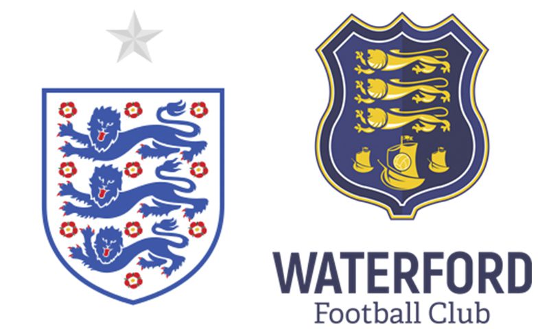
A Tale of Three Lions – Retro Rebranding
Did you ever wonder? Origins of well-known phrases
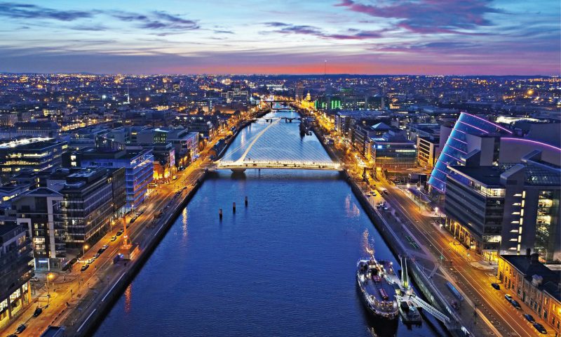
Where does your Dublin take you…
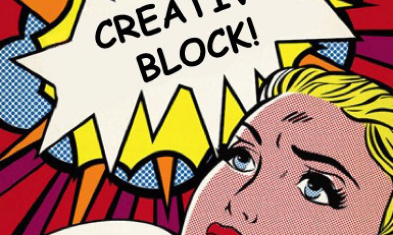
Lost your Creative Mojo?
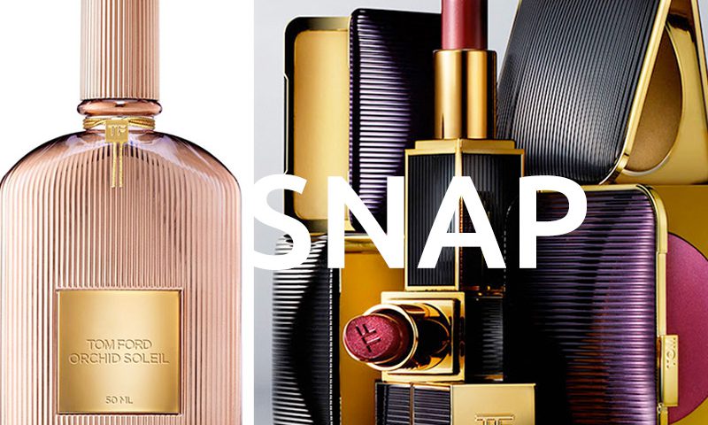
Packaging Gold
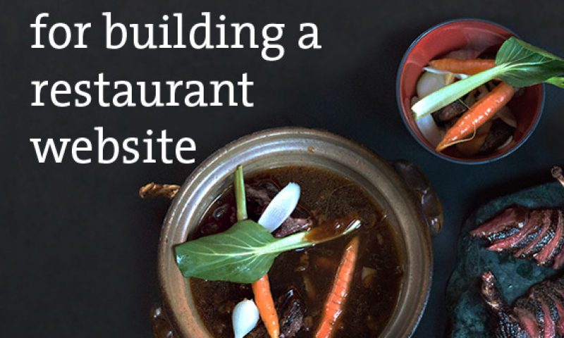
7 key tips for building a restaurant website
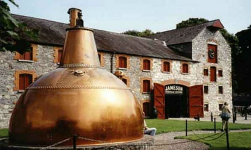
The Case of Midleton Whiskey
The Top 6 Greatest Fictional Brands
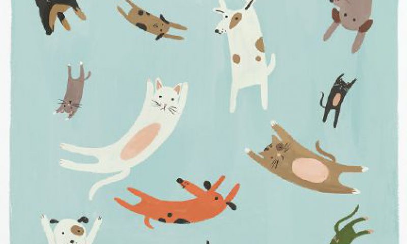
Design that’s set tails wagging
We’re hiring!
Client Question: What makes a brilliant packaging design...

Four unexpected consequences of GDPR
5 common mistakes we see brands make
Client Question: How do you assess category cues and how...