POSTED BY: Lorna McWeeney
Crouching cyclist, hidden bear: The best hidden messages in everyday logos
Crouching cyclist, hidden bear: The best hidden messages in everyday logos
![]()
Teeling Whiskey
Have you heard about the bird? I was enlightened about the meaning behind this whiskey’s logo during a tour of their Dublin 8 HQ. At a glance you might pass this logo over as a gothic bird in flight – something akin to the tattoo your boyfriend got on his Leaving Cert. holiday perhaps. The bird is, upon sober inspection, a phoenix rising out of the flames of a whiskey still. This bird emerging from fire is a subtle reference to 1871’s great whiskey fire of Dublin (read more about that fascinating night here) which had a huge impact on Dublin’s whiskey trade.
![]()
Museum of London
London is an ever evolving, transforming and vibrant city which, even on the face of it, is well expressed in the Museum of London’s current logo. Delving deeper, however, we learn that the apparently random overlapping shapes and colours represent the geographical area of London and its surrounds as they expanded over time. This thoughtful identity by design agency Coler, Porter Bell is perfectly suited to the client and is a masterclass in thoughtfully simple design.
![]()
MyFonts
‘Design a wordmark for a company that sells typefaces.’ – quite a daunting brief! Dutch design agency Underware took on this challenge for ‘MyFonts’and decided to make a type all their own. As an homage to the hand-crafted nature of type design, they created a distinctive, hand-painted logo with the ‘My’ in the shape of a human hand. This hidden message is perfectly executed – it’s subtle enough so that you don’t see it at first but clear enough that once seen, it cannot be unseen! Shout out to Steve Walsh’s eyes for helpfully spotting MyFonts hidden message!
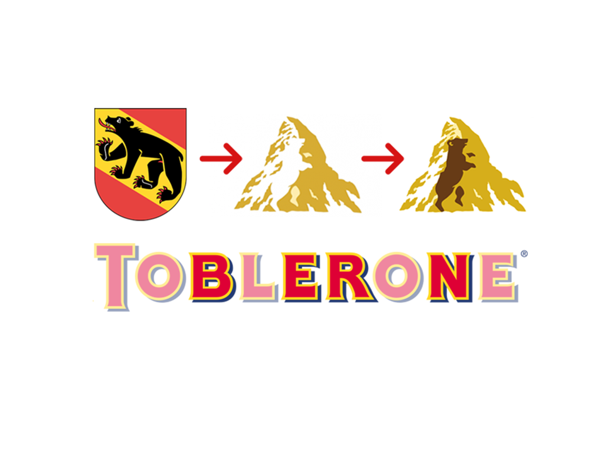
Toblerone
One may mistake Toblerone’s mark as rather plain and perfunctory – they’ve used a Swiss mountain; mountain = Swiss chocolate traingle, I get it. Hidden within that mountan however is a bear (up on his hind legs, like a little Rory Calhoun) which is a hint at the chocolate’s origins in Bern, a city whose name is said to mean “City of Bears.” As an added, ‘What else are they keeping from me?!” bonus, the word ‘Bern’ is also spelled out within the word Toberone itself. I know what you’re thinking but sadly no, Maltesers have no connection with the Maltese people nor the city of Malta.
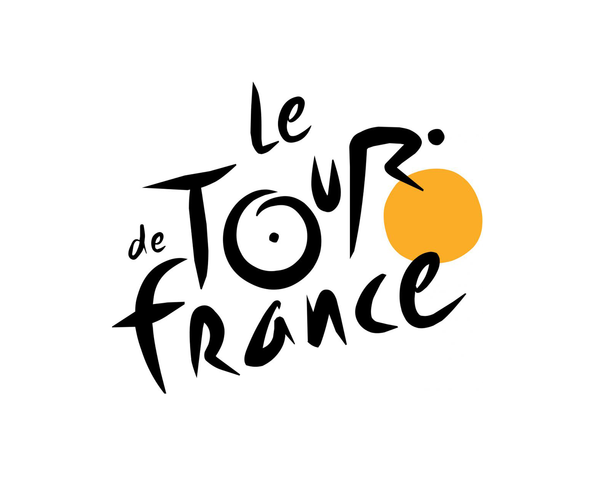
Tour De France
Tour de France’s logo was designed by French man Joel Guenounin 2002 and has remained unchanged ever since. Just to put that into context, that was so long ago that Nickelback’s ‘How you Remind me’ (don’t click this) was number one in the Irish charts. This logo’s longevity may lie in how it playfully captured of the essence of the 115 year old competition. Within the dynamic brush typography, a curious observer is rewarded by the sight of a person on a bicycle in the distinctive race position. The use of the yellow is also, of course, a nod to the jersey worn by the leader of the pack.
Lorna Mc Weeney | Packaging Designer
Lorna is a Packaging Designer with Neworld, a brand agency with over 30 years experience. We immerse ourselves in your industry, your customers, your competitors and your business goals to create design solutions that will guarantee to boost your bottom line.
Keep Reading
Draft, Bottle or Can?
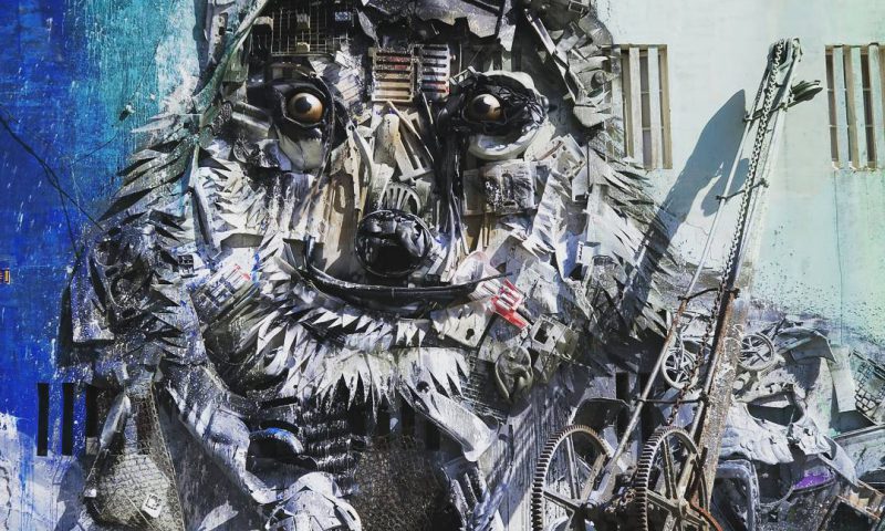
Recycling Through Street Art

The Secret to Happiness
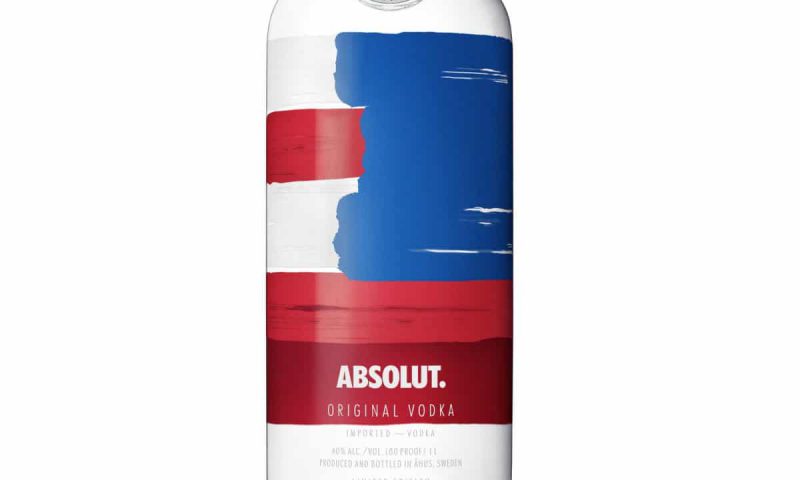
Absolut Perfect Packaging Design
Why B2B brands need to get emotional

3 weird things you never knew about your website’s...
10 Top Tips for a Bonza Barbeque Bonanza!
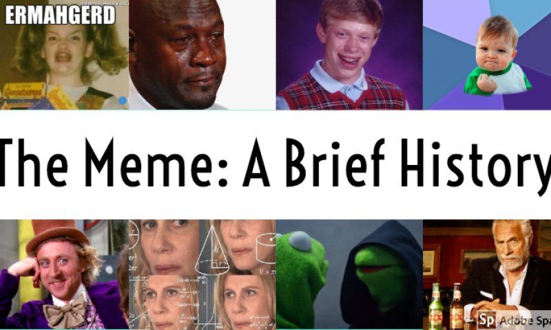
The Meme: A Brief History
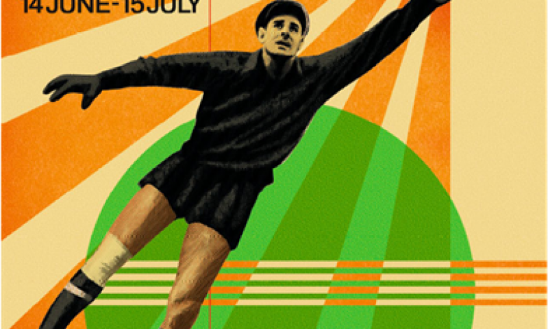
FIFA World Cup – Serious about design
Interview Questions and Answers
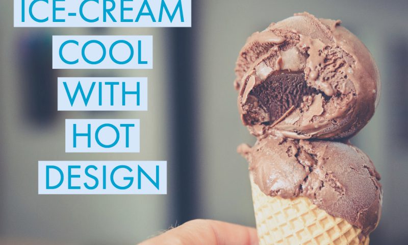
Staying Ice-Cream Cool with Hot Design
Plan your future now – don’t wait until it’s too late
What can hotels learn from cruise ships?
A Tale of Three Lions – Retro Rebranding
Did you ever wonder? Origins of well-known phrases
Where does your Dublin take you…
Lost your Creative Mojo?
Packaging Gold
Five bespoke typefaces we want to get our hands on!