A Tale of Three Lions – Retro Rebranding
With the World Cup over for another four years, France has updated their badge with their second World Cup star. During the World Cup, 1966 nostalgia was fervent in the UK and England fans were hoping their three lions would be the ones to add the additional star but ‘malheureusement’ it went home to their French rivals. However, ‘Les Bleus’ are not the only boys in blue to have added to their badge in recent years.
Waterford United filed for bankruptcy in 2016 following a decade of poor results and low attendances, it was time for a rebrand. With a new chairman, Waterford was back and with a new identity.
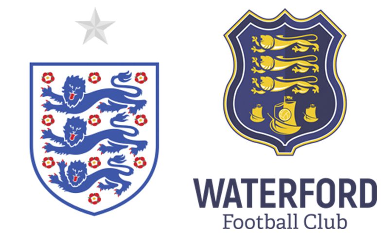
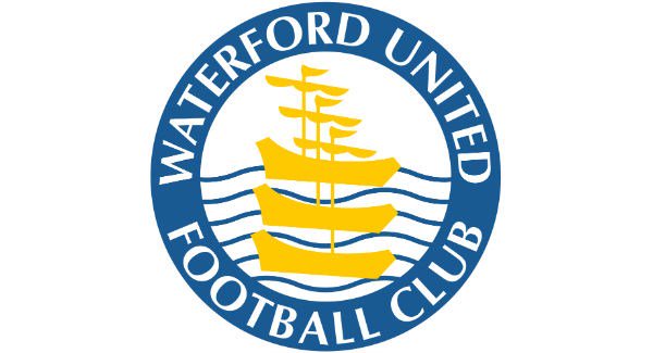
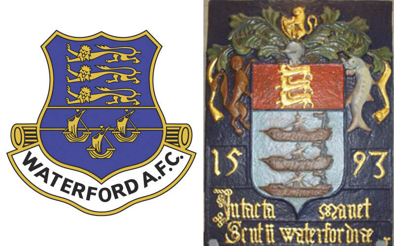
In 2017 Waterford FC’s rebrand received a mixed reaction – ‘Blues’ fans were familiar with the old Waterford United badge with Three Ships, a well-known symbol of Waterford’s maritime heritage. The three ships were still present, but in addition, there were three very dominant lions above. Shock, horror, it seemed to resemble the England football team’s badge. Were the Blues West-British?!! Was this just another clichéd crest with three lions just thrown in to imitate the England team? The answer was no, the re-brand was really retro branding, a nostalgic return to its original identity – an identity that represented a more successful period.
The club’s original 1930 badge was the Waterford City crest that included three heraldic lions. The city’s crest goes back a lot further. Founded by Vikings in 914, its coat of arms was first used in 1394 as a preface to Richard II’s charter. In the 1500s the lions passant, symbolising strength, courage and nobility and its motto “Urbs Intacta Manet Waterfordia ”(Waterford remains the untaken city) were added. The lions were part of the city’s coat of arms until the 1950s.
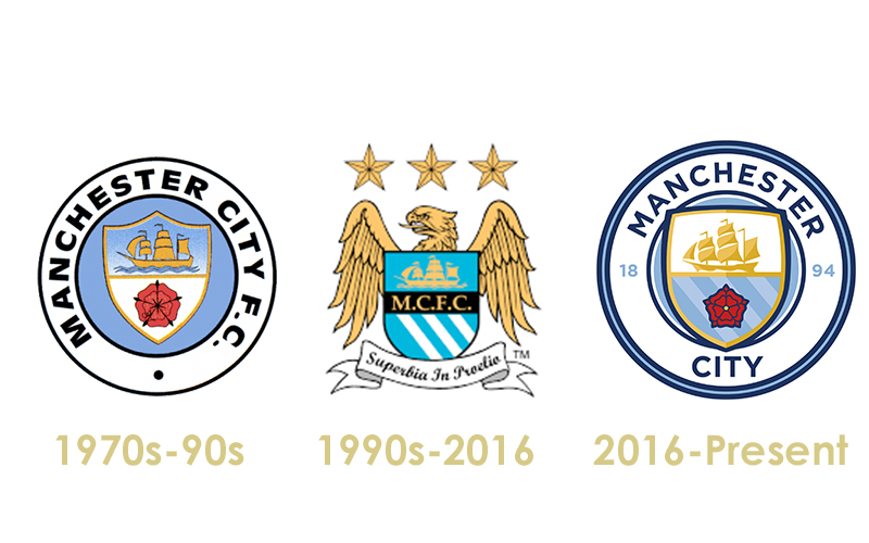
Retro branding has can be found everywhere from sport to alcohol – think of how Manchester City and Smithwicks have retro branded in recent years. As with Waterford FC, retro (re)branding can re-invigorate a brand by not reinventing the brand but revisiting the brand’s heritage and rejuvenating its history by retelling the brand story with nostalgic charm.

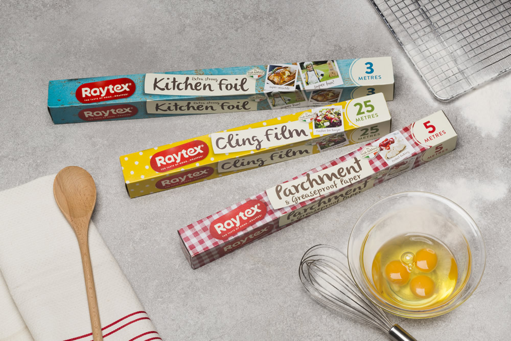
A retro rebrand I was involved with at Neworld was Raytex.
Fiona O’Farrell, Packaging Designer
Fiona joined Neworld as a packaging designer in 2016. Her agency brand and packaging experience includes work for Kerry Foods, Boyne-Valley, Deep River Rock, Fruice, The Dalata Hotel Group, Dunnes Stores and Aldi.
Keep Reading
Why B2B brands need to get emotional

3 weird things you never knew about your website’s...
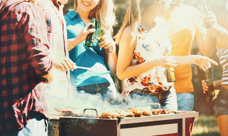
10 Top Tips for a Bonza Barbeque Bonanza!
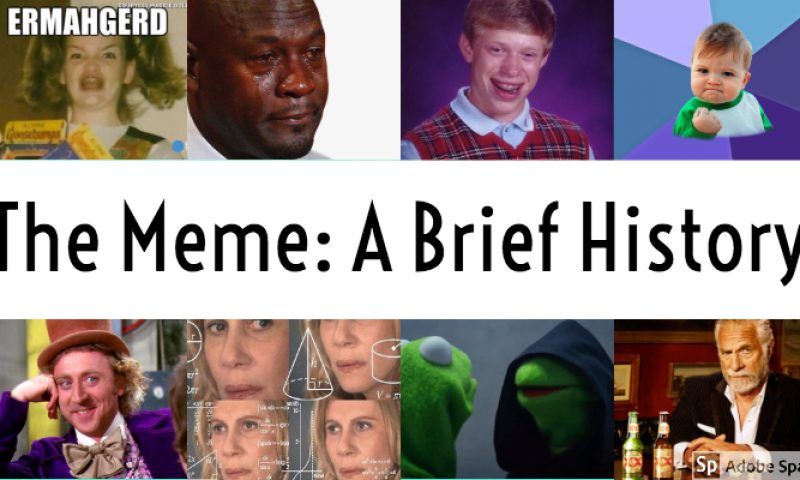
The Meme: A Brief History
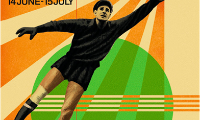
FIFA World Cup – Serious about design
Interview Questions and Answers
Crouching cyclist, hidden bear: The best hidden messages in...
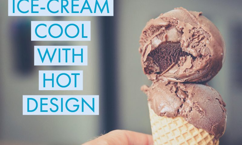
Staying Ice-Cream Cool with Hot Design
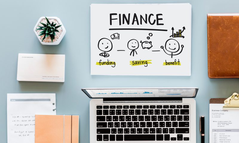
Plan your future now – don’t wait until it’s too late
What can hotels learn from cruise ships?
Did you ever wonder? Origins of well-known phrases
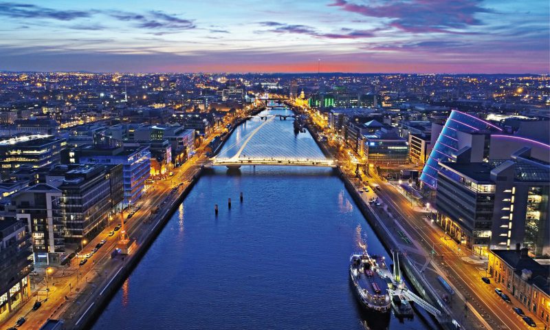
Where does your Dublin take you…
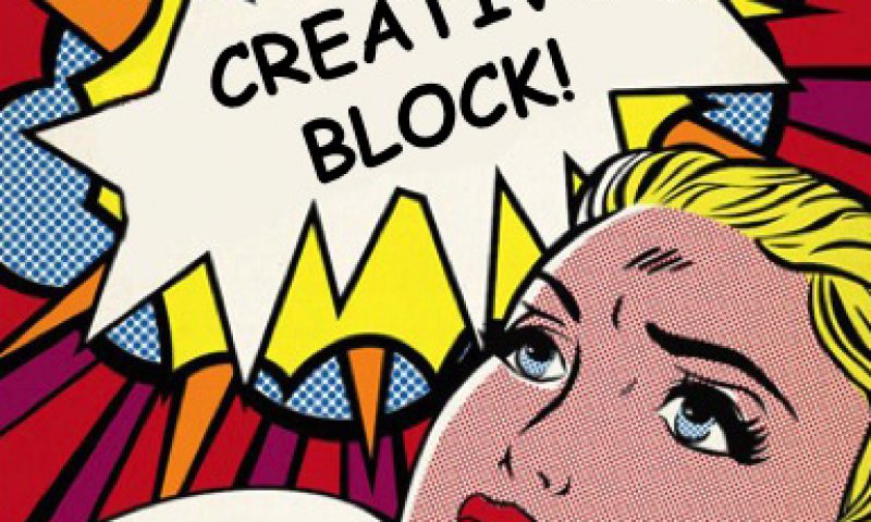
Lost your Creative Mojo?
Packaging Gold
Five bespoke typefaces we want to get our hands on!
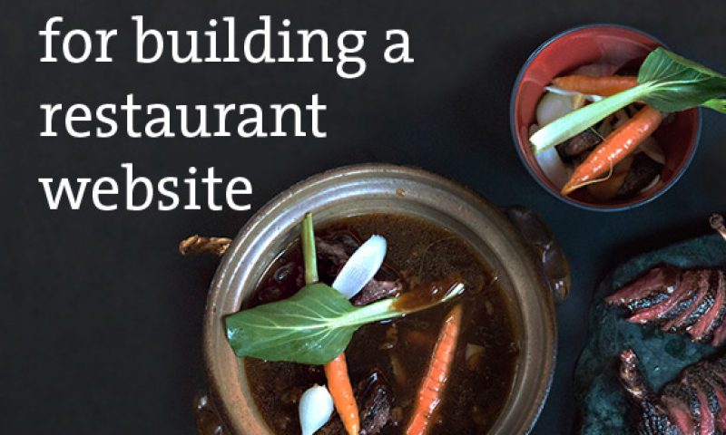
7 key tips for building a restaurant website
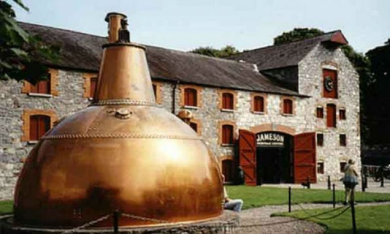
The Case of Midleton Whiskey
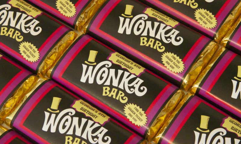
The Top 6 Greatest Fictional Brands
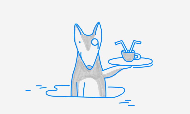
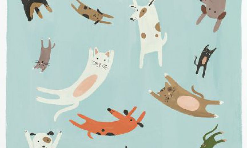
Design that’s set tails wagging