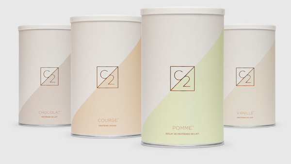
Using Pastels for Packaging Impact
Today on shelf, it is easy to find packaging using a variety of different colours, substrates and finishes.
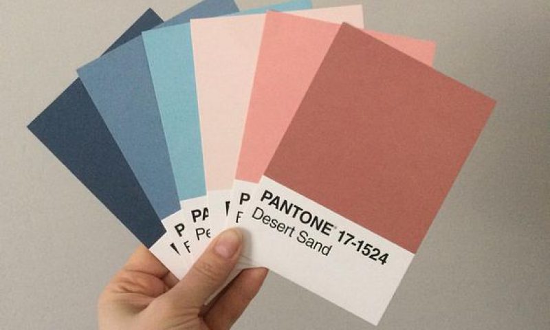
Of these, colour use is normally confined to using the full-colour process palette. This includes Cyan, Yellow, Magenta and Black along with the use of Pantone colours. However, one of the more underrated uses of colour on packaging is the use of Pastels.
Over the years, Pastel colours have been pigeonholed by an almost exclusive use within specific categories. These categories are typically the cosmetic and baby food sectors. This is probably understandable, based on the aim of each of these areas in terms of their market demographic. As a result, Pastels have become industry standard in specific categories almost by default. In turn, their use has become almost innocuous or overlooked in other categories.
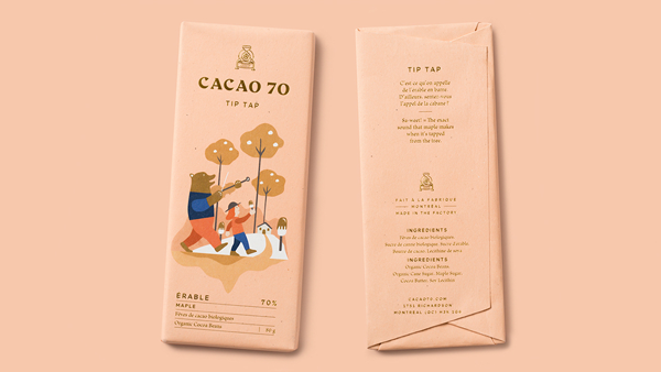
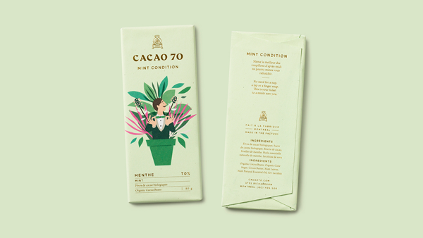
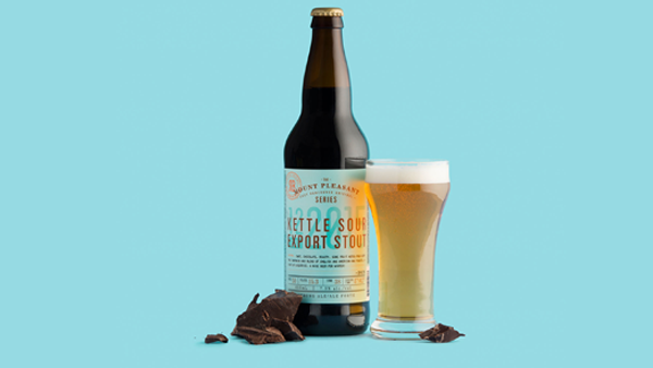
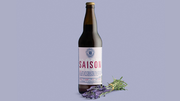
However, there is an ever growing Pastel range to choose from. Therefore, it’s worthwhile to see how beneficial Pastel use can be, outside of its apparently pre-destined category limitations. Breaking this form of colour inertia, there are great examples of Pastel colours on packaging in other market sectors. They appear particularly well with foiling and offer and subtle class to a pack’s overall appearance. A simple consideration at the design and print stage could eventually result in giving your pack some fantastic shelf appeal and its own unique pack standout.
Sean Deignan, Senior Production Artist
Sean is a Senior Production Artist at Neworld. He is responsible for the handling of major brand name projects from brief to final production, and for taking design concepts and working them to fully finished packaging and literature ready for print. He has worked with a variety of brands including Barry’s Tea, Glenisk, Arrabawn, The Jelly Bean Factory and Irish Pride.
Keep Reading

Social Media Predictions 2012
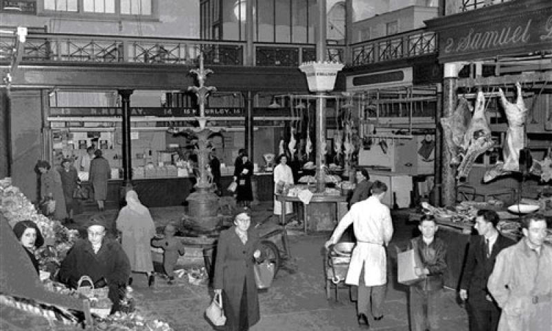
Packaging in Ireland’s Oldest Market

Creative People Are Complex – 10 Contradictory Traits...
Designer OCD

Ireland’s mobile internet habit
Is Craftsmanship Dead?
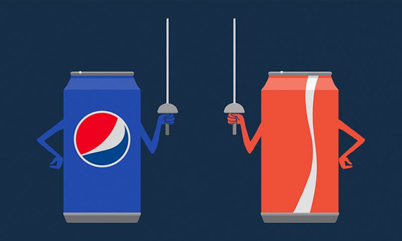
Pepsi vs. Cola: The Marketing Battle of the Century
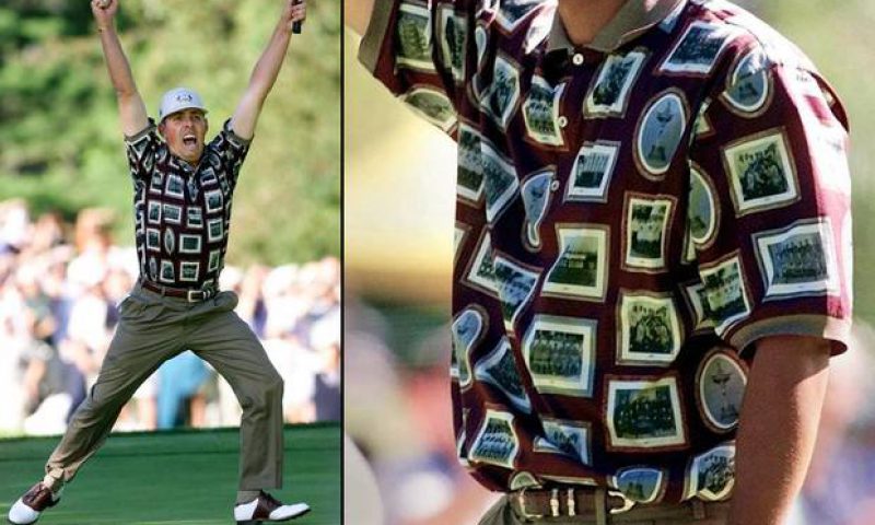
The Ryder Cup – team branding gives them the edge
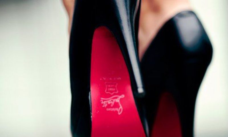
Why Do I Have A Passion for Shoes
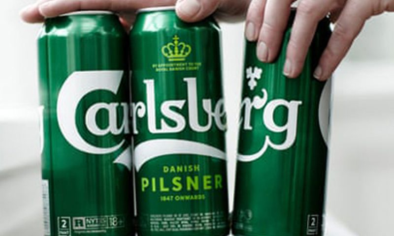
World first for the beer industry: Carlsberg sticks it to...

Personal Money Saving Tips
It takes a village (the right team) to build a brand
Packaging Design – Not just for profit

Let’s Get Mischievous
The Importance of Keeping Your Brand Fresh
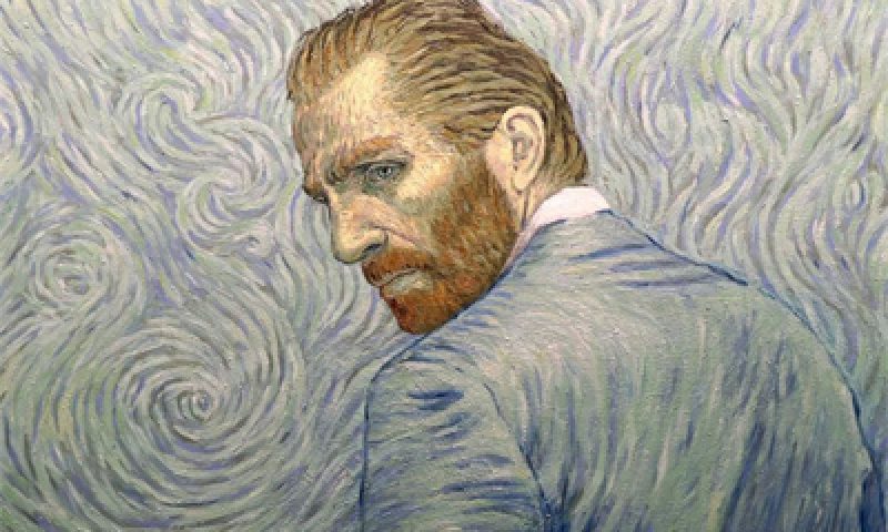
Loving Vincent

Happy World Tourism Day!

Curves, Swirls and Virgins – the world of media...
When a Slogan Fits, It Sits