The Ryder Cup – team branding gives them the edge
First played in 1927 and named after English seed merchant Samuel Ryder, the Ryder Cup, organized jointly by Ryder Cup Europe and PGA, is a biennial golf tournament that pits twelve-player teams of Europe and the United States against each other. The venue for the Ryder Cup alternates between European and American cities with the last having been played at Hazeltine National Golf Club in 2016 and the upcoming one at Le Golf National in Magny-les-Hameaux in two weeks time. Okay, so that’s the History lesson.
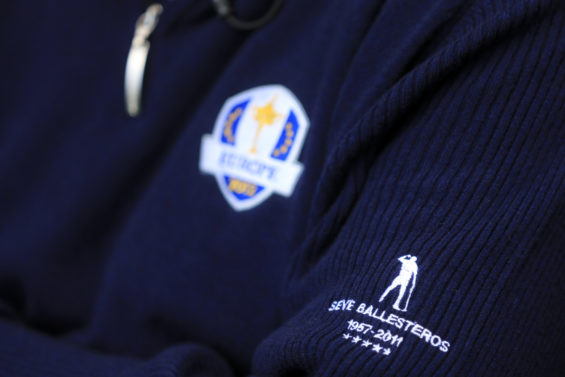
Back in 2011, the Ryder Cup announced a new logo designed by Interbrand.
“The brand research process was a strategy that reinforced the Ryder Cup’s relevancy for the future. The Ryder Cup is a competition that has longevity, and the consensus of all within the project was that its brand must be powerful to withstand any challenge. The power of the shield is a mark that has a contemporary feel to it. It is fundamentally sound and works well in applications from merchandising to the Internet, and yet remains self-contained.”
— Press Release in 2011
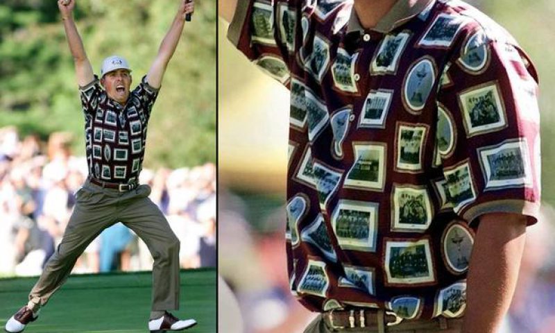
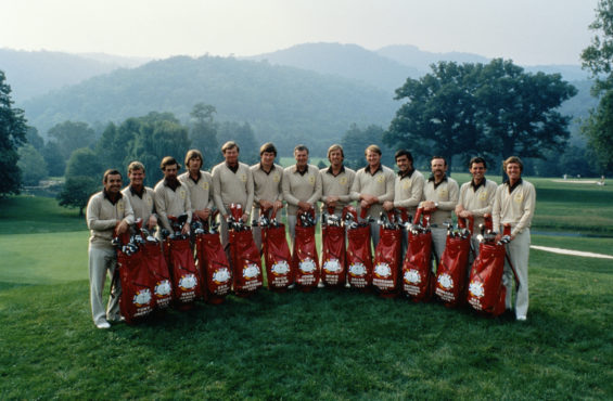
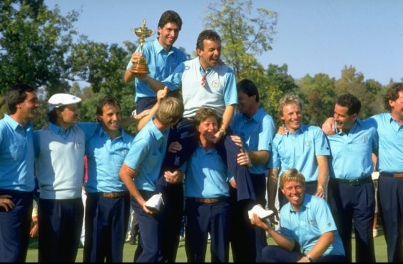
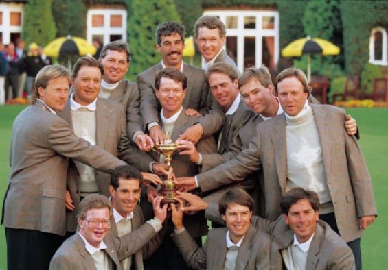
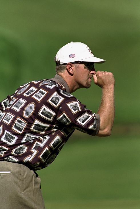
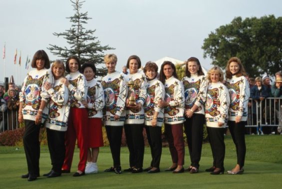
Money well spent by all accounts. Previously the brand mark was badly designed to say the least and every two years the host would add their own bit of flair to the logo. It was not only the logo which got the brand treatment each year, team outfits also featured and when the first European team was introduced in 1979 they sported a lovely beige v-neck number. Beige was featured in many other years on both the teams and in the player’s wives’ outfits. But it was the 1991 Ryder Cup match that the exuberance and the fashion, being used as a brand statement, reached new heights. So much so that it became known as the “war on the shore”. Polo shirts with images of past victories, baseball caps with army camouflage, and of course the stars and stripes featured strongly. Since then more and more thought has been given to the team outfits, every little psychological advantage been taken.
Beige, nice!
In 2014 when he was the Ryder Cup captain, I saw Paul McGinley talk at the Websummit in Dublin. Paul wanted to gain every advantage he could so he commissioned a series of large scale photoshop montages to cover the team talk rooms. Each montage had a significant story of a match that had turned on a small detail. This is what he wanted to instill in his players who went on to win that year.
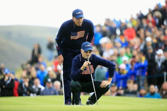
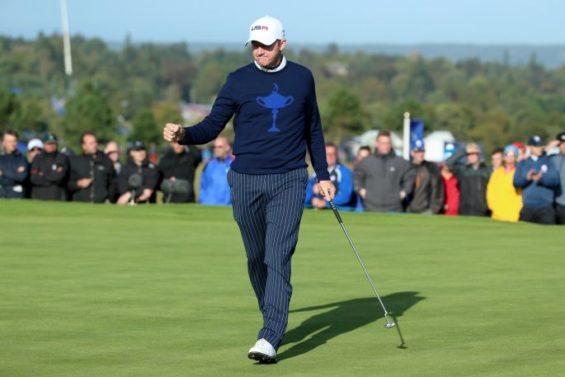
The Ryder Cup is a brand and merchandising dream with millions spent by fans to have that piece of paraphernalia with the Ryder Cup logo on it. In the next two weeks the team outfits will also gain lots of media coverage, lets hope they can improve from some of the past faux pas below!
US team getting in on the beige act
Not sure what to say about these shirts
Rory was a poor time keeper in 2014
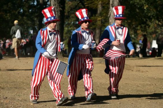
The fans getting in on the act
Lets make sure they know what team we are…
…and what we want to win
A proud moment I’m sure when they look back
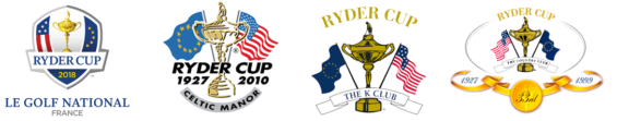
Some of the logos over the years
Gary Gleeson, Partner
Gary is a Partner at Neworld, a brand & creative design agency with over 30 years experience developing brands to position them for future growth. Gary has worked with some of Ireland’s biggest brands such as Diageo, John Rocha and O2 and is a recognised expert in hospitality branding, working with Fade St Social, Powerscourt Hotel, Mount Juliet and Adare Manor to name but a few. His belief in branding and its relationship with design effectiveness has seen him guide a myriad of companies through the branding maze. He realises client visions using this synergy of strategic branding and design. He is also the self-professed champion of chilli-making!
Keep Reading
A Creative Journey: Evolution of a Painting
Using the right colour in the right way
How to build your brand’s image through merchandise
Social Media Predictions 2012
Packaging in Ireland’s Oldest Market
Creative People Are Complex – 10 Contradictory Traits...
Designer OCD
Ireland’s mobile internet habit
Is Craftsmanship Dead?
Pepsi vs. Cola: The Marketing Battle of the Century
Why Do I Have A Passion for Shoes
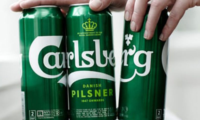
World first for the beer industry: Carlsberg sticks it to...
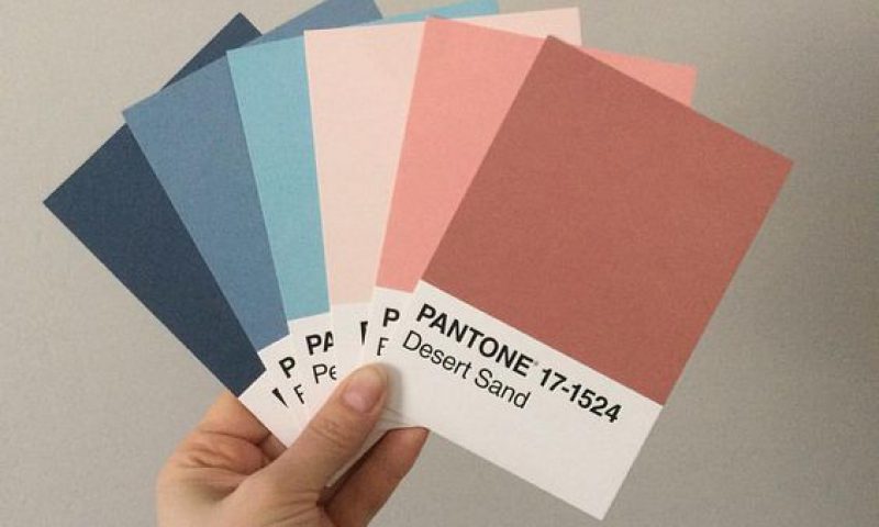
Using Pastels for Packaging Impact
Personal Money Saving Tips
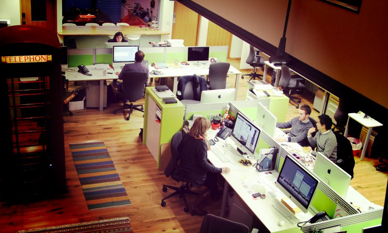
It takes a village (the right team) to build a brand
Packaging Design – Not just for profit
Let’s Get Mischievous
The Importance of Keeping Your Brand Fresh
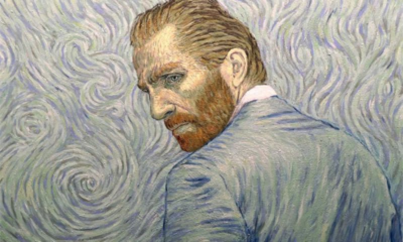
Loving Vincent