A rebrand that didn’t beat the clock
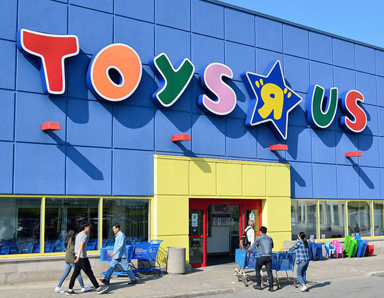
Toys “R” Us was an international toy company founded in April 1948 and went into bankruptcy in 2018. Before its demise, the design studio Lippincott was brought on board to refresh the identity in the hope of bringing it back to life and help it compete against the growing competition.
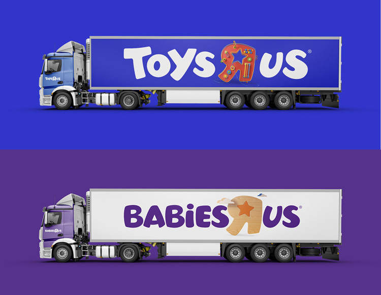
The project encompassed a new look that aimed to unify Toys R Us and sub-brand Babies “R” Us but unfortunately the branding never saw the light of day.
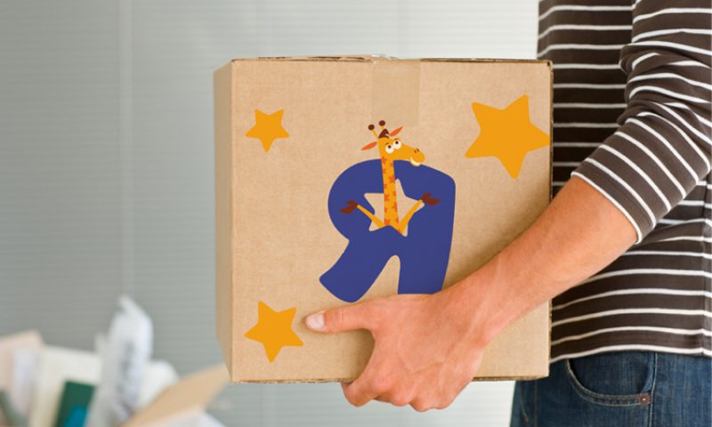
Lippincott kept the mascot Geoffrey the Giraffe, incorporating him into the redrawn R-shape and using him alongside a zoo load of other animals. A fresh colour palette of green, blue, orange, yellow, pink and purple was used for Toys “R” Us, while Babies “R” Us was given a more subdued purple, pink and blue palette.
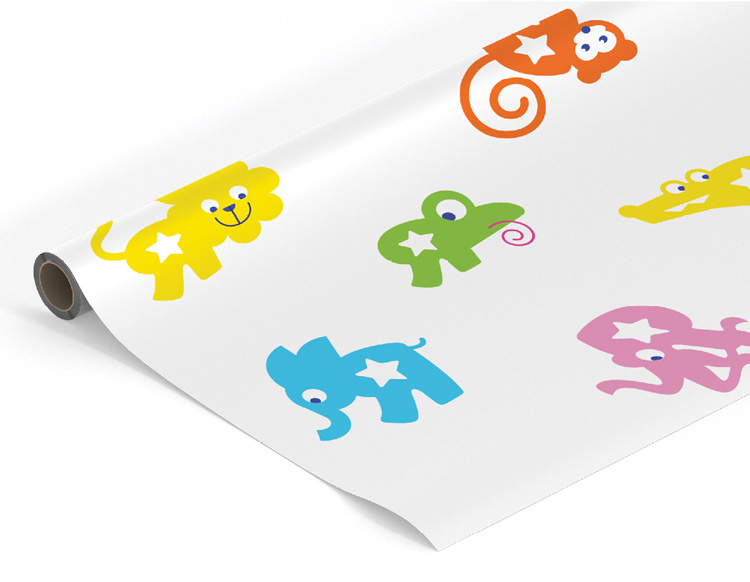
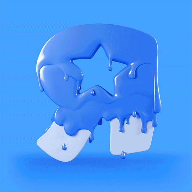
The new brand focused on the well-known backwards R letterform that features strongly in the brand name. Rather than getting rid of the R, it was turned into a series of animals, shapes and animations personifying the idea of play.
Unfortunately, time was ticking for Toys “R” Us and it went bang before the new brand was introduced. There is talk of a rebirth for the company, so hopefully this rebrand will see the light of day in the end!
More information on this rebrand can be found on Designweek »
Trish Brady, UI Designer
Trish looks after digital design here in Neworld, bringing a wealth of experience and insight to every project.
Keep Reading

New WordPress on the Block
What does Christmas Down Under taste like?

Branding from the Inside Out – the power of employee...
Christmas Cards from the Edge
Smart Speaker, Smart Branding
Why I will choose your competitor over you
Is Your Takeaway Coffee Worth It?
All in a Name
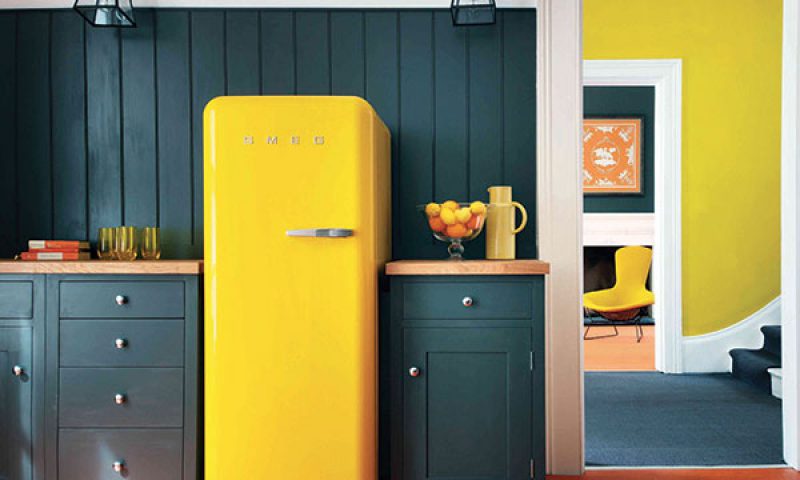
SMEG – Technology with Style
The January Effect
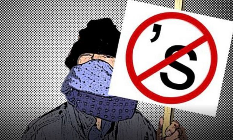
Grammar Vigilante
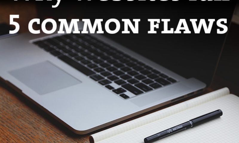
Why websites fail
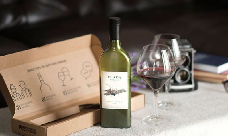
The Flat Wine Bottle
How are you ‘Brandishing’ your Logo?
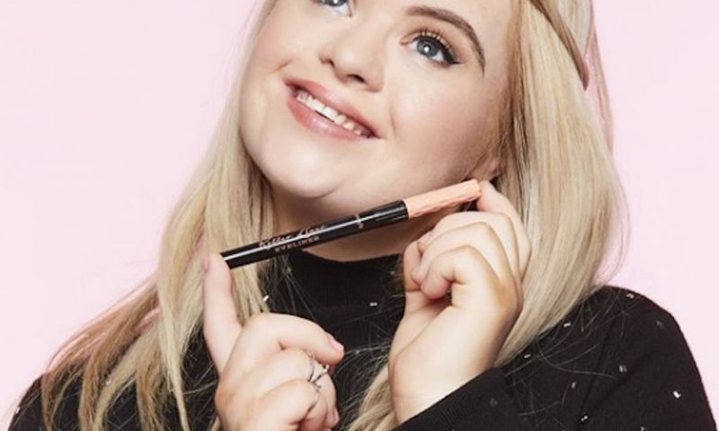
Inclusive Branding
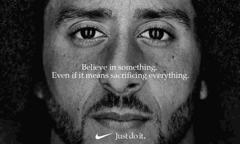
Brand activism: is it worth it?
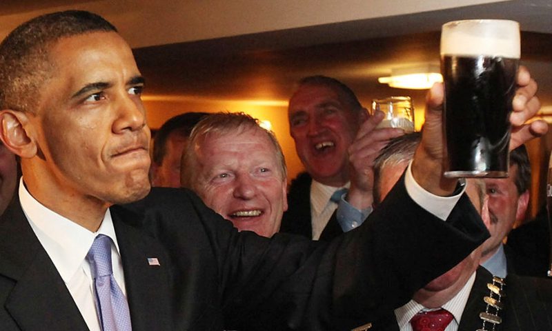
A pub with no beer?
Packaging – Seeing it from all sides
Egg-cellent Brand Activation