Cycling jersey branding – from dashing to dire
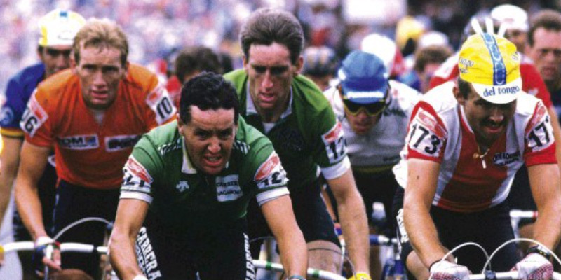
It’s yet another summer of sport and as we reach the start of July it means it will soon be time for another Tour de France. I know for most it’s of little interest but I’ve been a fan of professional cycling since the the 1980s when Irish cyclists Roche and Kelly were in their pomp, despite the longstanding doping issues that have blighted the sport since then.
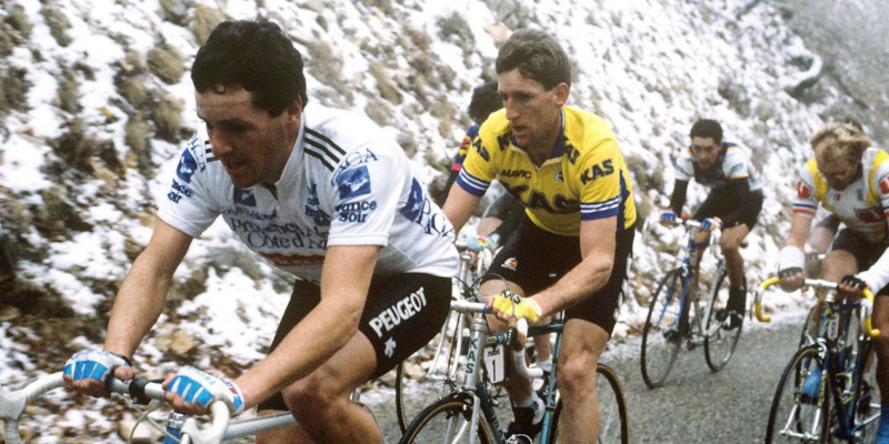
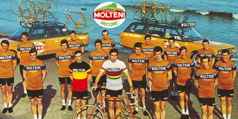
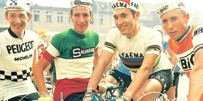
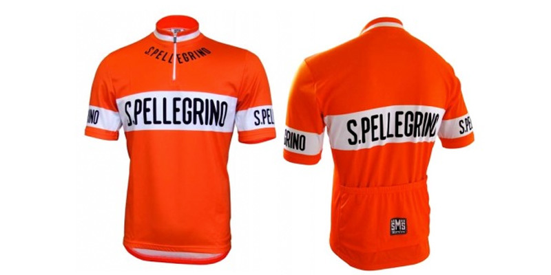
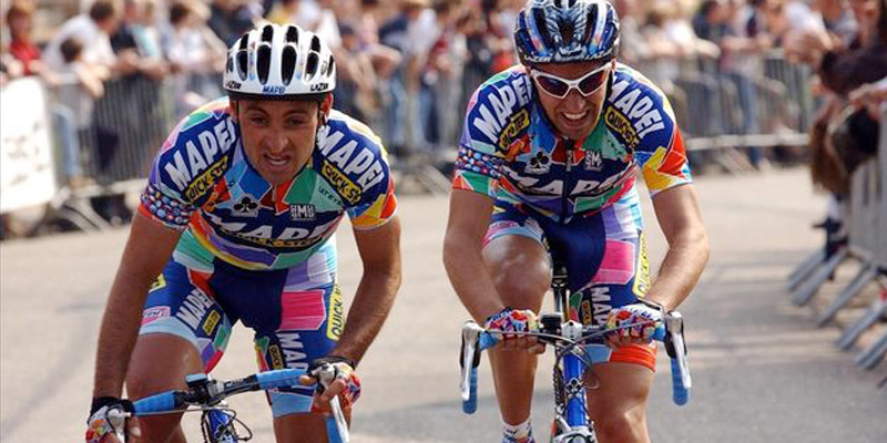
My abiding memory of pro cycling in the 80s apart from the drama of the races themselves were the jerseys the competitors wore and brands they promoted – often brands I would never otherwise have heard of. Then as now each team had one or more title sponsors who pay for their logos to appear on team kits. I still remember PDM (a Philips and Dupont joint venture that made cassette tapes), Festina (a Spanish watch manufacturer) and Carrera (an Italian Jeans company now part of Diesel) just because they were the sponsors of Irish cyclists’ teams. You could buy PDM cassette tapes and Festina watches in Ireland but I don’t think that Carrera Jeans ever made a big splash over here. Other brands sounded exotic and mysterious but little did I know that Mapei produced floor adhesives and chemical products, that Molteni were Italian salami manufacturers and Kas were Spanish soft drink manufacturers. But it does go to show the longstanding effectiveness of sport sponsorship, as the logos and brand names splashed across multiple modern sporting jerseys attest.
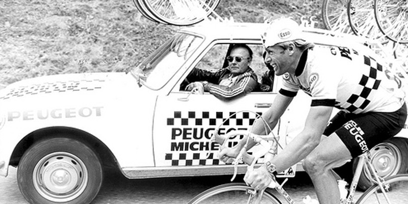
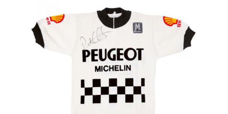
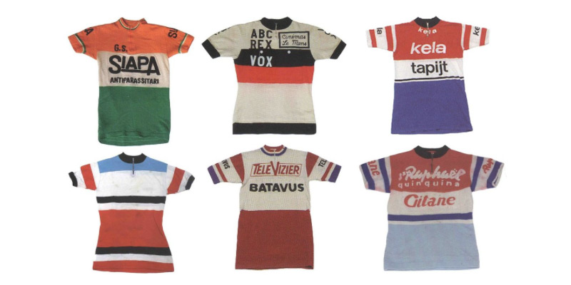
During the early 20th century cycling jerseys were simple affairs featuring just a stripe or club name. In later years cycling teams were sponsored by bicycle manufacturers and related companies eager to showcase their wares by having the best riders using their products. Once such was Peugeot, a bicycle manufacturer since 1882 (as well as a car manufacturer) which by 1901 was sponsoring it’s own team. The kit in various guises over the years featured an iconic black checker board pattern on a white jersey.
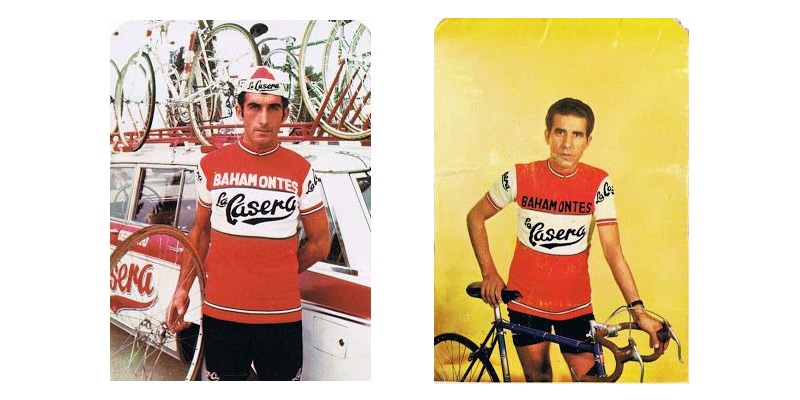
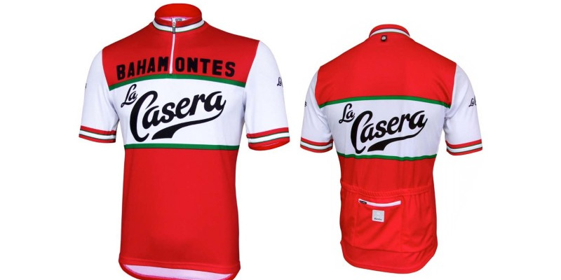
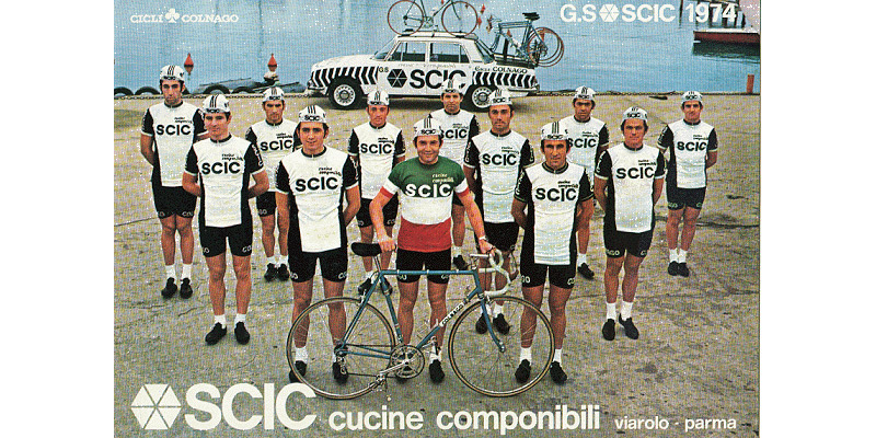
It wasn’t until the 1950s that other commercial concerns got involved due to a downturn in the fortunes of bike companies after a post war boom. The practical limitations of wool fabrics and the need to embroider logos resulted in the continuation of minimal clean and simple designs. For many this was the classic era of team branding with an Italian design aesthetic influencing the peloton. Reproductions of many jerseys from this era are still being manufactured and sold today.
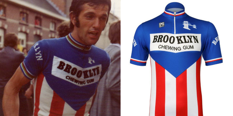
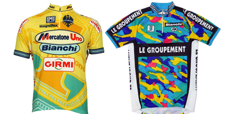
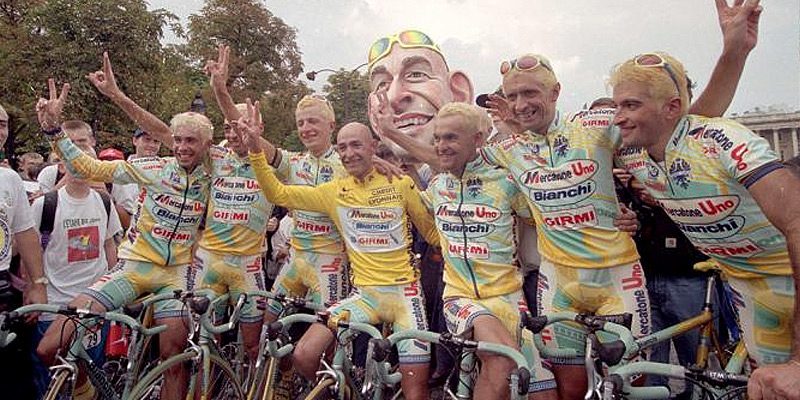
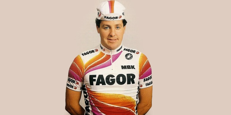
In the 1970s and 80s as the sport became more commercial bigger multinational brands got involved as title sponsors. They not only got to put their logos onto the jerseys but dictated the whole team identities from name, to colour palettes and everything in between. As polyester fabric also began to be introduced and modern printing processes replaced embroidery and flocking, practical limitations were reduced, and like an intern finding out how to use transitions in PowerPoint, it ushered in an era of horrendously garish jerseys which lasted well into the 90s. Commercial realities also meant that small teams needed multiple sponsors and so their jerseys ended up logos squeezed in all over them.
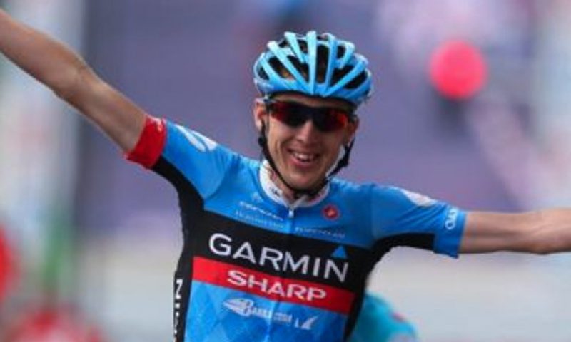
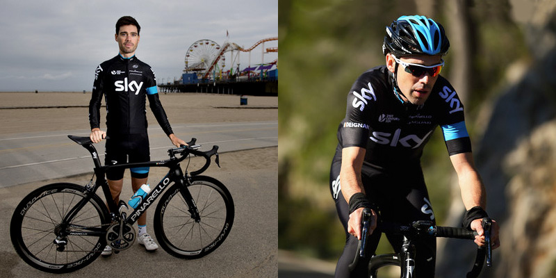
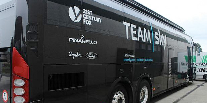
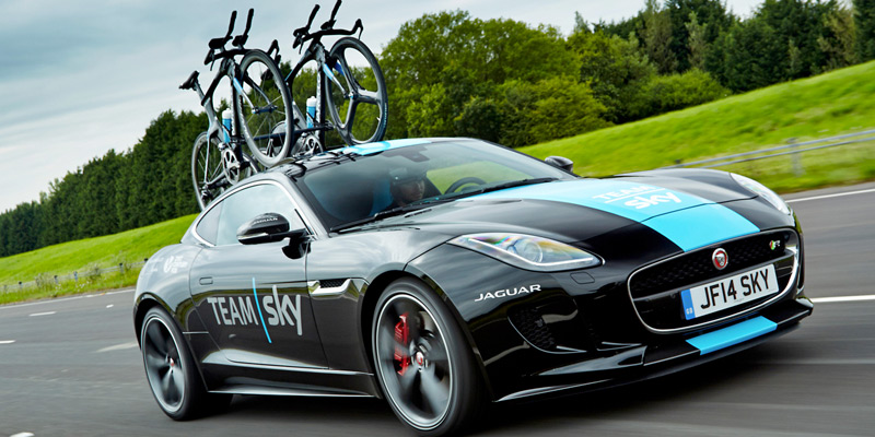
Sky Cycling is the team that many fans love to hate but you have to acknowledge that their professional approach extends to their branding. They have worked with kit suppliers Adidas, Rapha and more recently Castelli, but there’s obviously a branding company in the background ensuring their team cars, buses, uniforms, website, etc, are all consistently designed and branded.
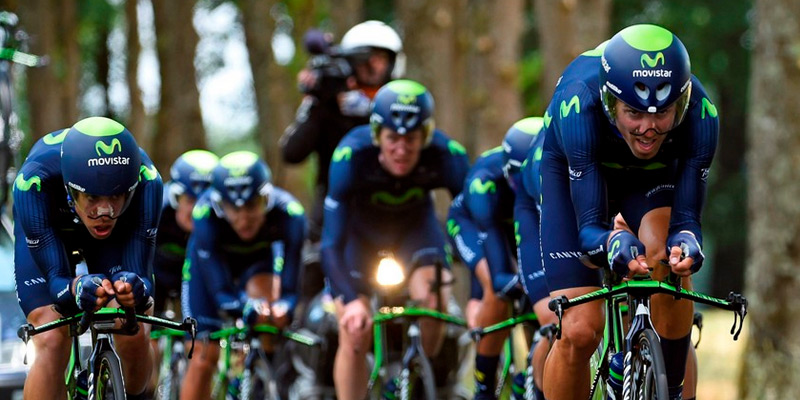
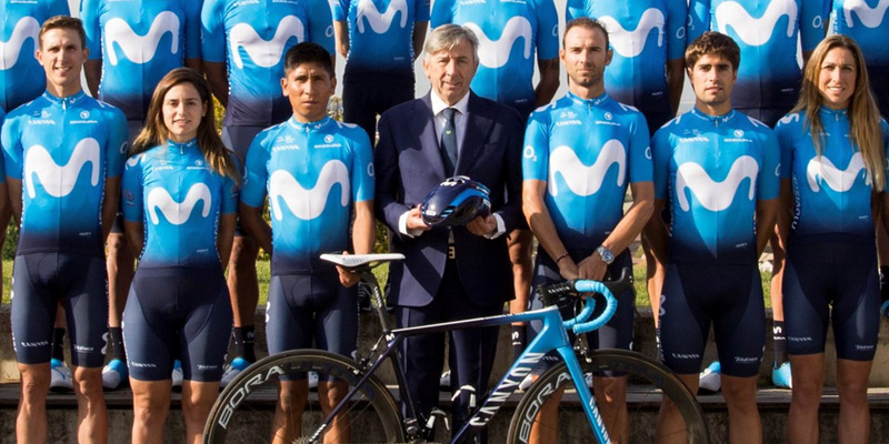
The same goes for the Movistar Team. Having a well funded title sponsor means that there aren’t multiple sub sponsors diluting the single brand impact. The classic purple kit of the last few years has been replaced with a blue Endura revamp this year. Interestingly the new kit includes small O2 logos on the sleeves to extend the effectiveness of the sponsor Telefonica’s investment beyond the hispanic countries where Movistar operates, to other geographic locations where O2 is better known.
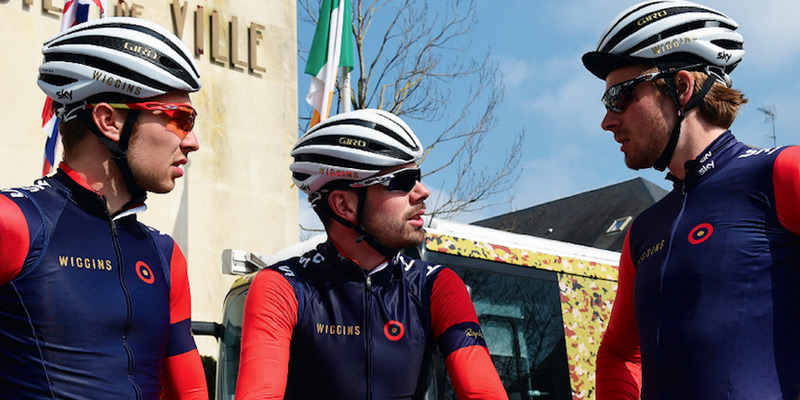
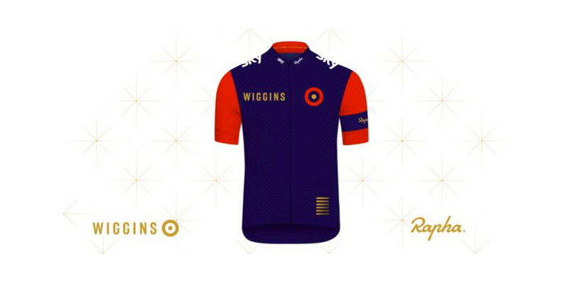
When Bradley Wiggins launched a development cycling team in 2015, his own mod era fashion aesthetic influenced the Rapha designed jerseys. It’s since been redesigned by kit supplier Le Col and has lost the integrity and focus of the original.
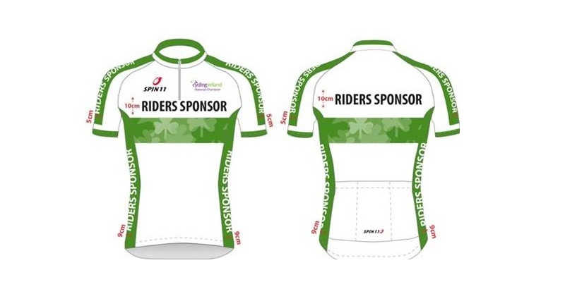
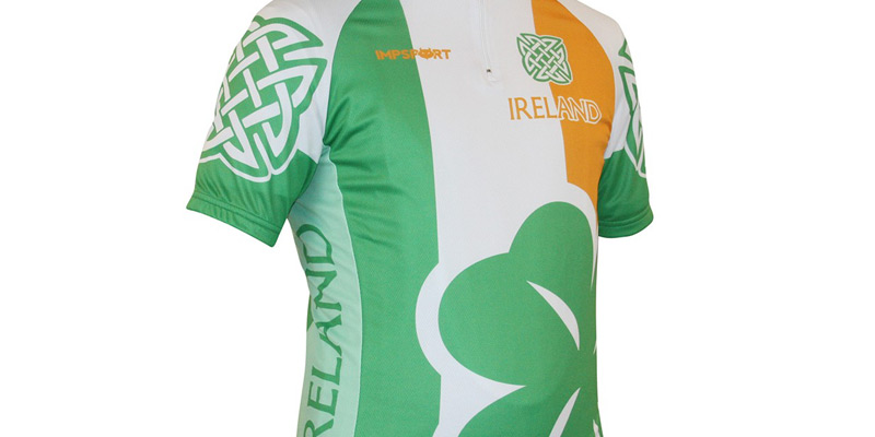
One set of jerseys that are usually more restrained are the national country jerseys used at the Olympics, World Championships and other similar events. Many country kits are sleek and well designed and they positively reflect their country’s elite sporting prowess on the world stage. But many others are not. The current official Irish team kit designed by Spin11.com, the national federation’s long-time clothing partner isn’t too bad but they couldn’t resist going down the shamrock route for the national champions jersey. There are unofficial commercial kits on sale that go to the extreme not so subtly marrying cliché and vulgarity with some added celtic symbology for good measure.
So if you do catch any of the Tour de France on your TV screens over the coming weeks, look beyond the riders, the scenery, and the iconic yellow, polkadot, green and white jerseys and keep an eye out for the team kit designs appearing in the peloton.
David Jordan – Digital Director
David set up the dedicated digital division of Neworld in 1999 and oversees the strategic approach, creative design and technical development of digital projects from websites to moving graphics and on-screen presentations. When not pushing pixels or travelling to other continents, he is likely to be tinkering with computers or watching a cycling race.
Keep Reading
Ireland’s Digital and Social Media Statistics 2018
Jamie Oliver goes snap, crackle and pop at Cereal
13 Tips for Overcoming Procrastination
What’s In a Name?
Ice Cool Seduction
Brand Ireland born in Rathmines

The importance of the face of your business…
During Pride, only rainbows matter
The differences between UX & UI
That Big Gay Flag
Draft, Bottle or Can?
Recycling Through Street Art

The Secret to Happiness
Absolut Perfect Packaging Design
Why B2B brands need to get emotional

3 weird things you never knew about your website’s...

10 Top Tips for a Bonza Barbeque Bonanza!

The Meme: A Brief History
FIFA World Cup – Serious about design