A Love Supreme
Last Monday, 13th of August, the inhabitants of New York City awoke to a brand phenomenon
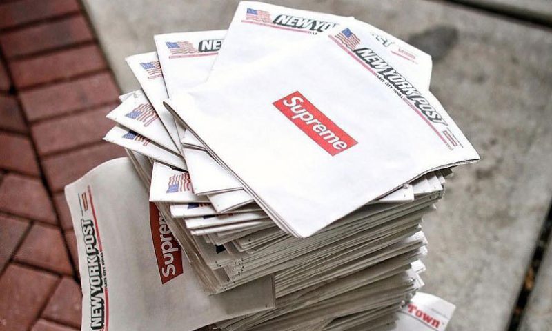
Their local newspaper, the New York Post, was on sale as usual but did not look as usual. Its iconic front cover was completely clear of sensationalist headlines and photos, featuring two things only: the Masthead and in the centre, a little red box containing one word – Supreme. In an era of struggling printed daily newspaper sales, the edition was sold out in most newsstands by mid-day, later being sold online for multiple times its $1.50 price or being resold as bulk purchases. The promotion was tantamount to brand frenzy and reflected the opinion of one social commentator saying ‘slap a Supreme logo on it, it’ll fly off the shelves, whatever it is’.
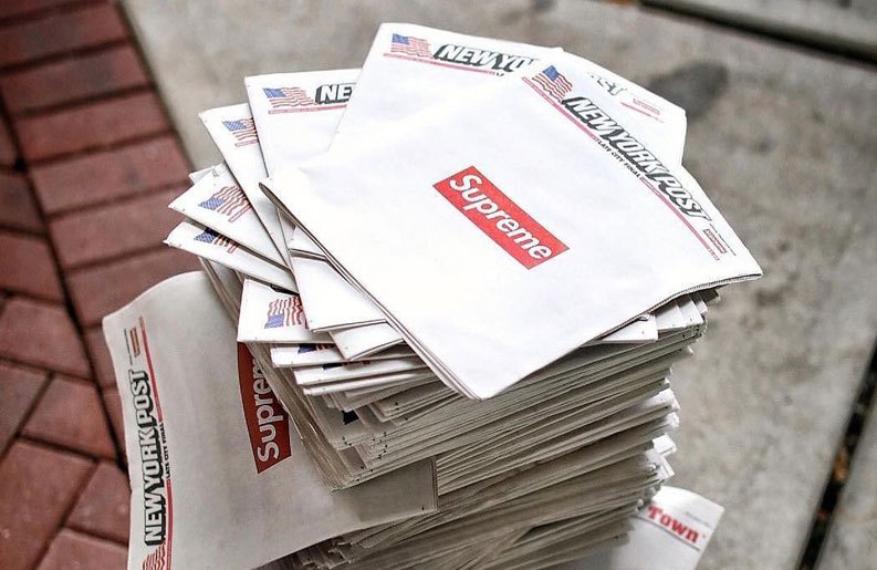
Collaborations are normal fare with the fashion brand. Link ups including the likes of eminent brands Louis Vuitton and Comme des Garçons. But not necessarily with a conservative, Trump leaning, Rupert Murdoch owned publication. With a reach of over 400,000+ daily readers and coupled with a follow up digital campaign, an albeit unlikely collaboration was enormously effective, both in the printed and digital world.
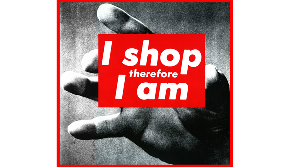
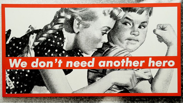
The work of Barbara Kruger
Developed by James Jebbia on an ideology of where high concept fashion-meets-art-meets-skater style, Supremes is not exactly the most straightforward, simplest concept. So, since it’s inception in 1994, the inherent simplicity of the Supreme brand mark has had a major bearing on making it one of the worlds most recognisable brands. The brandmark was influenced implicitly (to the point of litigation) by the work of conceptual artist, collagist and feminist Barbara Kruger. Her work features bold red and white colour palettes and statements and predominantly using the fonts Futura and Helvetica. In turn, Kruger was influenced by ‘Creative Revolution’ advertising from the 1960s. Using topics such as consumerism and feminism, Kruger’s art is to question and decontextualise – the same concept is utilised in a fashion perspective by Supreme today.
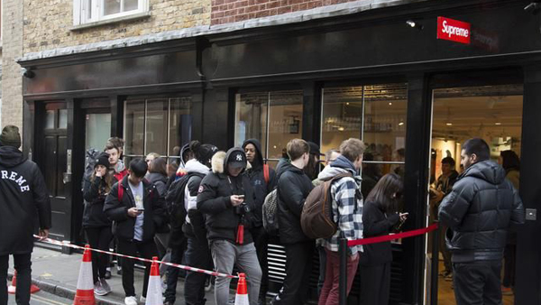
Queues outside the London store
Recently in London, I noticed how apparent its brand desirability has become. Strategically positioned on an innocuous street in Soho, the Supreme store had a steady queue of Off-White wearing 20 something’s outside (each person had to ‘sign-up’ before even making the line). Waiting patiently, the line is eventually allowed shuffle past high profile security doormen to go in-store and purchase literally bagfuls of very expensive street wear. It’s all brilliantly executed and reeks of a contemporary exclusivity, which of course is both the brand’s and its disciple’s raison d’être.
Supremes real success is in appearing vital and remaining so in a very fickle business sector – it has the strength and the execution of its brandmark over a period of time to thank for that.
And if anyone from Supreme is reading, I’m a 32″ waist, 34″ leg, you know yourself.
Sean Deignan, Senior Production Artist
Sean is a Senior Production Artist at Neworld. He is responsible for the handling of major brand name projects from brief to final production, and for taking design concepts and working them to fully finished packaging and literature ready for print. He has worked with a variety of brands including Barry’s Tea, Glenisk, Arrabawn, The Jelly Bean Factory and Irish Pride.
Keep Reading
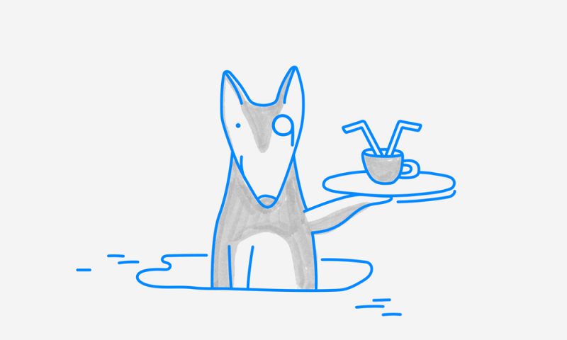
Design that’s set tails wagging
We’re hiring!
Client Question: What makes a brilliant packaging design...
Four unexpected consequences of GDPR
5 common mistakes we see brands make
Client Question: How do you assess category cues and how...
Hoteliers – the right brand partners with the right...

The Interview Questions – continued from last month
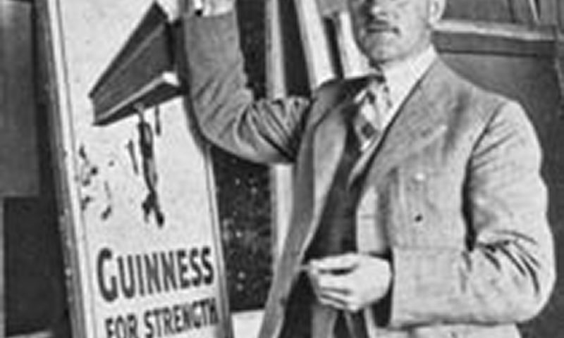
John Gilroy for Guinness: Four Corners and Some Vision
Client Question: What is tone of voice?
5 characteristics of successful businesses
Why become a packaging designer?
Client Question: Are brand guidelines important?
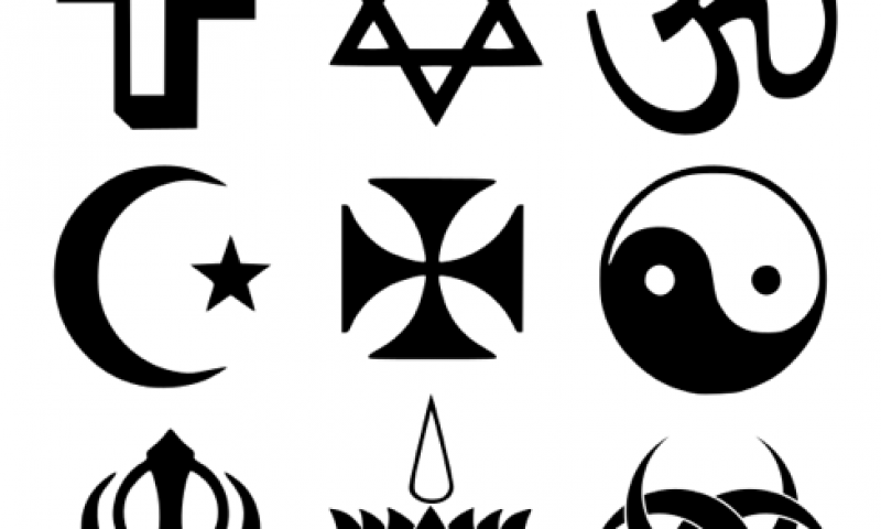
Branding gets spiritual

Top Five Flicks for Designers
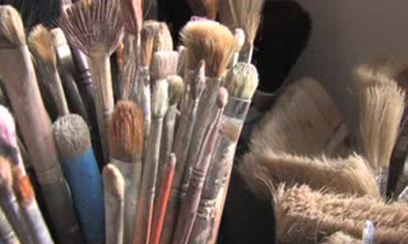
A Creative Journey: Evolution of a Painting
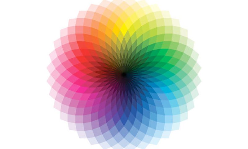
Using the right colour in the right way
How to build your brand’s image through merchandise
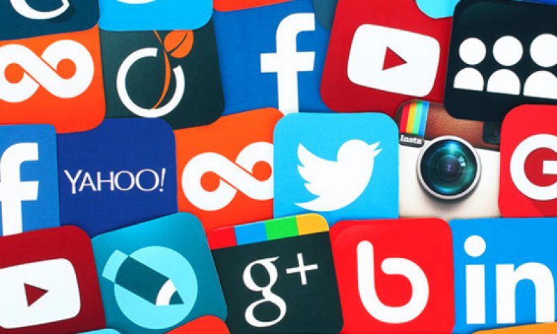
Social Media Predictions 2012