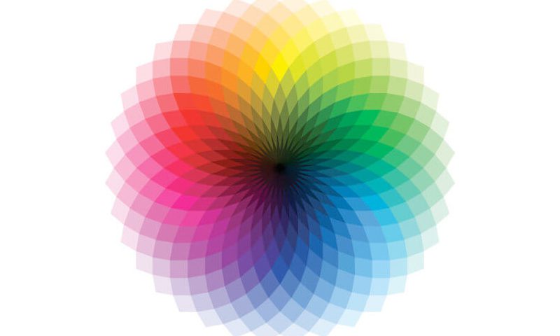
Using the right colour in the right way
According to research 90% of our assessment of a product is made on colour alone. If we don’t like a colour palette chances are we won’t buy the product or stay on a website for very long. On a simple level, the colours on the warm side of the spectrum – such as red and yellow – are bold, uplifting and energetic, while their cooler counterparts, blue and green, exude calmness and feel more reserved.
The survey says… women like blue, purple and green
In a survey by kissmetrics on colour and gender, 35% of women said blue was their favourite colour, followed by purple (23%) and green (14%). Orange was their least favourite, followed by brown and grey.
And men like blue, green and black
If you’re marketing to men use blue, green or black, stay away from purple, orange, and brown.
Blue for trust
Blue is a colour of trust, peace, order, and loyalty. Often used by utility companies and governments. Be careful when using it with food related products, evolutionary theory suggests that blue is a colour associated with poison!
Yellow is for warnings
Yellow is a colour of warning and can activate anxiety! But this sunny colour can also express a personality of happiness, optimism and friendliness – but use sparingly. When used with red it gives off a low cost budget factor to your target audience – McDonald’s anyone? And do you remember the 1980’s Yellow Pack? Okay maybe I’m just showing my age!
Green is ideal for environmental and outdoor products
The most intuitive colour connection is green – used to connect to nature and the environment. The word green itself is a buzzword for environmental awareness. Used extensively in science, tourism and ecological-business.
Orange is bold and vivid but can be overwhelming
The positive side of orange is that it can be used as the fun colour. But because of its energy and brightness, it can quickly become overwhelming, especially on screen. Follow Amazons lead and use it in small doses, they use it in their logo and on their ‘Buy’ button. Interestingly it’s one of the highest converting colours when used as a call to action online (black, dark grey and brown have very low conversion rates).
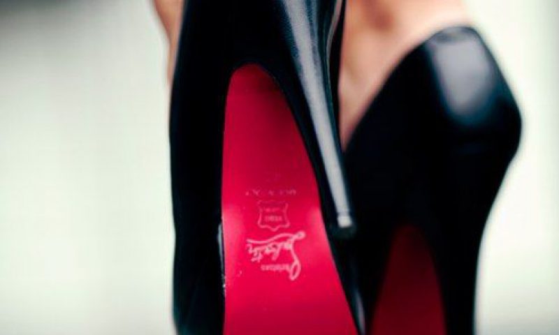
Red makes you hungry!
Red can be a difficult colour for a brand to own, it’s the colour of anger and danger but on the flip side passion and warmth. It is also proven to increase your heart rate, raise blood pressure and apparently it triggers the appetite! So a perfect choice for food products and restaurants. Red can be a bold choice to use it extensively on your brand, but it has done no harm for Virgin, Coca-Cola or Vodafone!
Black adds a sense of luxury and value
Black is used extensively when marketing luxury goods. It creates a feeling of elegance, sophistication and power. If you are selling high-value luxury consumer items, black would be a good choice of colour to use. Black is also used a lot on financial and construction websites drawing on its powerful undertones.
Don’t neglect white
Copious use of white space is a powerful design feature, just look at Google and Apple! Most well-designed websites today use plenty of white space in order to create a sense of freedom and spaciousness. Yet people are afraid of white space in design, many people see it as wasted space. But it’s the opposite – it balances the design, is trustworthy and has a calming effect.
More on the power of white space »
Trish Brady, UI Designer
Trish looks after digital design and creative development at Neworld, bringing a wealth of experience and insight to every project. Her favourite colour is turquoise – almost never used for call to actions!
Keep Reading

The Interview Questions – continued from last month
John Gilroy for Guinness: Four Corners and Some Vision
Client Question: What is tone of voice?
A Love Supreme

5 characteristics of successful businesses
Why become a packaging designer?
Client Question: Are brand guidelines important?
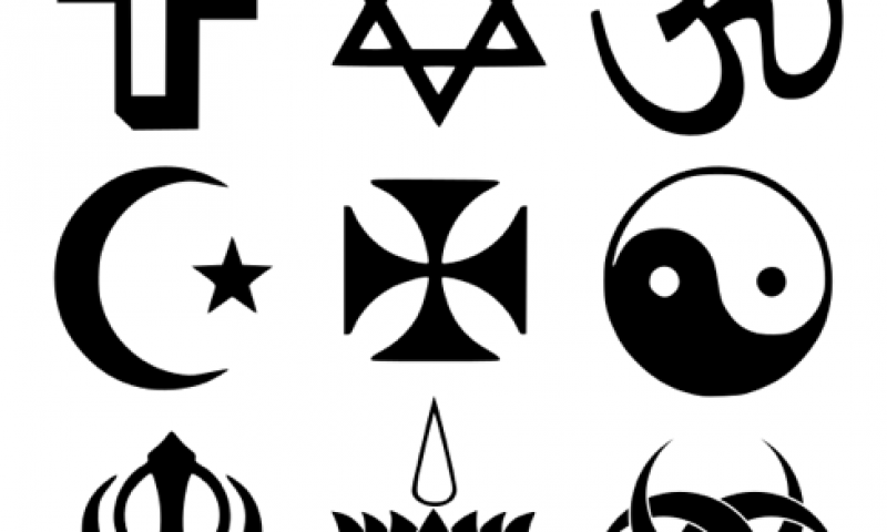
Branding gets spiritual
Top Five Flicks for Designers
A Creative Journey: Evolution of a Painting
How to build your brand’s image through merchandise
Social Media Predictions 2012
Packaging in Ireland’s Oldest Market
Creative People Are Complex – 10 Contradictory Traits...
Designer OCD
Ireland’s mobile internet habit
Is Craftsmanship Dead?
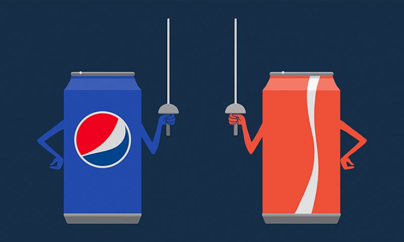
Pepsi vs. Cola: The Marketing Battle of the Century
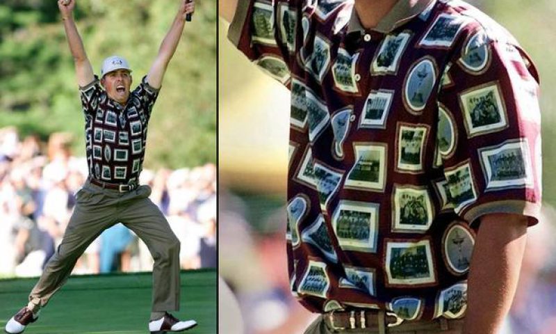
The Ryder Cup – team branding gives them the edge