Before Pantone …
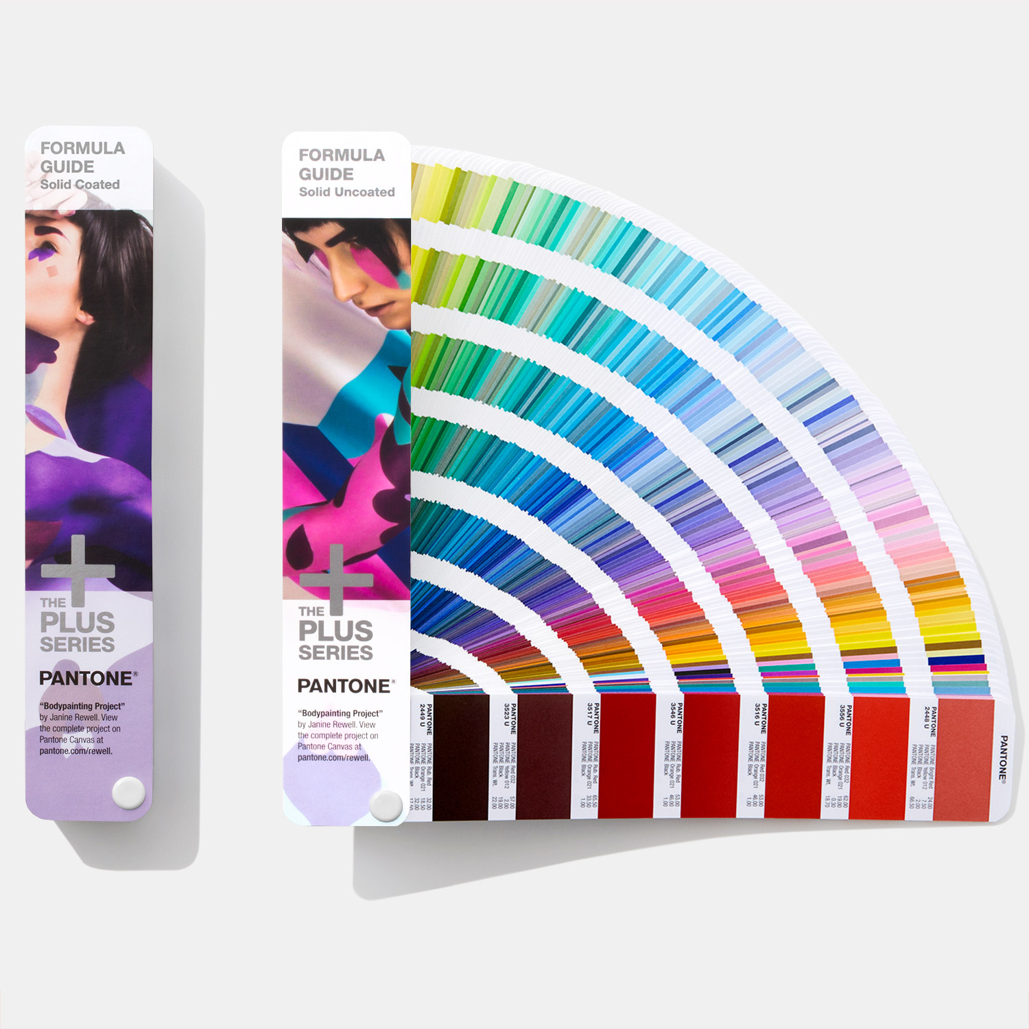
The Pantone colour guide system is a basic design tool that is a vital part of a designer’s toolkit. You will find a Pantone Book on the desk of every good designer. It’s used to communicate and specify colours for print on paper, packaging and consumer products and is universally understood and accepted as the colour standard in the print and design world.
What is it?
Essentially it allows designers to “colour match” specific colours when a design enters production stage and acts as a recipe book for printers to mix inks together to produce the colours that are specified by designers. The inks are produced worldwide and will be stored by all printers. For example, if you specify Pantone Red 032C (letterbox red) you will get the same colour printed in Dublin as you would in New York. The Pantone colour system was established in New York in 1963 by Lawrence Herbert who published the first Pantone Colour Guide.
300 years earlier
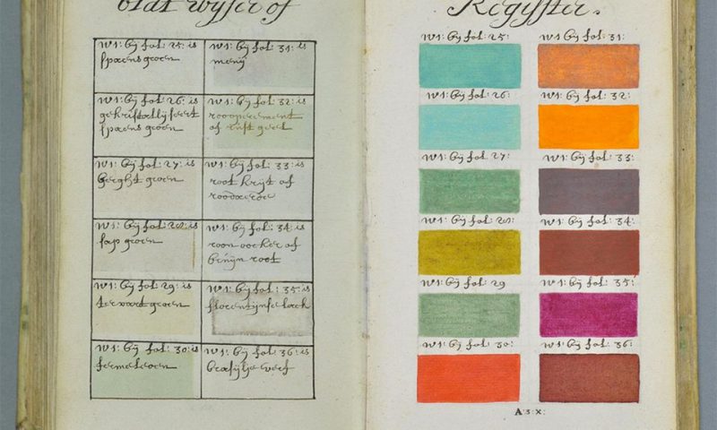
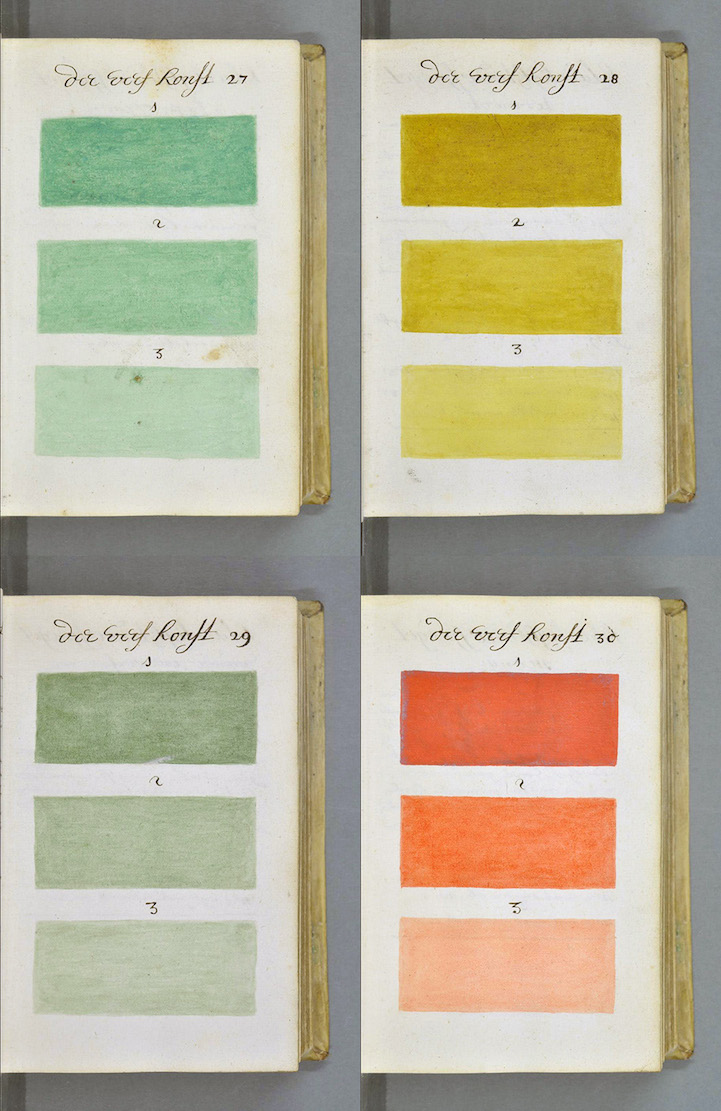
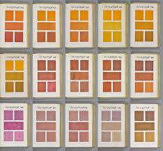
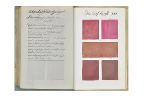
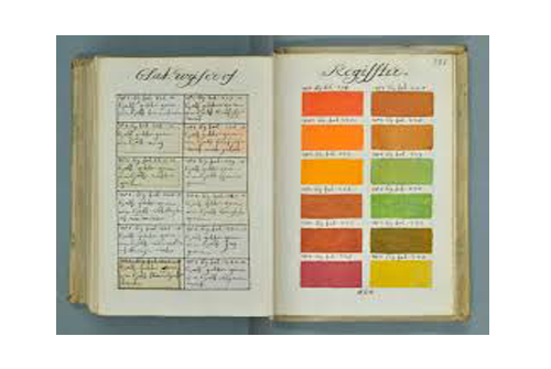
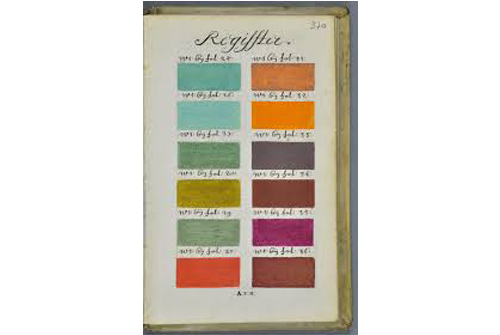
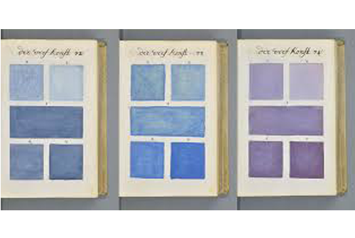
But go back over 250 years earlier and a Dutch artist known only as “A. Boogert” produced a book that is probably the most comprehensive guide to paint and colour of its time. The author sat down to write a book about mixing watercolours and detailed every colour in the spectrum, all by hand. Each page shows several colours in various shades, with a name and a listing in an index.
The First Colour Manual
The book is called ‘Traité des couleurs servant à la peinture à l’eau’ (Treatise on the colours used to paint with water) and contains a staggering level of detail and depth. The book itself seems to have been created as an educational tool, teaching young painters how to mix watercolour paint and change their tone (by adding “one, two, or three portions of water”). Each page shows several colours in various shades, with a name and a listing in an index. The result is nearly 800 pages of vivid hues and beautiful Dutch script. Although intended as an educational tool, there was only a single copy ever made, so only a few artists at the time ever got the chance to see it.
Good Old Eric
That is until Dutch art historian Erik Kwakkel discovered it in the Bibliothèque Méjanes in Aix-en-Provence. He dusted it off, translated the introduction and posted selections from the book on his blog and made available for everyone online. It’s hard not to compare the hundreds of pages of colour to its contemporary equivalent, the Pantone Colour Guide, but these hand-painted colour tables deserve a look in their own right.
VERONICA DOOLEY – CLIENT SERVICES MANAGER
Veronica is our resident artist and brings her undeniable flair for the creative into her role as Client Services Manager. She’s always on hand to guide you through all the aspects of your project right through to the final stages. When she’s not at her desk, you’ll find her getting creative in her own private studio, working away on everything from paintings to printmaking and drawing.
Keep Reading
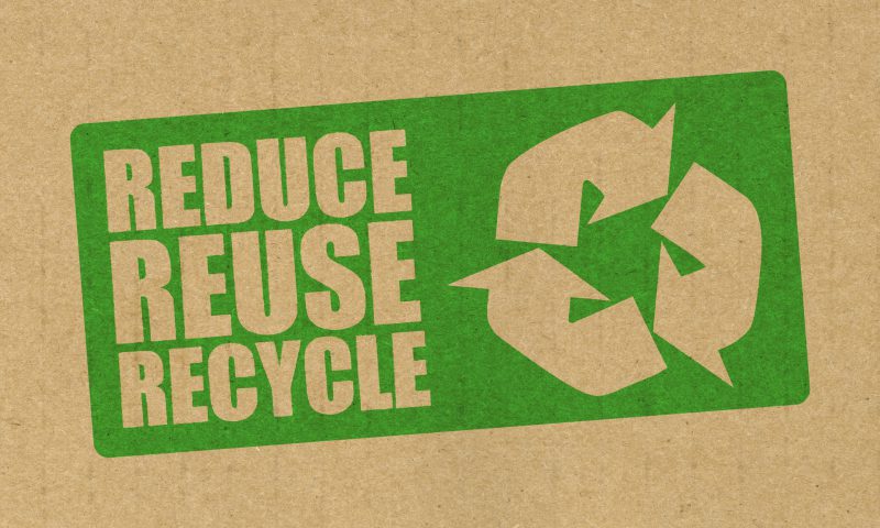
Attract Millennials to your Brand: Reduce Packaging Waste,...
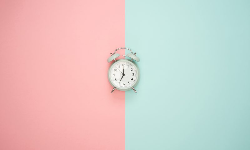
Time Management for Designers

Illustrator Jean Jullien: A Lesson in Simplicity

A Christmas Experience

The Perks of Coffee Packaging

For the love of twitter

How the Irish are influencing tech
Seasonal Packaging – that lasts
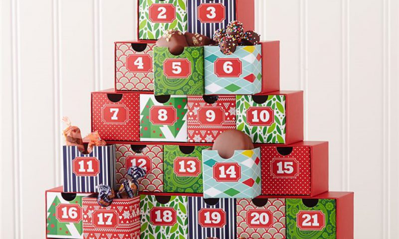
Advent Calendars

Happy Black Friday
Is no brand the new brand?
Neworlds Top 5 Calendars
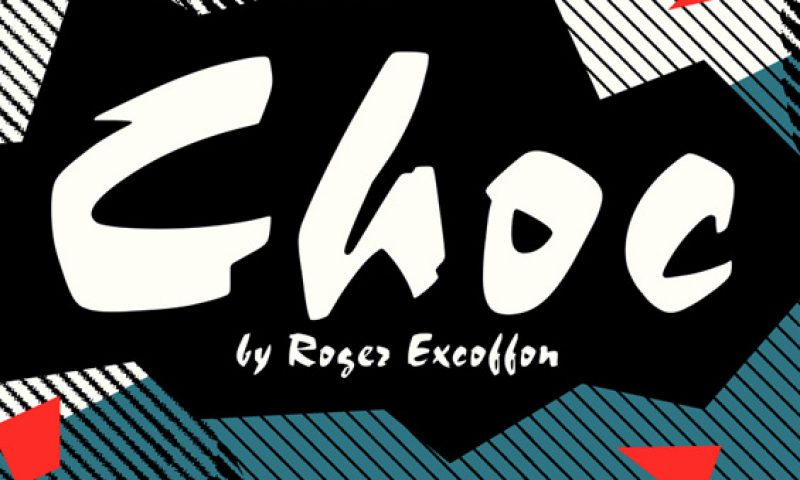
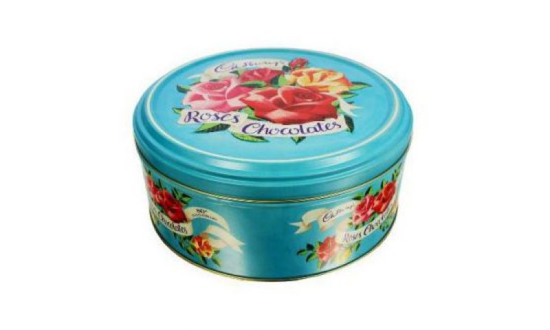
A Choc delight

Why do consumers choose one brand over the other?

Hot food in cold weather
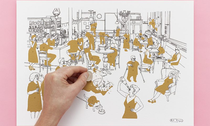
What logos of famous painters would look like

Igniting a spark of magic this Christmas

Make it Special – ring any ‘jungle’ bells?
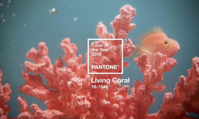
Pantone Colour of the Year 2019