United They Fell
On Thursday evenings, a local radio station has a feature with Johnny Giles, an ex- Leeds United legend (as they say in the business), offering opinions on all things English football. He often relays his owns experience of playing with a very successful Leeds side of the late 60’s and 70’s, both domestically and on a European stage, and does so in a considered, avuncular, old schoolmaster fashion.
Fast forward to modern day Leeds, ‘Master’ Giles would probably give a mark of ‘D’ to their predicament – strangely mired in dour ‘mid-table mediocrity’ of the English 2nd tier and trophy free for years. As for their recent rebrand experience, well that would be an unfortunate ‘F’, followed by the immortal ‘Must do better’.
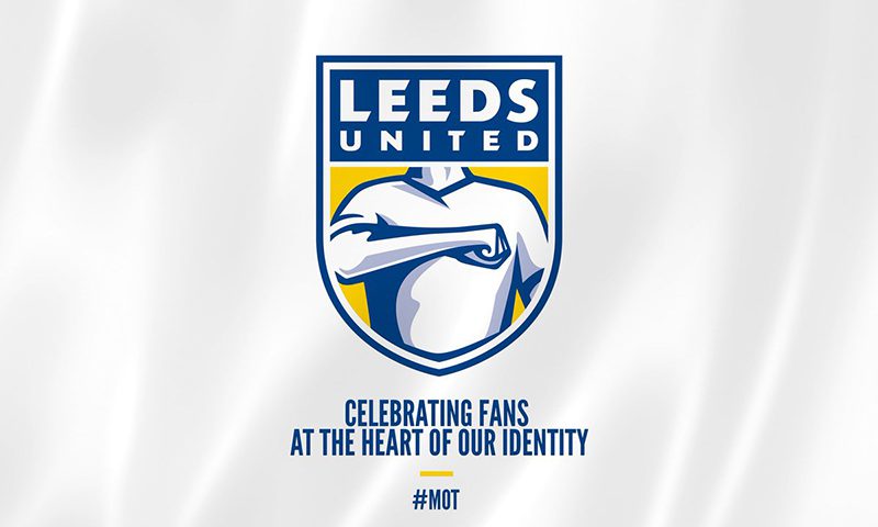
Launched on Leeds United Official Twitter on the 24th January last, Leeds unveiled their new crest ahead of their 100th year Anniversary in 2019. Developed in order ‘to herald a new era, following a largely turbulent and unsuccessful period’, the design dismissed the traditional iconography of previous crests, favouring a ‘Hand on Heart’, used by supporters when singing the club anthem ‘Marching on Together’. The launch followed 6 months of ‘extensive’ consultation by an in-house creative team with over 10,000 people including players, staff, owners and members, using a variety of digital, one-on-one and group surveys.
Intended to reflect a ‘strength in unity’ and place fans at the heart of their identity, the new brandmark suffered a dreaded response – it was derided immediately by their own fan base. The response being so swift (in the form of an ire-fuelled online petition that eventually reached over 24,000), the brandmark was removed from Twitter within 6 hours of its launch by senior management, followed with an apology and a promise to reconsider.
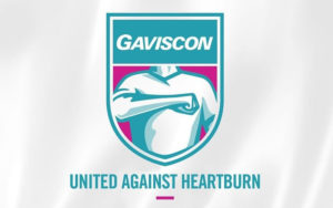
One of the many parodies of the crest
If properly completed, a rebrand could be part of a catalyst in giving the invigorating effect that Leeds United needed. It potentially could have unified everyone associated with the club and give a fresh impetus to achieve success in their 100th year of existence and onwards. Instead, applied and launched in the manner it was, it succeeded only in unifying the club support in a negative and dismissive way.
Rebrands – necessary and hugely effective when completed correctly, if not, well as pragmatic Gilesy might say ‘Careful as you go’.
Sean Deignan, Senior Production Artist
Sean is a Senior Production Artist at Neworld. He is responsible for the handling of major brand name projects from brief to final production, and for taking design concepts and working them to fully finished packaging and literature ready for print. He has worked with a variety of brands including Barry’s Tea, Glenisk, Arrabawn, The Jelly Bean Factory and Irish Pride.
Keep Reading
Get Ready To Explore
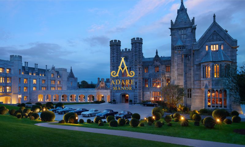
How building brands pays dividends in hospitality
International Women’s Day
100 Archive

Copywriting & SEO: Write for people and the search...
What’s the Story?
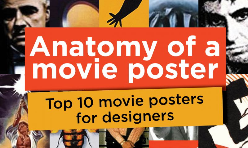
Anatomy of a movie poster – Top 10 movie posters for...
Stop shouting, be confident and stand out with a whisper
Top of the pack-ing order: How Packaging Influences...
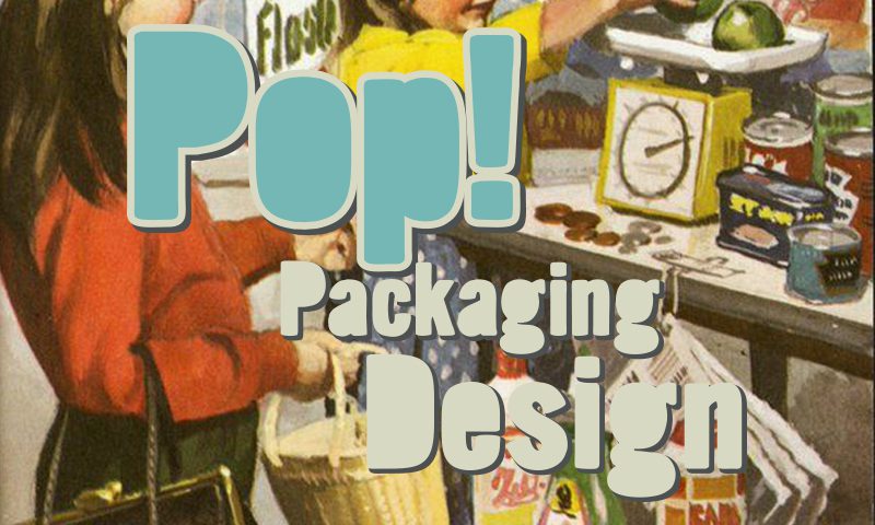
Pop! Packaging Design

The value of branding – how to measure the success of...
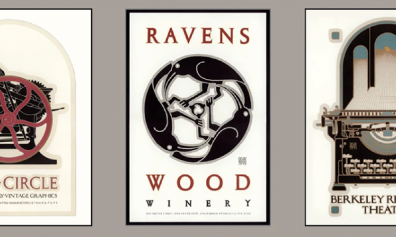
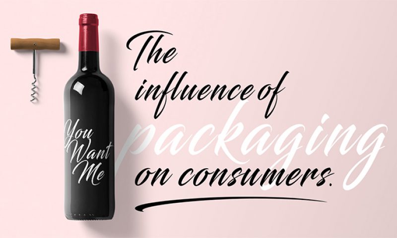
Great wine or great design?
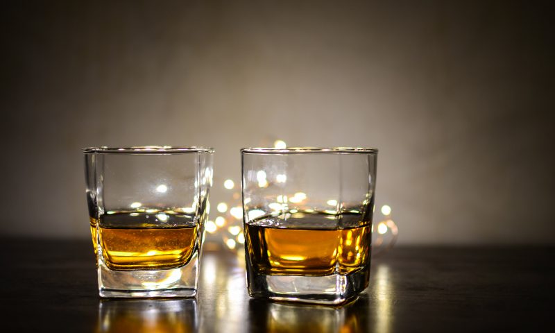
Branding for Ireland’s Whiskey Renaissance

To disrupt or not to disrupt? That is the question!
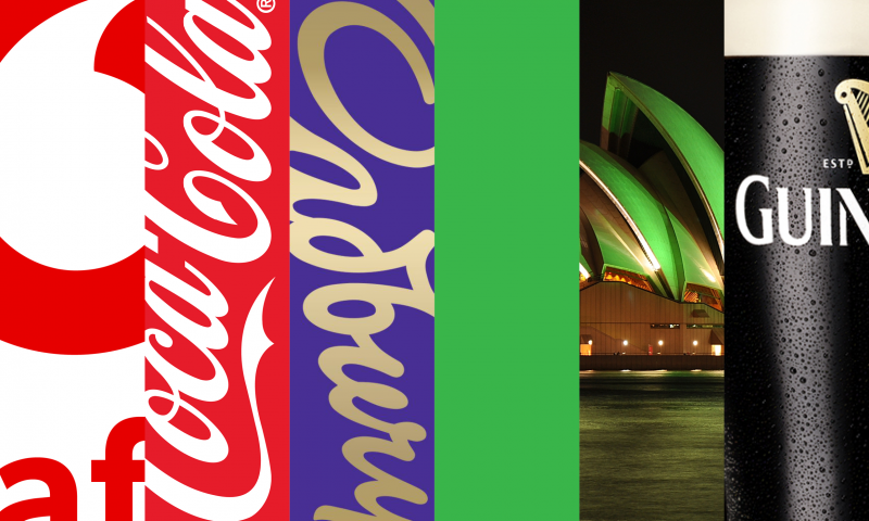
The Power of Colour
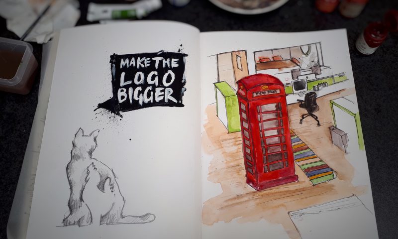
It Started With a Sketch – Sketchbook Challenge
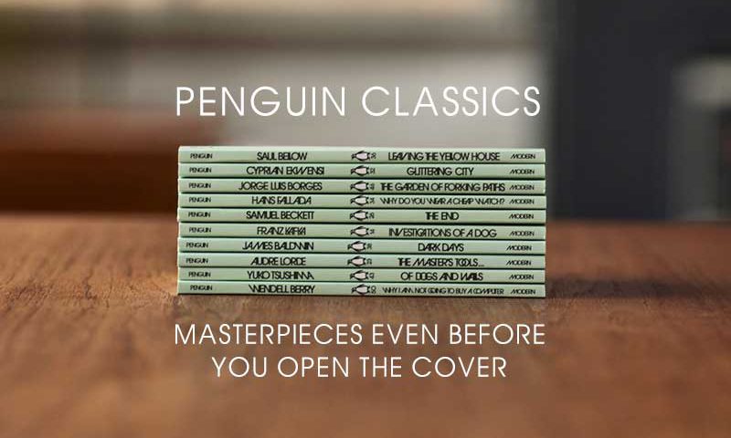
Penguin Classics – masterpieces even before you open...
The emoji – powerful design or millennial nonsense?
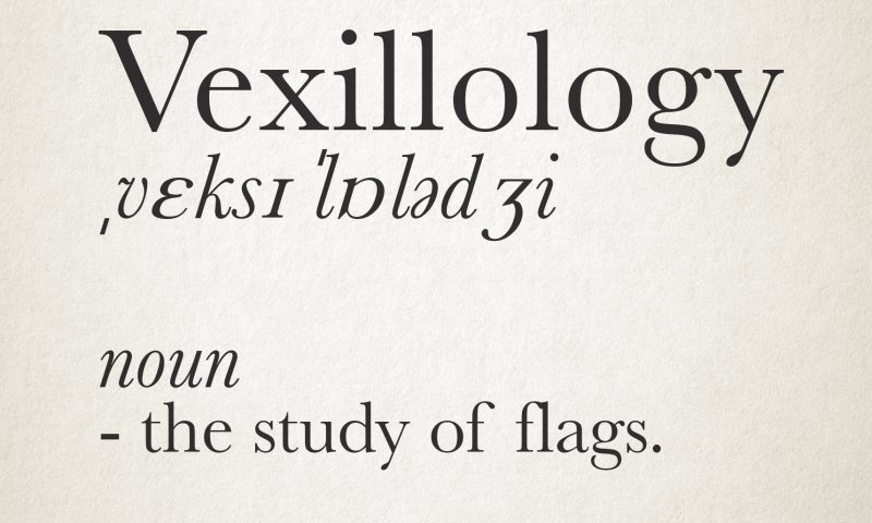
Vexillology