POSTED BY: Gary Gleeson
Anatomy of a movie poster – Top 10 movie posters for designers
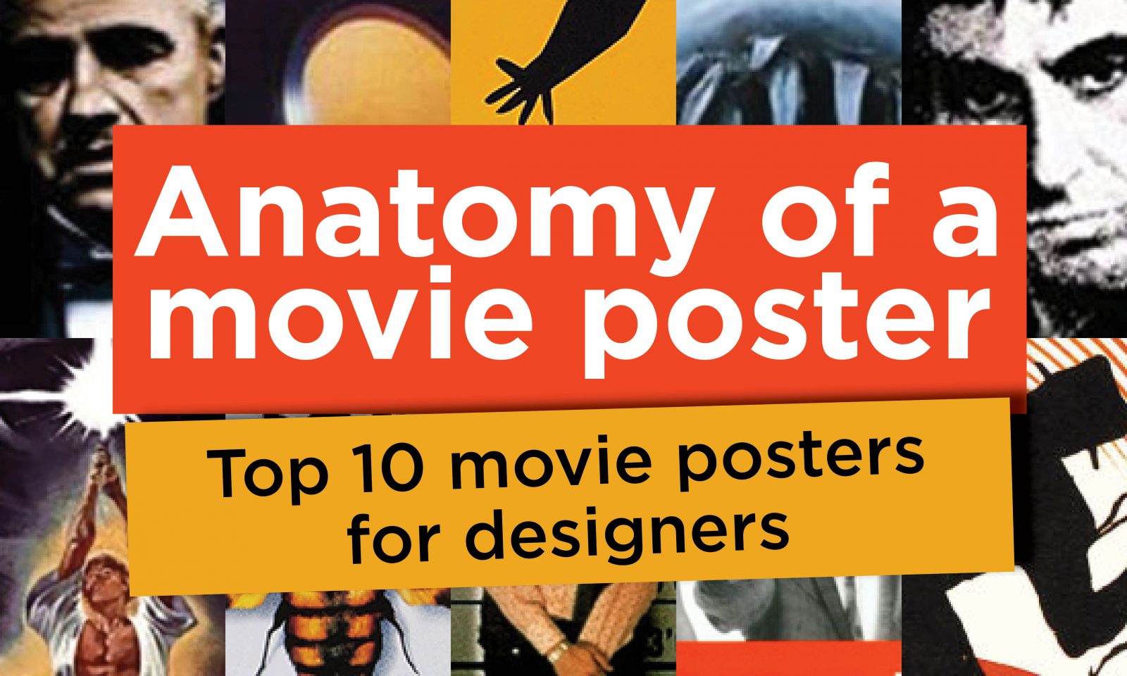
Anatomy of a movie poster – Top 10 movie posters for designers
As both movie buff and designer I’ve always been fascinated with movie poster designs. A good movie poster can set the scene and really give you a sense for the movie.
Many of these posters have adorned students’ walls over the years. Here are 10 of my favourites in no particular order:
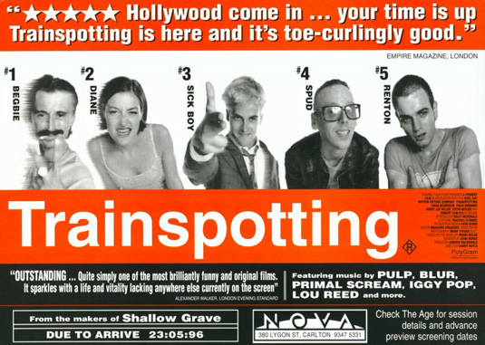
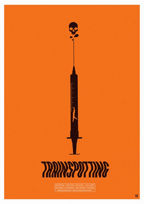
Trainspotting – It was edgy, with black and white portrait imagery, vibrant orange, san serif fonts – it was the ultimate cool student poster and must see movie of the year.
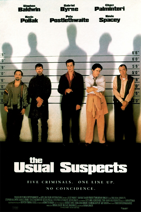
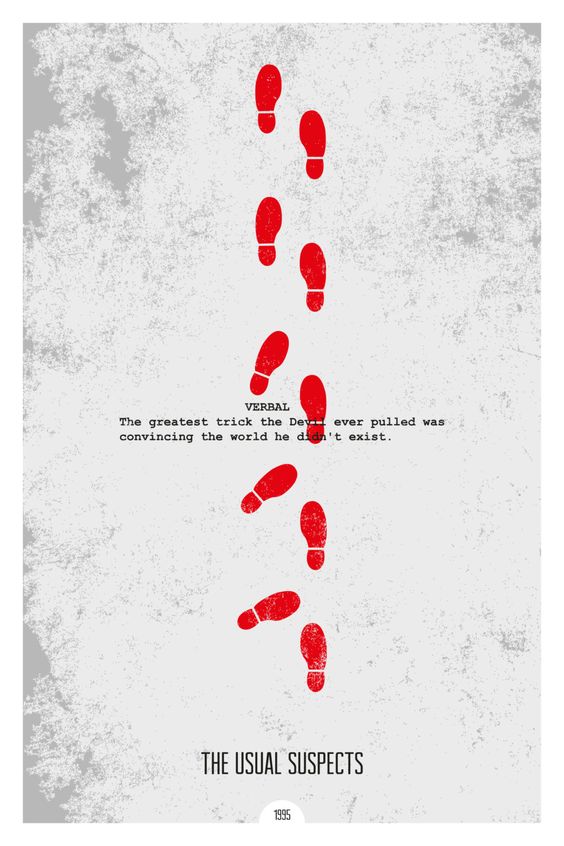
Usual Suspects – Often copied but never equalled, the strong image of our suspects in a police line up intrigues the viewer and immediately introduces you to a bunch of shady characters.
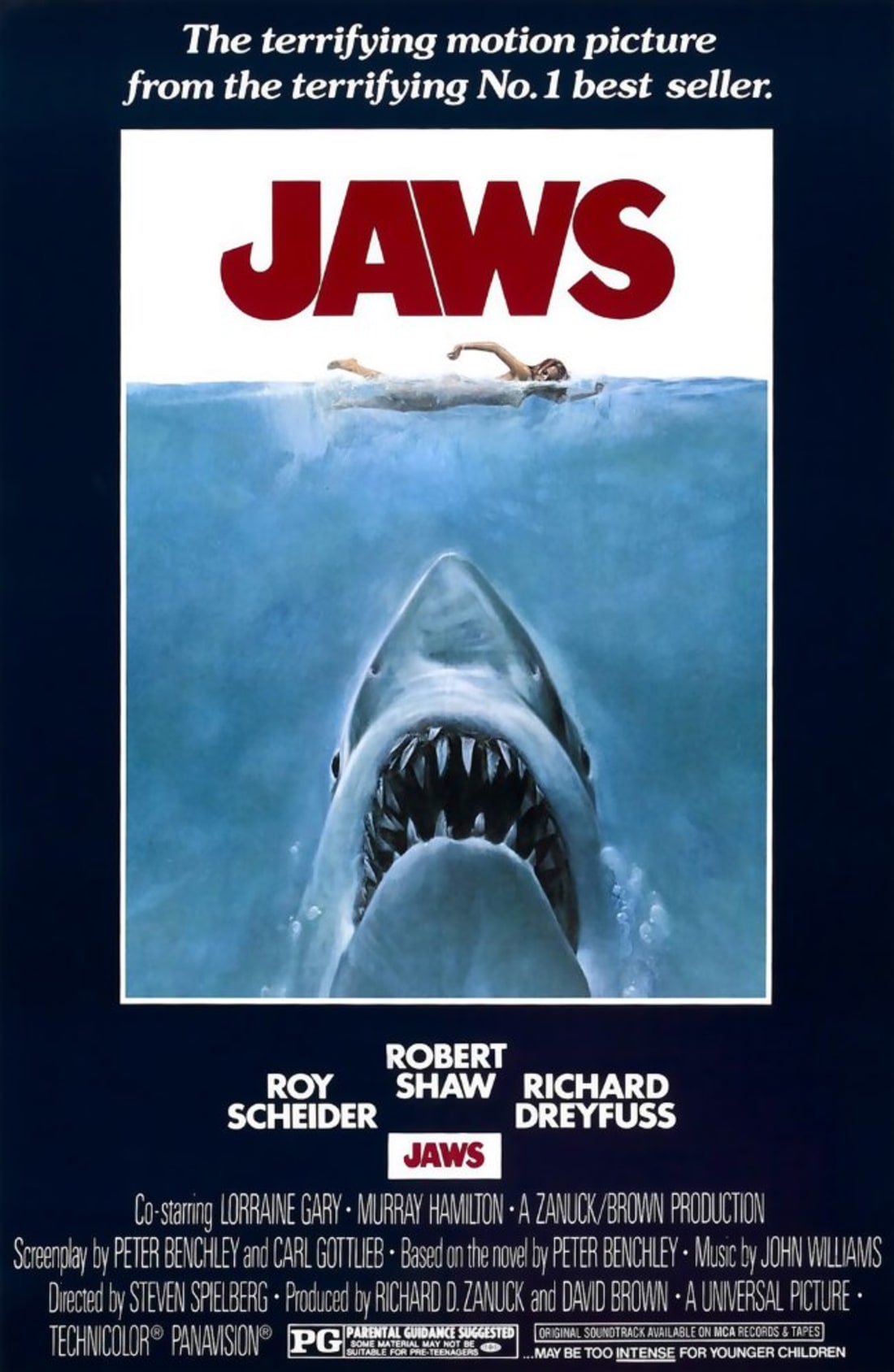
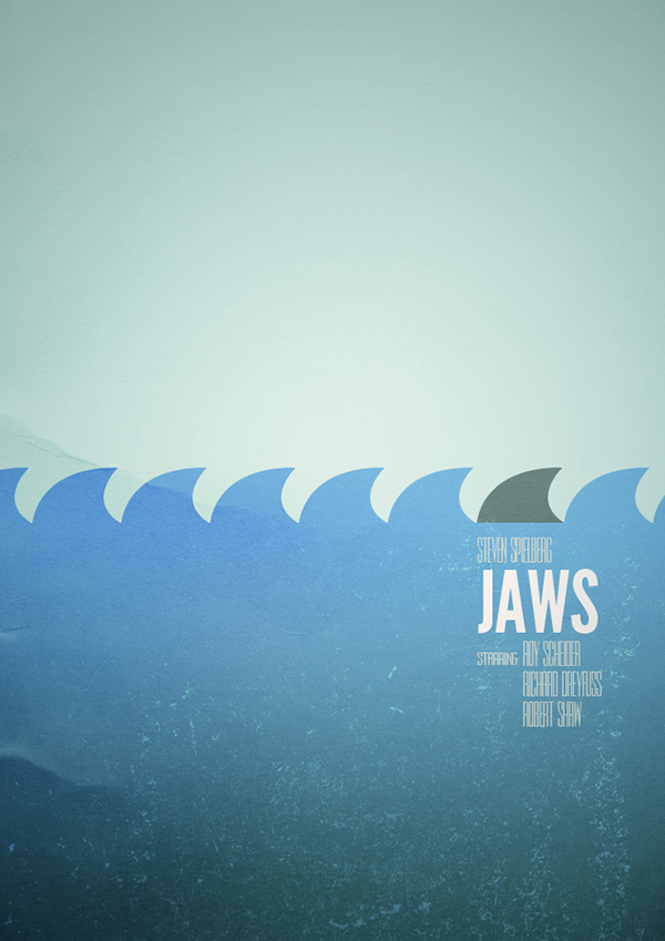
Jaws – Brilliant depiction of unsuspecting terror beneath the surface. The giant, oversized shark with large red title conveys the horror of what’s to come. Generally regarded as the best movie poster of all time. Didn’t help the tourist season in many a seaside town…
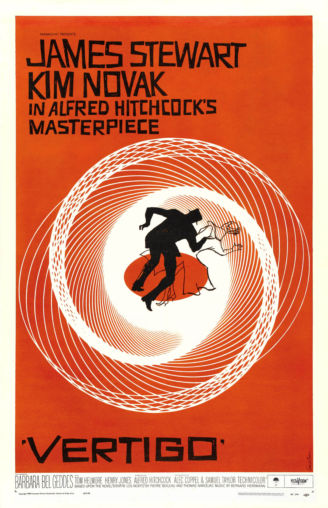
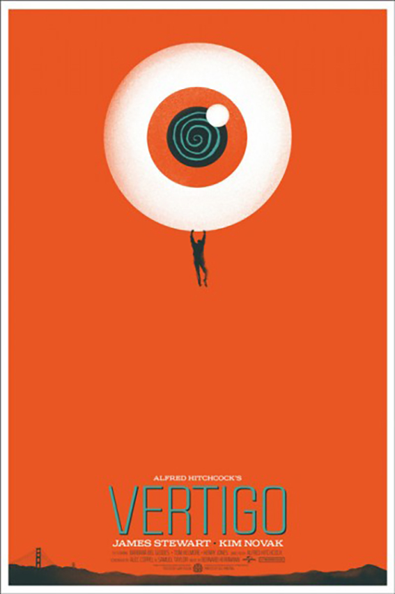
Vertigo – Saul Bass’s brilliantly graphic poster has a dizziness and out-of-control feeling, something that Jimmy Stewart experienced acutely throughout the movie. The quirky hand-drawn font against the backdrop of orange adds to the distress.
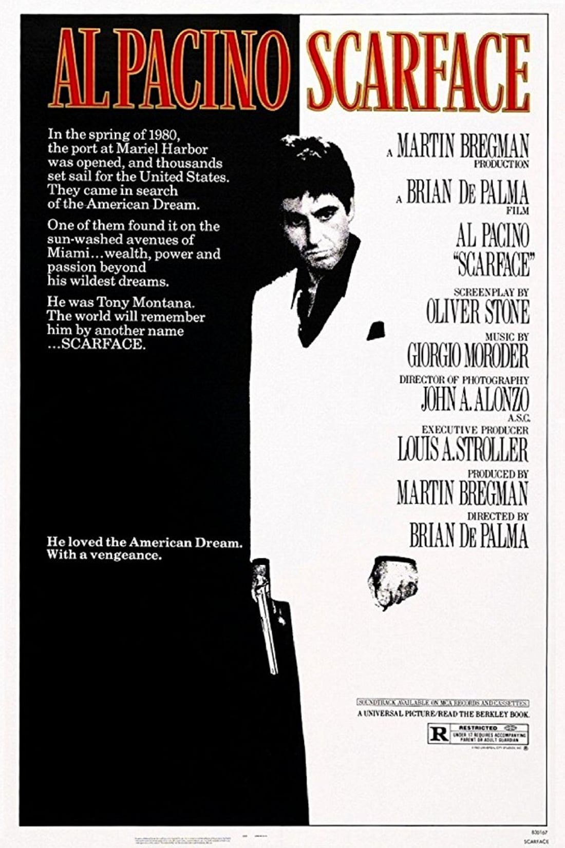
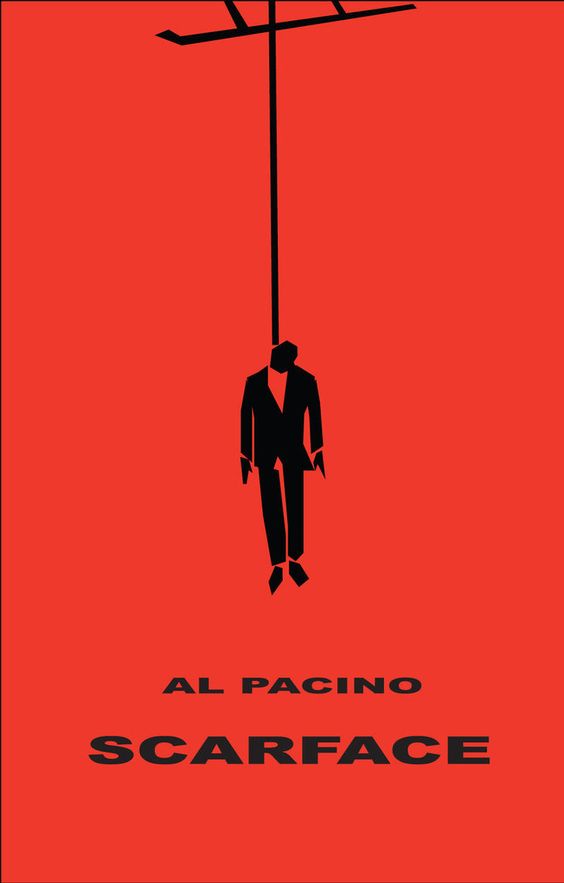
Scarface – The white suit says it all. Features prominently in nearly ever MTV Cribs episode.
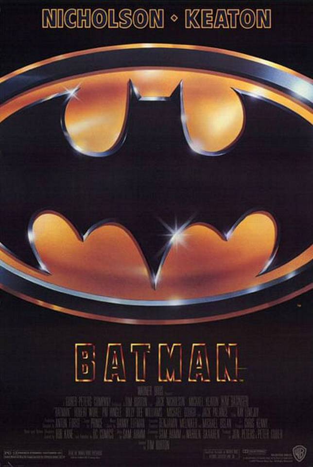
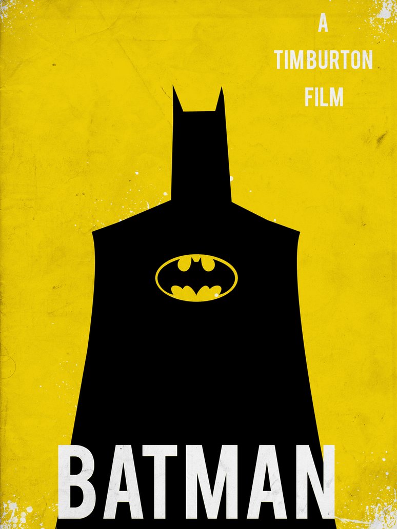
Batman – Tim Burton’s highly-anticipated Batman had to move the audience away from the 60s character and introduce something new. It was a bold statement, using just the strong graphic symbol and no characters from the story. P.S. Airbrushing was very popular at the time!
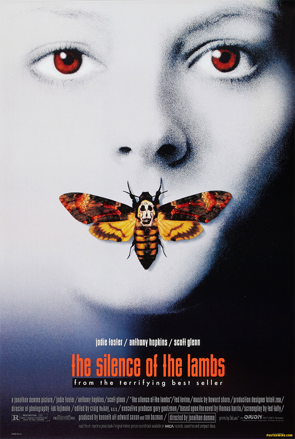
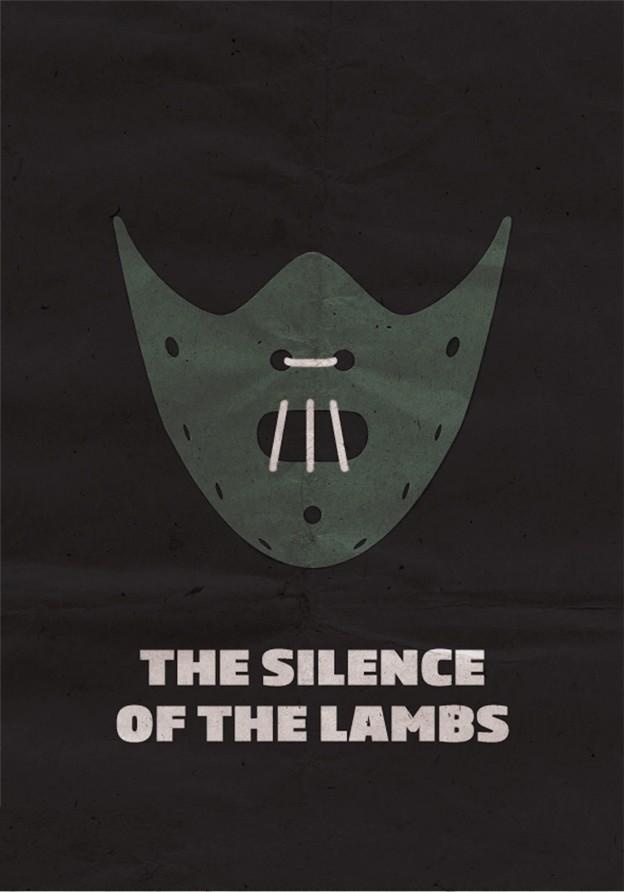
The Silence of the Lambs – This visually striking poster captivates and creeps you out at the same time. The synergy of colour between Clarice’s eyes, the death’s head moth and title type works really well to balance the poster and unbalance the viewer. With closer inspection, the skull on the moth’s back is actually made of nude women, paying homage to Salvador Dali’s In Voluptas Mors.
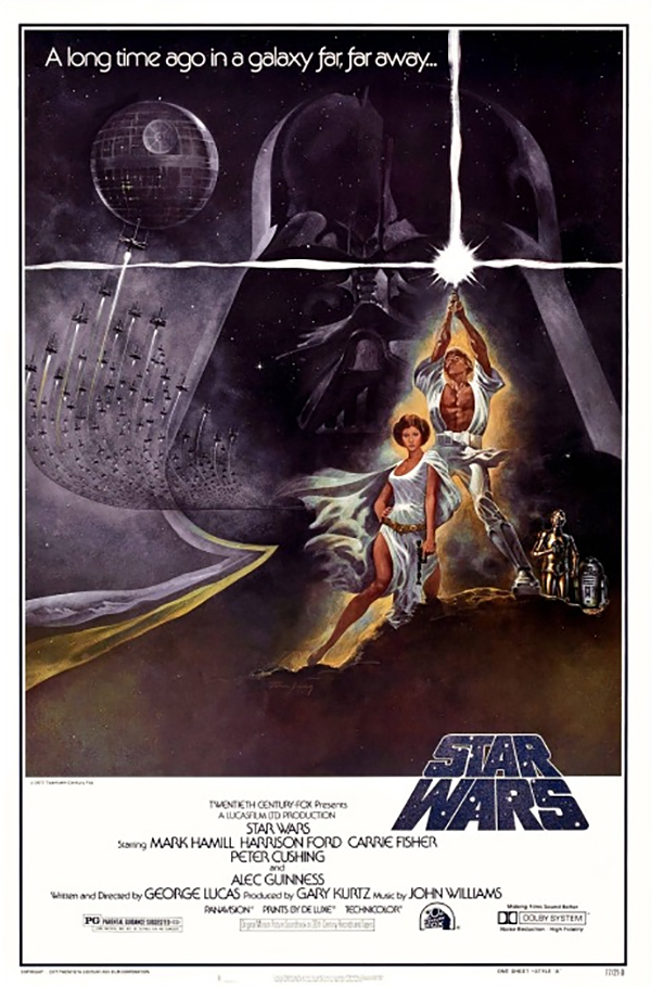
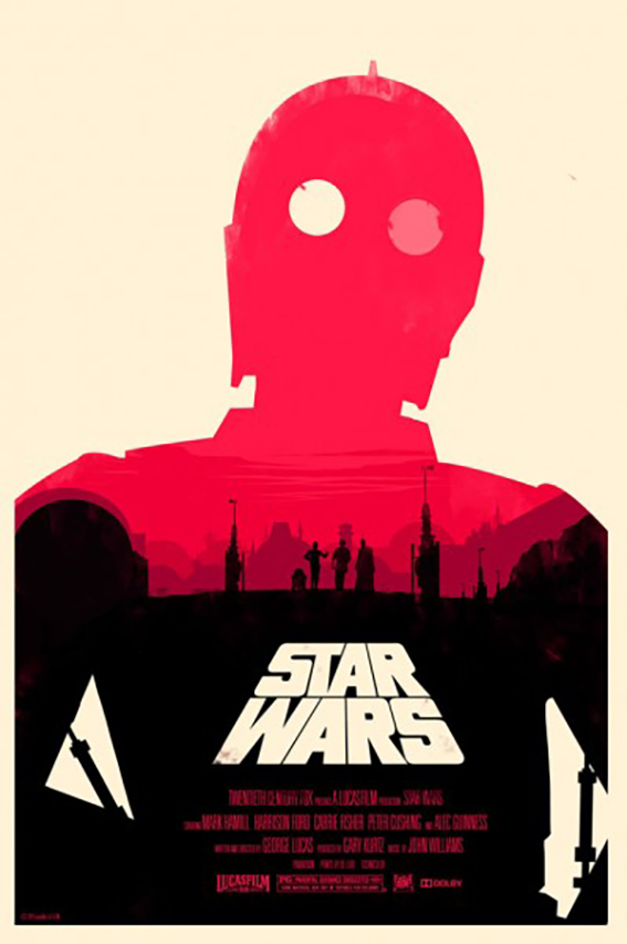
Star Wars – The ultimate good-versus-evil poster. The menacing head of Darth Vader in the background with a burst of energy forming a cross from the light sabre. The Star Wars type treatment is lifted straight from the title sequence of the movie. I’d say Mark Hamill was pleased with his abs. And interestingly, Harrison Ford doesn’t even feature.
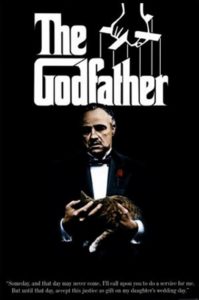
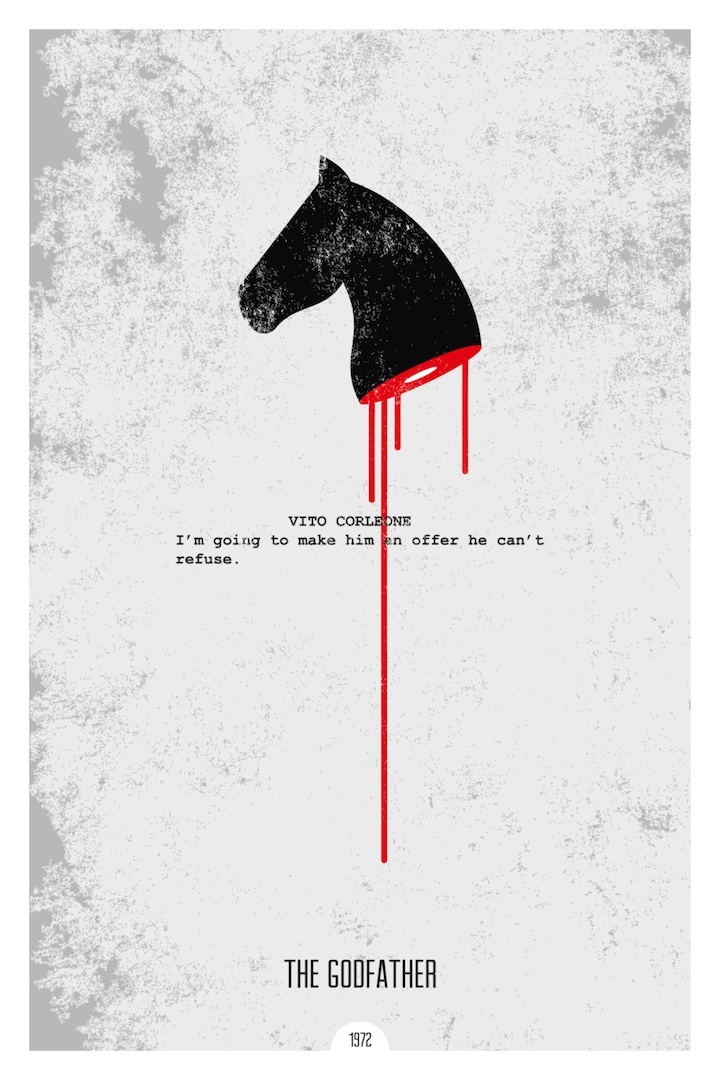
The Godfather – A brilliantly simple yet powerful poster featuring Don Corleone with his eyes blacked out, cradling his much-loved pet. The title art is taken directly from Mario Puzo’s best-selling novel, featuring a strong black and white graphic of the puppeteer pulling strings. Designed by legendary graphic designer S. Neil Fujita.
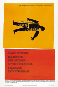
Anatomy of a Murder – The dissected body image, reminiscent of a police chalk line, sitting on a solid colour block, you know this isn’t going to end well… Saul Bass got a second entry with this iconic poster design so simplistic and minimalist it could easily have been designed today. That got me thinking, I thought it would be interesting to finish with minimal modern day interpretations of the previous 9 movie posters. Enjoy.
Gary Gleeson, Partner
Gary is a Partner at Neworld, a brand & creative design agency with over 30 years experience developing brands to position them for future growth. Gary has worked with some of Ireland’s biggest brands such as Diageo, John Rocha and O2 and is a recognised expert in hospitality branding, working with Fade St Social, Powerscourt Hotel, Mount Juliet and Adare Manor to name but a few. His belief in branding and its relationship with design effectiveness has seen him guide a myriad of companies through the branding maze. He realises client visions using this synergy of strategic branding and design. He is also the self-professed champion of chilli-making!
Keep Reading
Bonsai Bar
Neworld 2017
Fantastical brand for Adare Manor’s Tack Room
Design steeped in heritage
Get Ready To Explore
How building brands pays dividends in hospitality
International Women’s Day
100 Archive

Copywriting & SEO: Write for people and the search...
What’s the Story?
Stop shouting, be confident and stand out with a whisper
Top of the pack-ing order: How Packaging Influences...
Pop! Packaging Design
United They Fell

The value of branding – how to measure the success of...
Great wine or great design?

Branding for Ireland’s Whiskey Renaissance

To disrupt or not to disrupt? That is the question!
The Power of Colour