Pop! Packaging Design
Galleries and museums are full of design icons, but when I visit a new city I’m just as intrigued as to what different packaging I’ll discover at the local corner shop or supermarket. The story and heritage of the place can be found on these shelves. Here are a few examples:
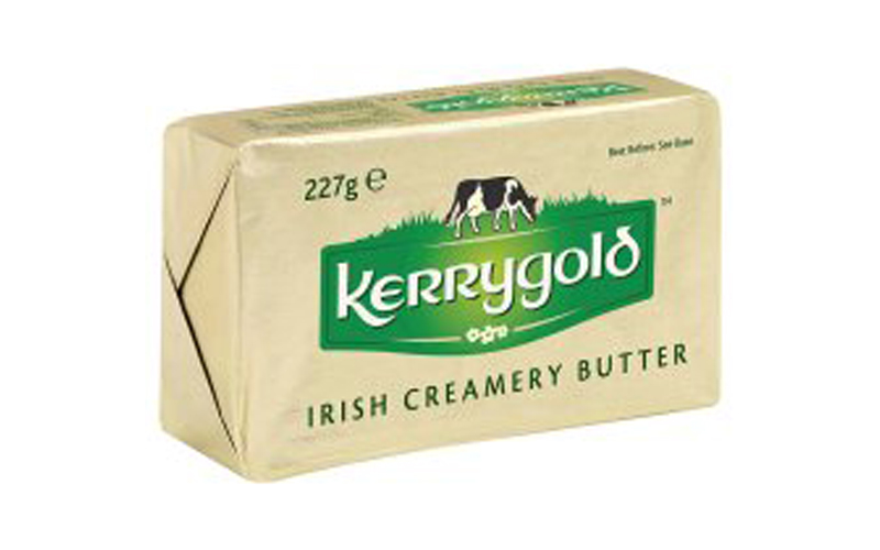
Kerrygold Butter
This little gold bar has been around for decades. The gold wrapper evolved from its early seventies yellow pattern. A distinctively Irish product that could almost have been found at the end of the rainbow. This brand is as recognisable to the Irish as it is to the story we sometimes like to portray.
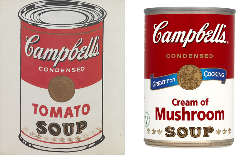
Campbell’s Soup
Simplicity with colour and type that is pure 20th century Americana – for Andy Warhol, its ordinariness deserved its place sitting along side Marilyn Monroe and Elvis Presley. No colour coding necessary.
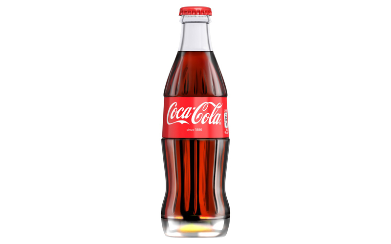
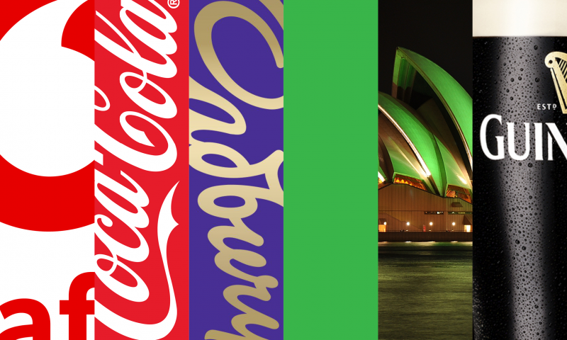
Coca-Cola
A simple script logo emblazoned across a clear bottle, sometimes embossed, sometimes on a red label. The bottle’s curves have changed at times but the overall design is so timeless that it almost looks like it’s a signature from the past, present and future.
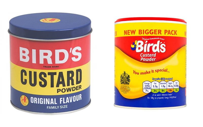
Birds Custard Powder
Simple type, eye-catching bright primary colours. The original three bird logo, designed in 1929, stripes and type have been modified over the years in order to keep up with changing tastes but the core concept has remained the same and is as familiar as ever.
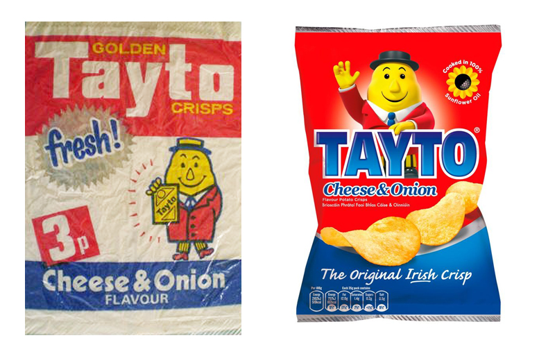
Tayto
The individual design elements have been tweaked over the years but it maintains its distinctive identity. The Mr. Tayto character has stayed on pack along with the familiar and uniquely Irish colour coding of red for Cheese & Onion and Blue for Salt and Vinegar.
Good packaging design continues to provide products, ‘ordinary’ or not, with well deserved success and longevity.
Fiona O’Farrell, Packaging Designer
Fiona’s agency brand and packaging experience includes work for Kerry Foods, Boyne-Valley, Coca-Cola HBC, The Dalata Hotel Group, Dunnes Stores and Aldi.
Keep Reading
Design steeped in heritage
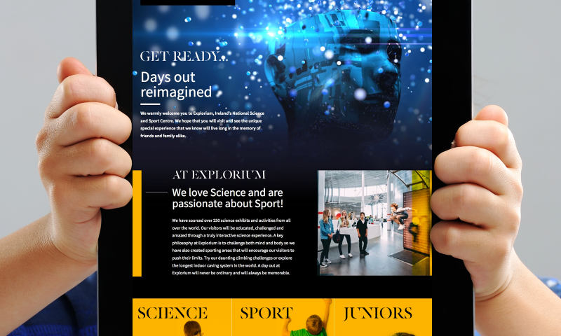
Get Ready To Explore
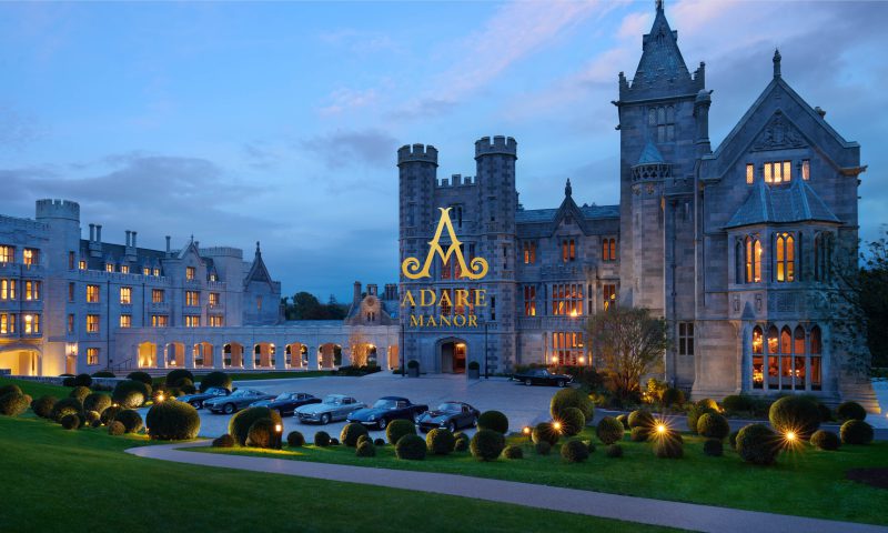
How building brands pays dividends in hospitality
International Women’s Day
100 Archive

Copywriting & SEO: Write for people and the search...
What’s the Story?
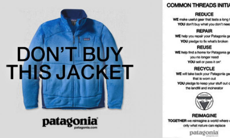
Anatomy of a movie poster – Top 10 movie posters for...
Stop shouting, be confident and stand out with a whisper
Top of the pack-ing order: How Packaging Influences...
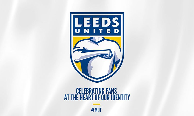
United They Fell

The value of branding – how to measure the success of...
Great wine or great design?

Branding for Ireland’s Whiskey Renaissance

To disrupt or not to disrupt? That is the question!
The Power of Colour
It Started With a Sketch – Sketchbook Challenge
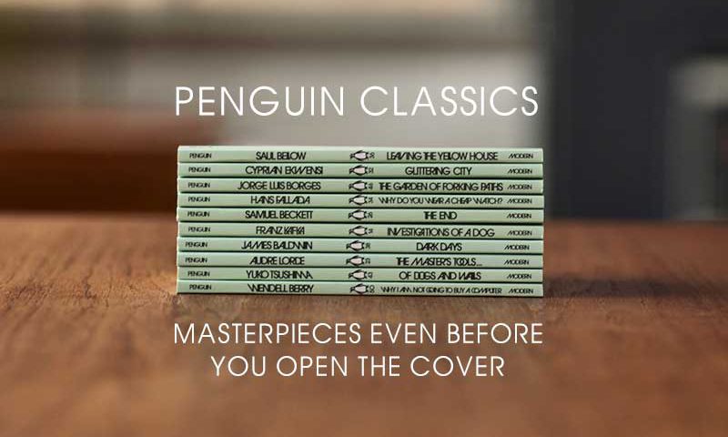
Penguin Classics – masterpieces even before you open...

The emoji – powerful design or millennial nonsense?