POSTED BY: Fiona O’Farrell
Packaging Information – Can you see the wood for the trees?
Packaging Information – Can you see the wood for the trees?
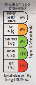
Making informed decisions on what products to buy should be easier than ever due to clearer labeling and packaging information. That’s not to say that some claims can be misleading, but the introduction of more trusted logos and simpler classifications such as the ‘traffic light system’ regarding our daily nutritional intake should help us a lot.
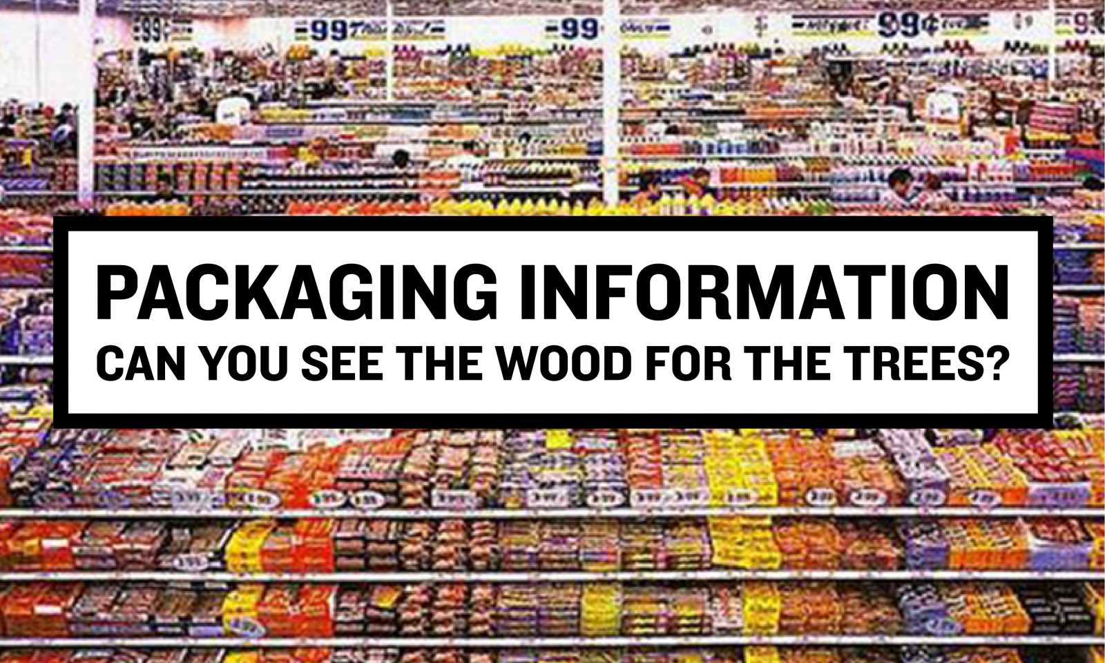
![]()
A ‘Plastic Free’ icon has been introduced in the UK and The Netherlands. Inspired by propaganda posters, it’s bold and eye-catching. The type is a bold condensed sans serif, representing the shape of a box. It is a no-nonsense, upfront and proud statement that’s plainly obvious what it means.
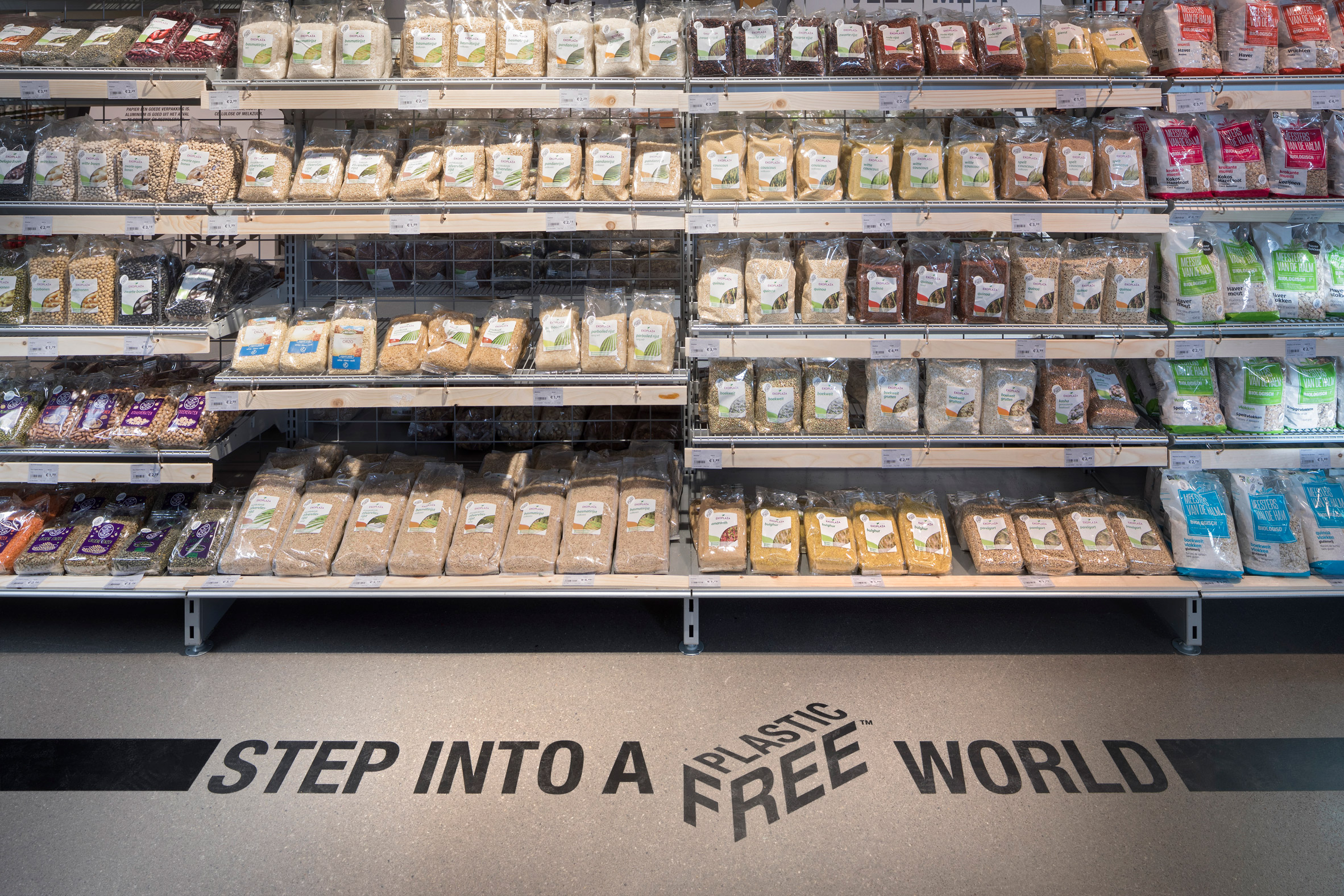
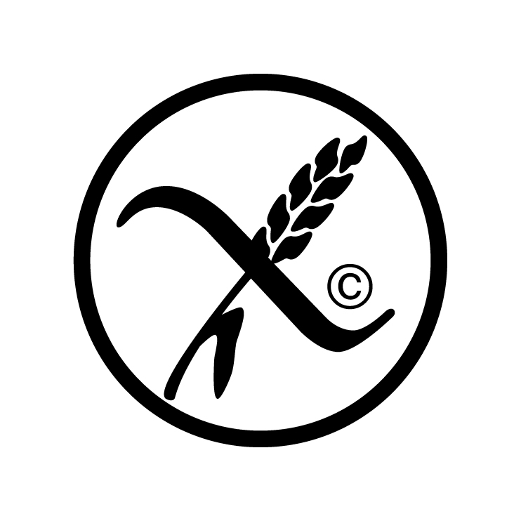
As a packaging designer, it can sometimes be a challenge to display all of these icons in a clear and informative way that doesn’t detract from the overall aesthetic of the pack. It is, after all, our job to ensure that the consumer wants to buy the product and not be blinded by so much information that they miss what is important to them. The ‘Crossed Grain Certified’ symbol might be of primary importance to one shopper while the product’s provenance may be more important to someone else, so hierarchy can be an issue when some icons demand to be in a particular position or colour way on a pack.
![]()
Icons and logos are some of my favourite things to design and can sometimes be tricky to get right, and with greater constraints of regulations, it can make the design process far more interesting.
Fiona O’Farrell, Packaging Designer
Fiona joined Neworld as a packaging designer in 2016. Her agency brand and packaging experience includes work for Kerry Foods, Boyne-Valley, Coca-Cola HBC, The Dalata Hotel Group, Dunnes Stores and Aldi.
Keep Reading
Where the heart is
A ‘Can’ Do Attitude
Confessions of a Weather Nerd

Create a truly delicious package – Ireland’s top...

Three Reasons Why Brands Should Partner with Social Media...
The wrong hotel restaurant branding can eat your lunch!
GDPR – What’s it all about?
Building a Brand Name: Learn from the Leaders
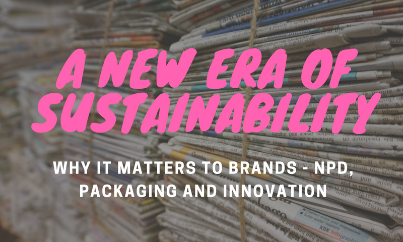
Sustainability and why brands must take action
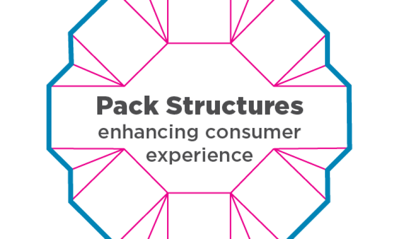
Pack structures – Enhancing Consumer Experience
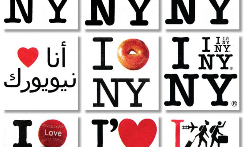
I ♥ NY – An Iconic Design Shared Around the...

Connect engage and build relationship

The Grey Area Project
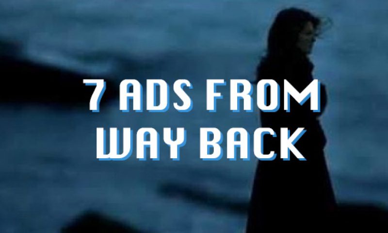
7 Classic Irish Ads and earworms
Aliens invading London and the perils of co-opting social...
The Cola Wars

A typeface you can see and feel
Stark Crazy! Embracing the WTF moments
Bloomin’ Brilliant – Our Irish Producers showcase their...