Tuzo Mexican Restaurant - Archived Work from 2013
Macabre, Colourful, Quirky, Tuzo has a brand personality that’s distinctly different!
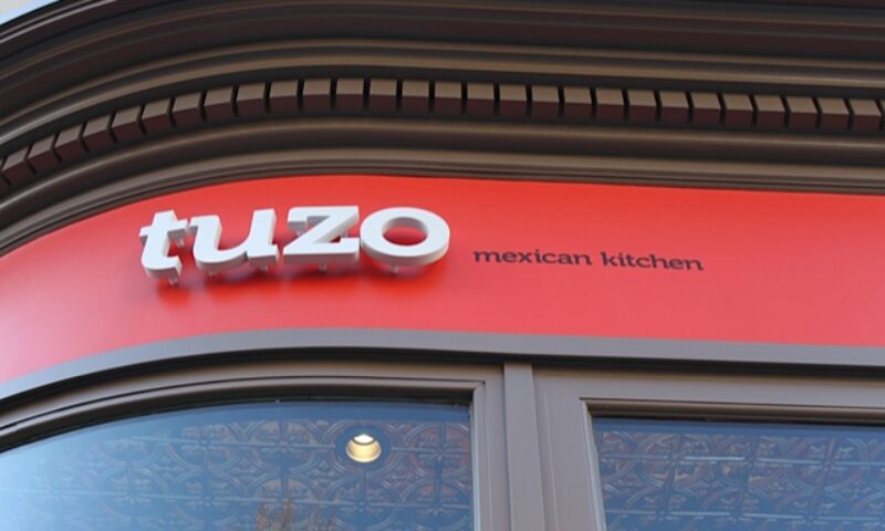
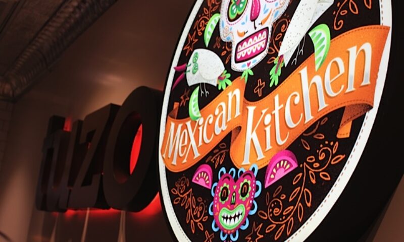
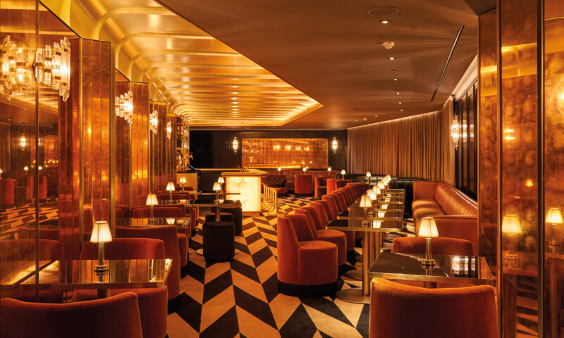
Tuzo Mexican Restaurant
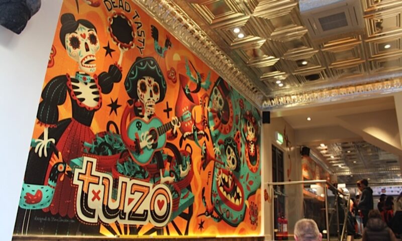
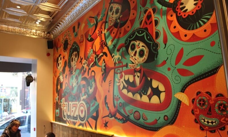
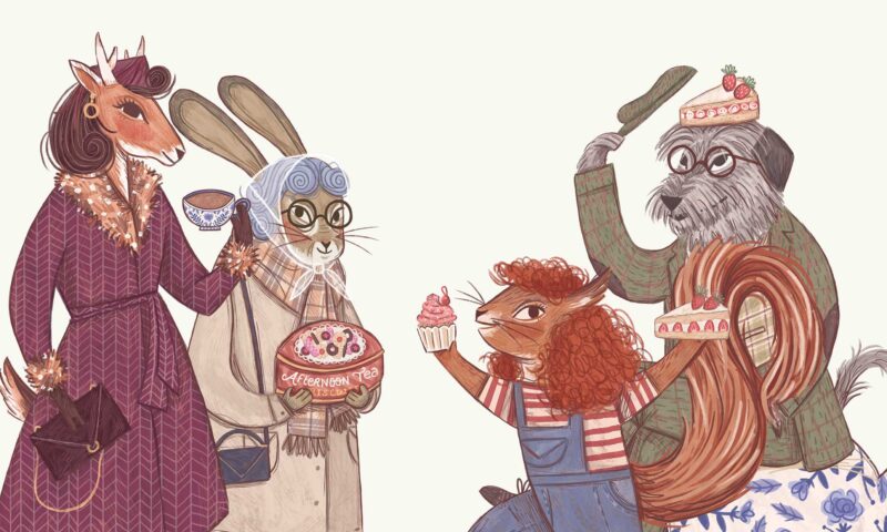
The creative concept draws inspiration from Dia de Muertos, or Day of the Dead, which is a festival which honours the deceased. This ritual has been observed by these civilizations perhaps for as long as 2,500 – 3,000 years, and in the pre-Hispanic era, skulls were commonly kept as trophies and displayed during the rituals to symbolize death and rebirth.
We chose this theme to create a multi-sensory experience – a gathering of people, food and music, with a distinctly Irish twist. Through a series of creative workshops we defined the creative concept and brand personality. In addition, we created a snappy, memorable name – Tuzo (it’s a type of Mexican gopher) in keeping with the Mexican pedigree.
Macabre, Colourful, Quirky
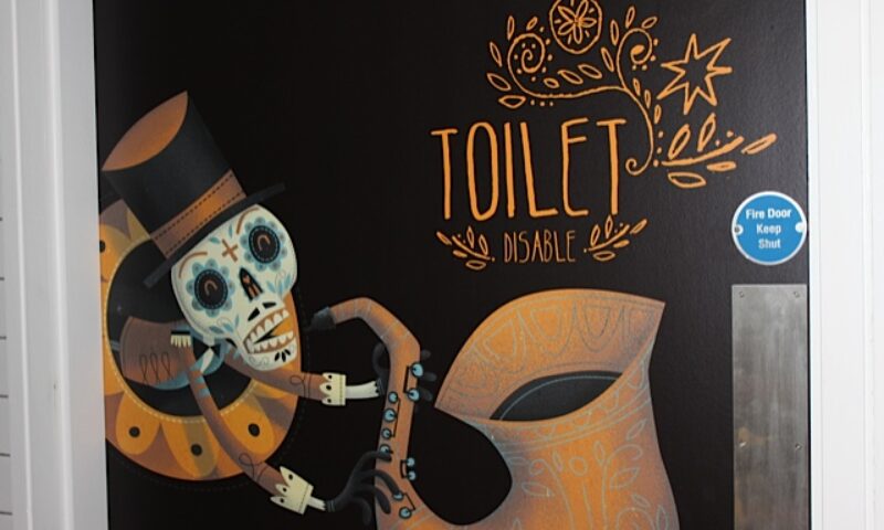
A simple, understated brand identity was created as a solid foundation for the brand. We then commissioned artist and illustrator Steve Simpson to create a mural and artwork which captured the brand personality. The illustrative style is draws you into a unique storyboard which is macabre, colourful, quirky and punchy.
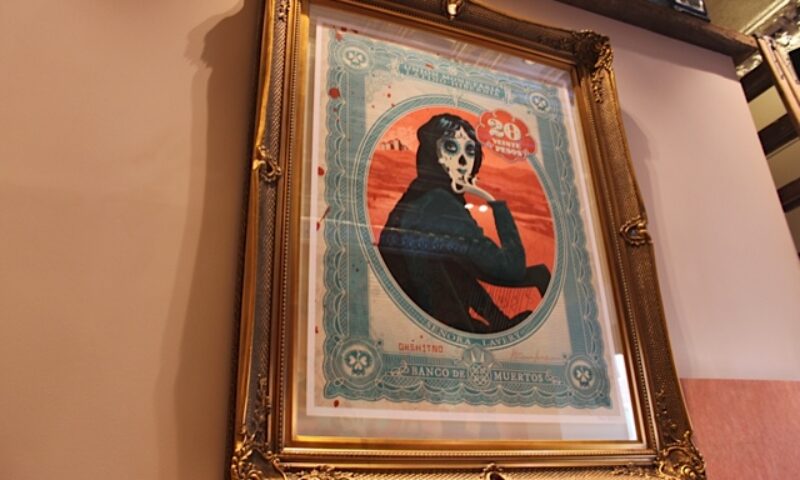
We were conscious of the importance of the customer journey – there are plenty of burrito novices out there – and we wanted to make the food experience easy and fun. Our copywriter got to work to create a cheeky, teasing narrative that built on the anticipation of the feast that they were going to devour, while they queued up to order. This was brought to life once more through the illustrative style. In keeping with our Irish roots, we also created a huge large format print of “Senora Lavery” overlooking diners from a gilded frame.
The result is a pretty unique dining experience that has got foodie tongues wagging for all the right reasons.
Skills used on this project
Brand Development / Art Direction / Illustration / Corporate Identity / Copywriting / Tasting!
Other Work
Warbler & Wren
Slane Castle
Active Iron
NCCR AntiResist
Áine’s Handmade Chocolate
DLR Mill Theatre
Glenisk
8 Degrees

NUI Galway
Adare Manor
Kish Fish
Golden Bake
Nuvion Nutrition
Monaghan

The Hendrick
O’Neills
Golden Irish
Flahavan’s
Bord Bia Food Works
Vintage Tea Trips

Mercury
Terrace Club
Montenotte
Donnelly Fresh
The Shelbourne
IrelandsEye

Mimi Care

Forestry Partners

Hamilton Princess