Raytex - Archived Work from 2018
In a cluttered category where own-brand often rules, Raytex stands alone as an iconic Irish brand.
Raytex
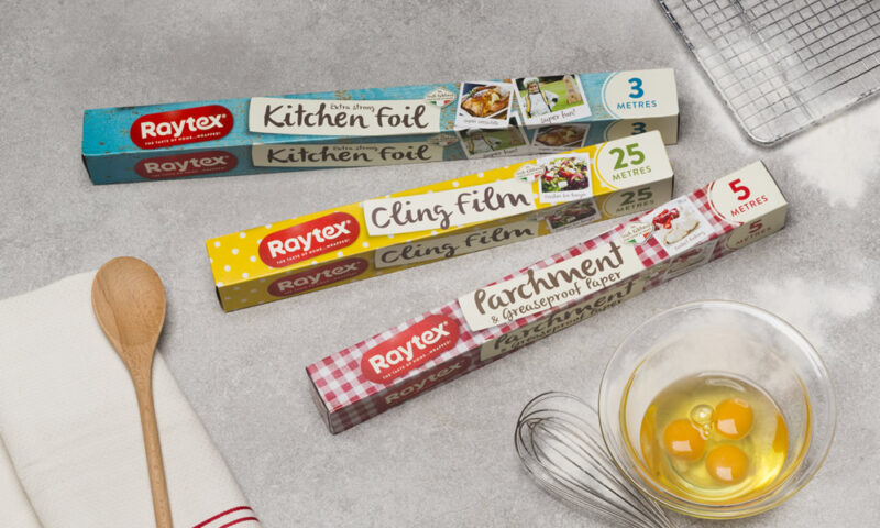
Raytex has been part of the fabric of the nation’s kitchens for generations. In a cluttered category where own-brand often rules, Raytex stands alone as an iconic Irish brand. With a reputation for quality that is second to none, its range of clingfilm, foils and cooking papers has developed significant trust in the eyes of certain consumers.
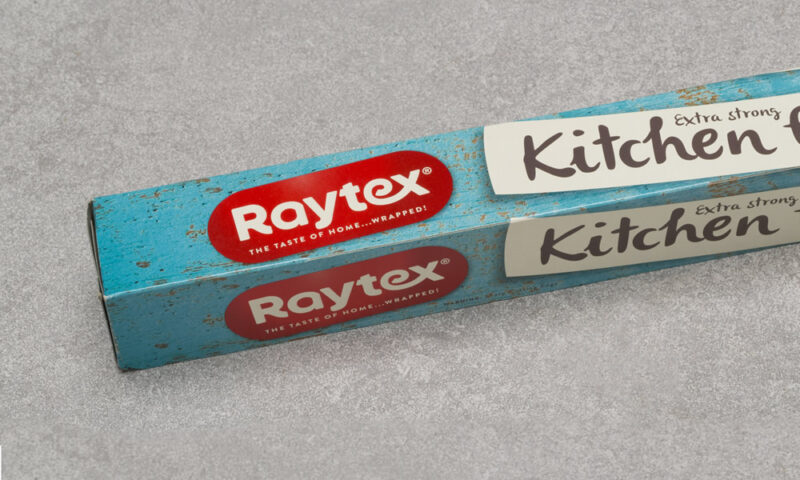
Yet the challenge for Raytex lay in the fact that after 50 years in Irish kitchens, the landscape had changed. Less acquanited with the brand, the younger cohort of consumers were increasingly less loyal, often opting to shop with discounters. Alongside this, the logo had become tired and lacked impact – it needed to be reinvigorated.
We needed to bring Raytext into the here and now, to reposition the brand in a modern context and ultimately define the compelling “why” that would engage the next generation of home chefs.
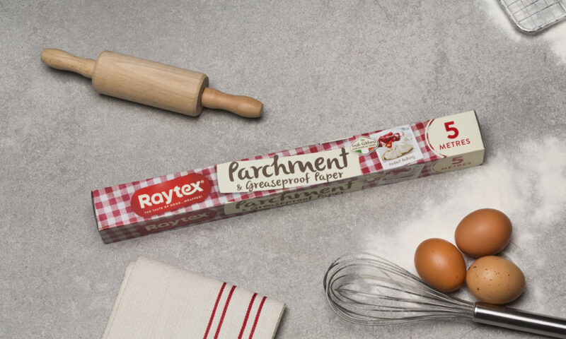
With a respect for its heritage, we refreshed the brand’s look and feel in a way that carefully balances new with old. We re-ignited its fun, friendly personality through a variety of bright, eye-catching patterns that create real cut through on a supermarket shelf.
Alongside a compelling new brand positioning “the taste of home… wrapped!”, we encorporated on-pack cooking suggestions with real foodie appeal to help the brand re-connect with families across Ireland.
Other Work
Fit Foods

Mimi Care
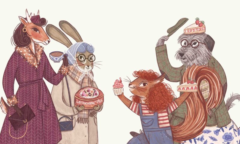
Vintage Tea Trips

Mercury
Kish Fish
Golden Irish
Flahavan’s

Slane Castle
WEEE
Monaghan
Bord Bia Food Works
Warbler & Wren
Golden Bake
Terrace Club
Green Man Nuts
The Killarney Park
8 Degrees
eDesk
DLR Mill Theatre
Donnelly Fresh
Montenotte

NCCR AntiResist
Glenisk
O’Neills
The Shelbourne
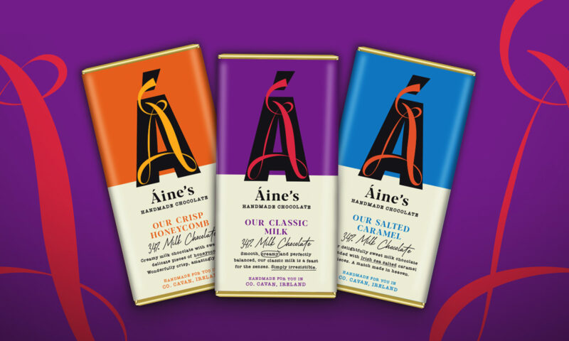
Áine’s Handmade Chocolate

Forestry Partners
Adare Manor

IrelandsEye

Hamilton Princess
Active Iron

NUI Galway
Nuvion Nutrition
