Mount Juliet - Archived Work from 2016
How we gave a brand steeped in heritage a contemporary look and feel...
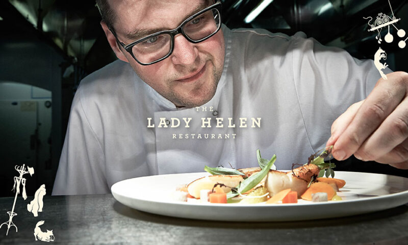
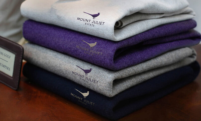
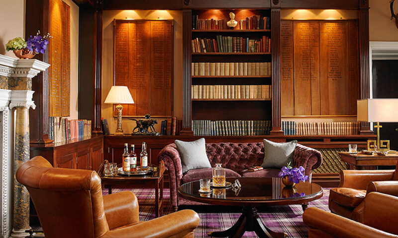
Mount Juliet
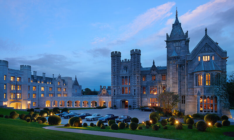
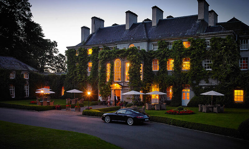
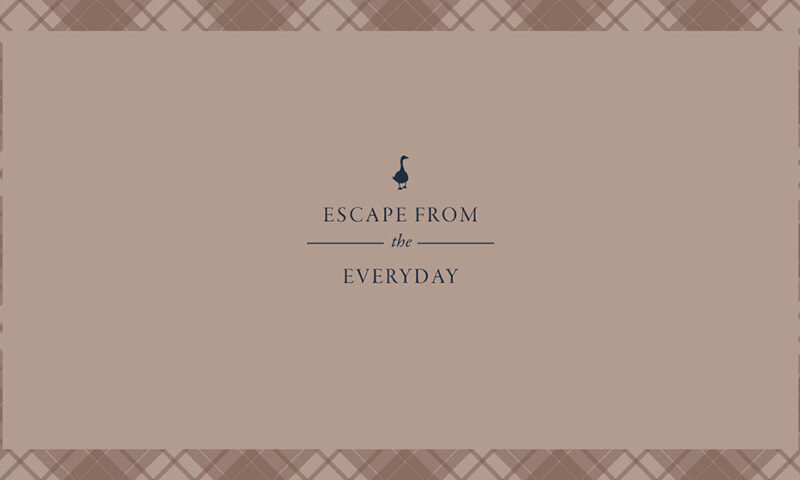
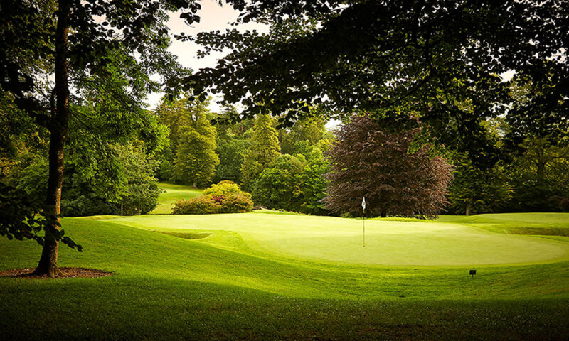
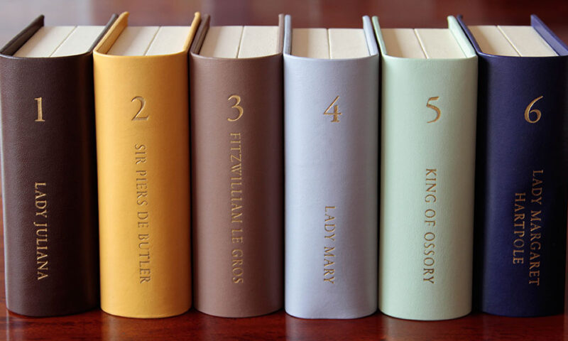
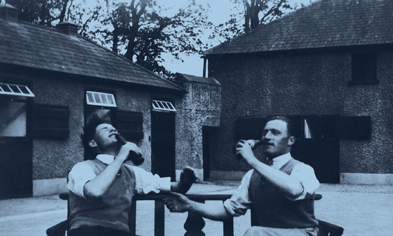
Mount Juliet Estate came to us for a new lease of life. It had begun to lack relevancy in what had become a highly competitive market. The team realised that there was huge scope to set Mount Juliet apart from the competition by appealing directly to a younger demographic, both nationally and internationally. But it wasn’t just as simple as creating a contemporary aesthetic – the Estate has an incredibly rich heritage and history. Our challenge was to balance a well deserved respect for the property’s past with a strong desire to bring it firmly brought into the now.
Our Solution
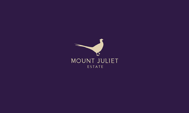
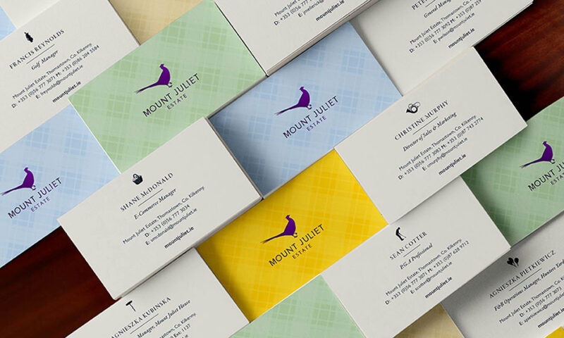
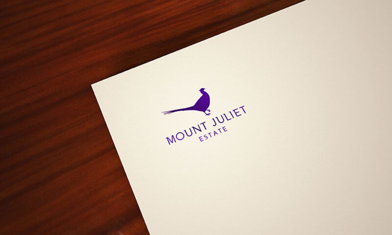
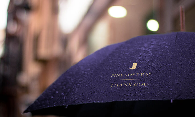
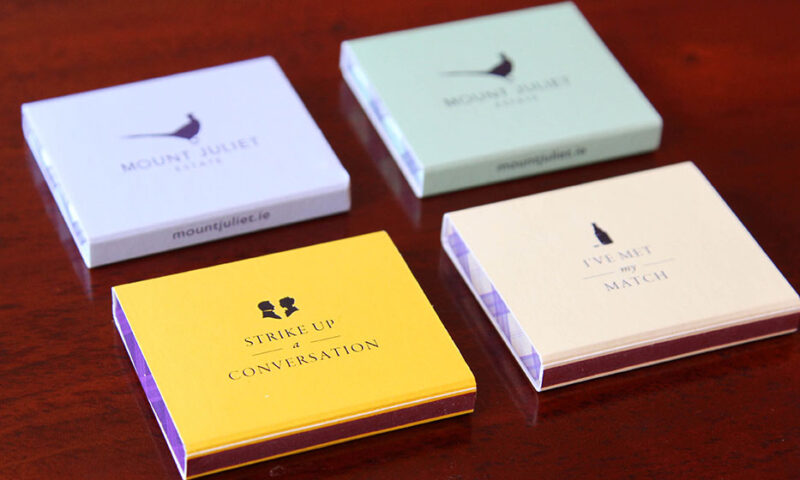
We completely reimagined the Estate’s longstanding pheasant brandmark with a sleek, fresh look that retained valuable equity. Alongside this we created a set of bespoke tartan patterns that were classic yet contemporary – a celebration of the property’s rich heritage and the people that lived there. To great success we’ve rolled the brand out across all collateral, from tone of voice, to brochures, to business cards, to distinct iconography, a dynamic colour palette, foils and finishes and numerous sub-brands.
Other Work
Nuvion Nutrition
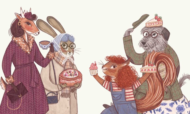
Vintage Tea Trips
IrelandsEye
Terrace Club
Montenotte
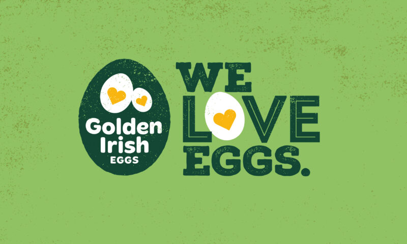
Golden Irish
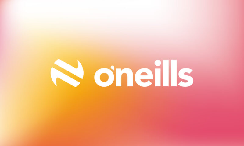
O’Neills

The Hendrick
Bord Bia Food Works

WEEE

Mercury
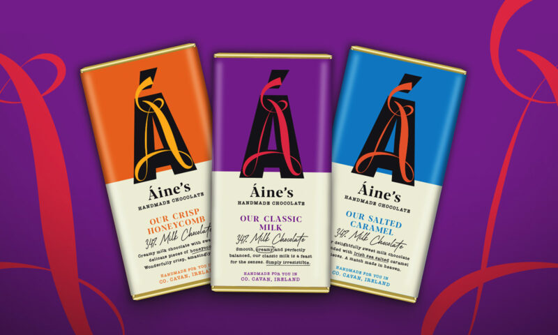
Áine’s Handmade Chocolate
8 Degrees
Flahavan’s
Active Iron
Kish Fish
The Shelbourne

NUI Galway
Glenisk

Hamilton Princess

Forestry Partners
Golden Bake
Warbler & Wren