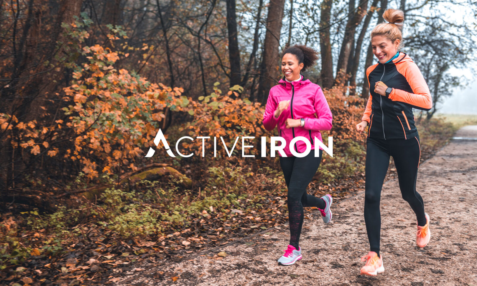
Active Iron
The mission
Active Iron is the brainchild of Solvotrin Therapeutics. Through their work, they discovered a ground-breaking method of delivering iron as a dietary supplement. This new approach improves absorption and reduces negative gastro-intestinal side effects, tackling some of the most common barriers that people face when trying to improve their iron levels.
When we met them, the team had just launched their first Active Iron product. They came to us because they wanted to reevaluate it, at a brand level. The goal was to workshop their positioning to make sure they were really getting across the unique aspects of this product.
The question
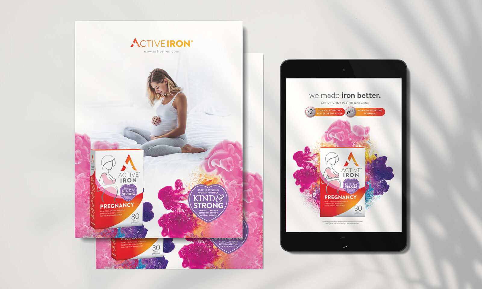
How do you communicate strength in a gentle way and gentleness in a strong way?
Iron deficiency is a common and serious problem. For many years the reality of taking iron supplements has been miserable, with frequently severe effects on digestion and gut health. The Active platform technology is a true innovation in the oral supplement product market.
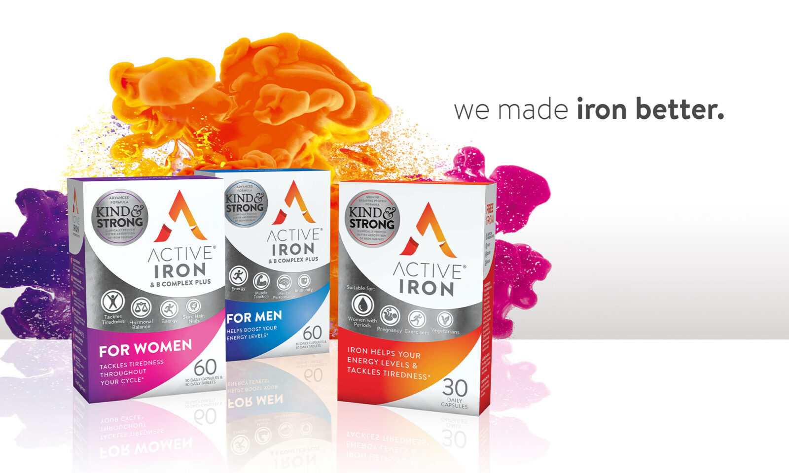
Their USP was strong, but they needed our help to create a brand position that would communicate the balance of those benefits in a way that consumers would instantly understand and trust. The brand needed to show the benefits of choosing Active Iron over other iron deficiency products. Having design flexibility was also important for its extensive developing product range.

The process
We led strategy workshops with Active Iron to gain a complete comprehension of their product and how it would revolutionise the world of iron deficiency.
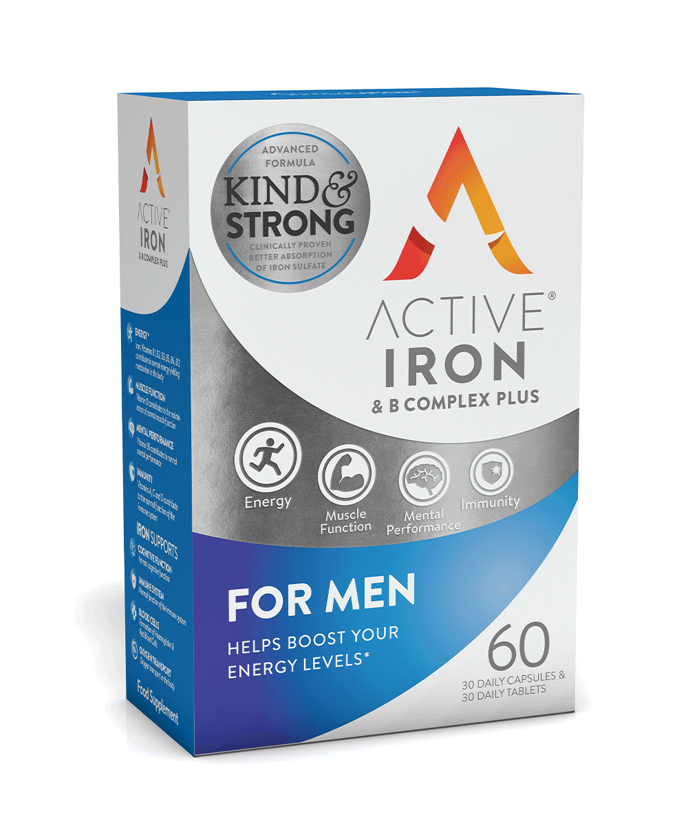
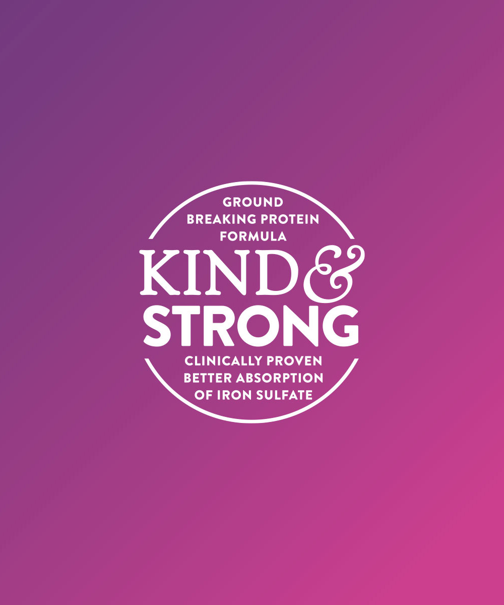
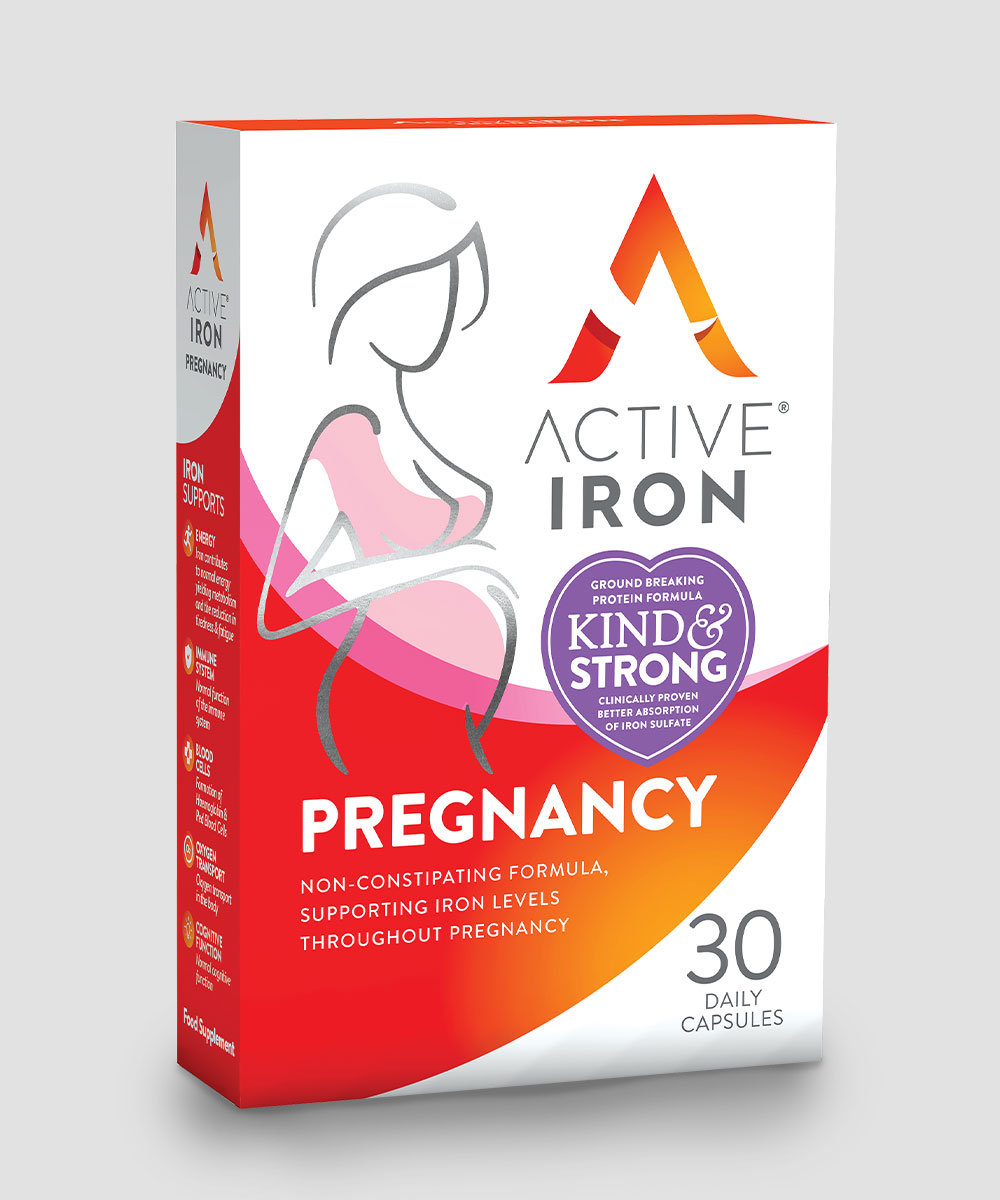
“Kind and Strong”, the fruit of that strategy work, is their key point of difference and the very essence of the Active Iron brand. The visual language needed to emphasise that the strength and gentleness of the product were not at odds with each other, rather, they reinforce each other.
We set out to create a brand that was full of colour and life and energy. We began with an overarching design approach that would be expansive and dynamic enough to work across the extensive range of Active Iron products targeting different specific consumer needs.
The transformation
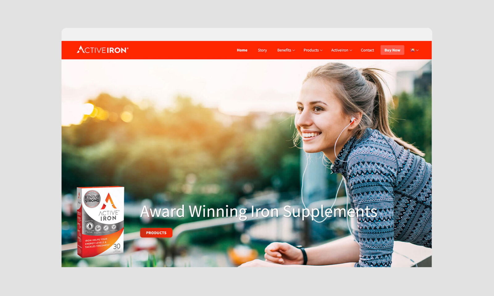
When we had the core brand identity in place, we began to adapt it for various products, to communicate their unique targets and benefits. From there, we helped the team deploy the new packaging and branding across their sales channels, supporting them in the creation of a new website with ecommerce capabilities. We developed a simple, impactful interface and selected dynamic photography with a straightforward, friendly tone of voice to tell the brand story (and indeed users’ stories), bring them to life in multiple languages, and sell the products on the online Shopify hosted store.